Bold Bean Gets Down to Business and Ditches Cafe Kitsch
By
Published
Filed under

By
Published
Filed under

Sometimes coffee packaging can lean a little too much on café kitsch.
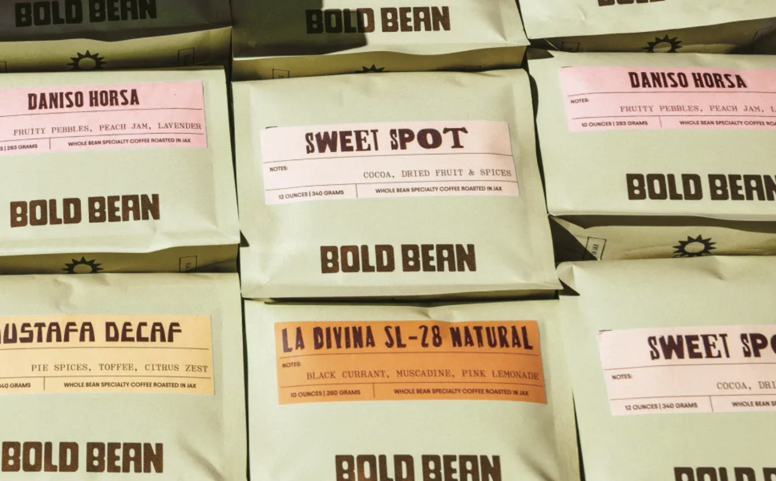
But with Bold Bean’s packaging, designed by Andreas Pedersen, ornamental storytelling goes out the window; in its place are soft, sage bags, industrial brown wordmarks, and paper labels that look like shipping stamps and roastery logs. The typography is blocky and confident, while muted pastels highlight the roast profiles. The system treats coffee like a cataloged good, standing apart in a category addicted to rustic excess and illustrated theatrics.
Get unlimited access to latest industry news, 27,000+ articles and case studies.
Have an account? Sign in