Bloom Brand And Packaging Redesign Takes A Modern Approach
By
Published
Filed under

By
Published
Filed under
Riser redesigned Bloom’s packaging to help women navigate the supplement market more comfortably. The new packaging and branding system creates a more modern approach, leaning into more charismatic and elevated elements while keeping the brand’s initial essence alive.
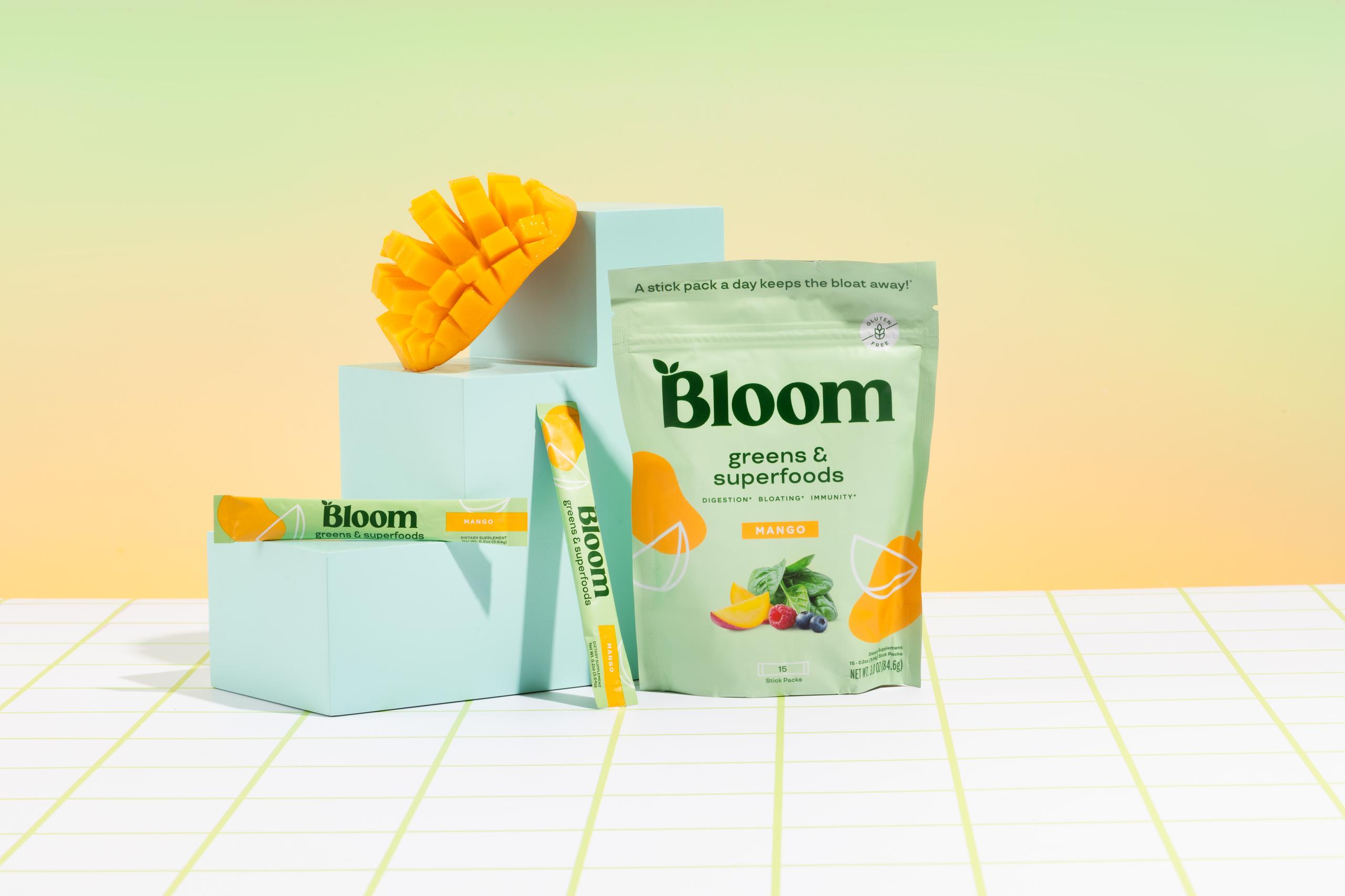
Aspiring to help women who are intimidated by supplements (and fitness overall) meet their full potential, Bloom engaged Riser to design a brand that would be fun, slightly fem, modern, and capable of flexing across D2C and traditional retail channels. We started with the logomark, transitioning the existing “B” into a more elevated, memorable, and curvaceous “Bloom” health-conscious females could relate to. Stylized ingredient illustrations add modernity and charm, while creating an ownable look that easily extends into digital channels.
Get unlimited access to latest industry news, 27,000+ articles and case studies.
Have an account? Sign in