21 Highlights From the Final Expo East
by Fred Hart on 09/26/2023 | 6 Minute Read
After 38 years, Expo East—the East Coast's largest natural products tradeshow—has officially closed its doors.
Lucky for us, we attended the final show in Philadelphia last week. While the news was bittersweet, the energy remained high at this year’s show, with brands determined to go out with a bang. From a product and food innovation perspective, it certainly had everything—nut milk, non-alcoholic cocktails, mushroom elixirs, seaweed snacks, tomato spreads, snacking noodles, and so much more.
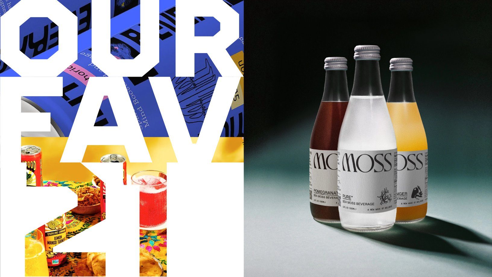
So, in honor of Expo East’s final year, we’re highlighting 21 brand standouts from the farewell show. And not to worry, Expo Easters, you’ll always have Newtopia Now.
Moss
The sea is beautiful and mysterious, which feels like the brief for its incredibly understated and elegant packaging. Anchored by a charming wordmark and wine-inspired paper label, this new-age functional beverage excites the senses without even having taken a sip.
Aaji's
Perhaps the most delicious thing we tasted at the show was Aaji’s tomato lonsa—an Indian spread of cooked tomatoes and Indian spices. The two colored labels, bracketed by bold type with a craftsman illustration at the center, promise big flavor and fun.
Drumroll
Formerly Greenhouse Foods, this mini donut underwent a glow-up as it repositions and redesigns to focus on flavor and attitude. Mouthwatering photography meets personality-driven type for a show-stopping look.
Geem
Inspired by the ocean, this minority and female-founded seaweed snacking brand pulled out all the design stops—a wavy wordmark with a metallic finish, repeating wave illustration, a beautiful teal brand color, and a little crab character.
Better Buckwheat
From the bakers at Maine Crisp comes a new product line harnessing the power of the ancient seed, buckwheat. What's more, the salmon brand color creates a nifty billboard introducing the brand to new consumers.
Yoro
Finally, a beverage that caters to your "need-state." This new-age functional drink carries a beautifully gridded design language that feels as focused as Yoro makes you.
Melting Forest
It wouldn't be an Expo East (or West) without a healthy dose of shrooms—no, not those kinds of 'shrooms. That said, Melting Forest and its sparkling adaptogenic drinks and gummies more than leans into the psychedelic tropes of the 70s and 80s to highlight its functional mushroom ingredients.
Treehouse Pecanmilk
Treehouse Pecanmilk avoids design tropes like showing large images of pecans creating artificial splashes of milk, a clear indication that maybe it's time to close down the alterna-milk pools. Instead, the brand opts for a beautifully simplistic but charming label with illustrations of people enjoying life’s simple pleasures and definitely not cannonballing into a sea of not-milk.
S’Noods
Snacking noodles, aka S’noods, burst onto the Expo scene with packaging that packs a flavorful punch. Big type, bold imagery, and prominent flavor names make for a snack you must get your greedy paws on.
Halmi
Minority and female-founded, Halmi is bringing a traditional sparkling Korean beverage into a new age. Inspired by a grandmother's recipe, the colorful illustrations are a nod to the founder's family heritage. Plus, what's not to like about a drink with cinnamon, ginger, jujube, and persimmon?
Secret Island Salmon
Tired, bland imagery of boats, fishermen, and expected coastal imagery dominate the seafood aisle. Not anymore. These big, bold, and vibrant designs shatter the category norm and invite you to try some of the most flavorful fish you’ve ever had.
Rob’s Backstage Popcorn
The Jonas brother-backed popcorn brand got a remastered design, inspired by album covers and street flyers, that shows off distinct, candid photos on each bag.
Juni
What does a happy mind look like? Just ask Juni, a line of adaptogenic beverages that celebrate your best self in a series of illustrations that change per flavor.
Blue Zones Kitchen
What happens when you mix health, longevity, and appetite appeal? Simple, sleek packaging that shows off elevated food photography artfully plated on, yes, a blue plate (and ready to add a little class to the frozen food aisle).
Pricklee
The prickly pear cactus water vibe gets perfectly captured by rigid lettering, punchy pink brand color, and angular illustration. The only thing missing is a little alcohol to, you know, make it spiked (thanks, we'll be here all night, and don't forget to tip your waiters).
Bollygood
Bollywood? More like Bolllygood. These Indian-inspired limeaids and lemonades bring all the bright colors, patterns, and imagery you’d imagine and deliver on it with the most distinct, refreshing flavors you’ve ever had.
SaySo
"Sleek and sophisticated." Those words perfectly summed up the cocktail bar aesthetic for SaySo cocktail mixes. An elevated wordmark mixed with jewel-tone palettes offers the brand a flawless introduction to these incredibly delicious flavors. Pinkies up.
Jack&Friends Jerky
If you’re looking for a storybook world full of flavor, you’ve come to the right place. The lush scenes of growing jackfruits and flavor ingredients changes per flavor, giving you a snack you can truly get lost in.
Shire’s
Formerly Nuttin’ Ordinary, the brand shed its previously quirky name and image for a more sophisticated heritage look that focuses on quality
and not on its main ingredient, cashews.
Paro
Urdu-inspired letterforms made for one of the most beautiful wordmarks witnessed at the show. But if that weren’t enough, a beautiful trapezoidal shape took center stage on pack to highlight the flavor name with contrasting organic icons explaining the product and how to use it.
Emotional Utility Beverage
The future of beverages is here. Founded by two ex-tech workers looking for a better way to unlock their potential, this immersive, mind-altering beverage has packaging to match—loaded with type, illustration, imagery, and plenty of personality-filled specs.