Span Studio’s Packaging Design For The Chicago Blend
By
Published
Filed under

By
Published
Filed under
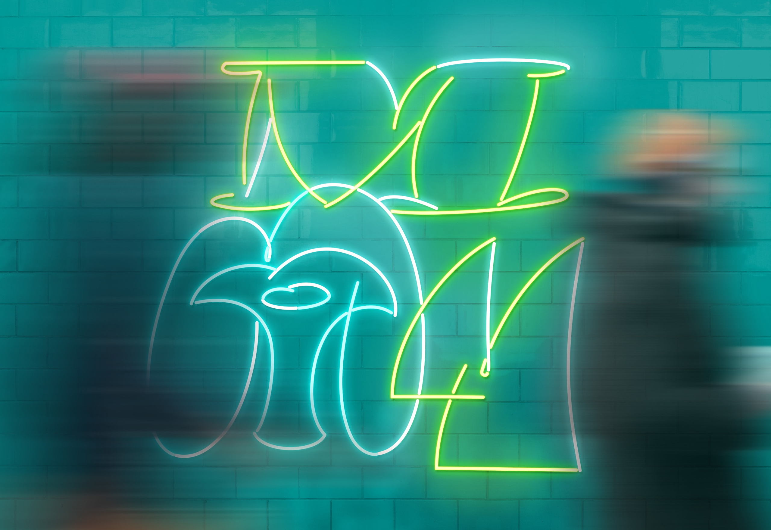
Span Studio’s packaging design for The Chicago Blend coffee is a captivating departure from conventional consumer packaged goods narratives. Instead of a typical brand-focused approach, the design draws inspiration from the essence of Chicago, paying homage to its urban grid system, airport locations, and iconic cultural elements like Susan Jackson Keig’s Aspen installation and György Kepes’ photograms. The playful bubble letters spelling ‘Chicago’ are reminiscent of the city’s New Bauhaus school and street art, while the ‘M’s echo Metropolis Coffee’s branding and reference notable figures like Oswald Cooper and Pablo Picasso. The reflective, metallic bag design reflects Tomoko Miho’s Great Architecture in Chicago poster, creating a visually stunning and conceptually rich packaging that supports the Design Museum of Chicago’s mission.
Span studio created the package design for The Chicago Blend, a specialty roasted coffee with proceeds going to the Design Museum of Chicago, a nonprofit museum dedicated to free, inclusive public programming serving artists and designers from diverse backgrounds, neighborhoods, and age groups.
Get unlimited access to latest industry news, 27,000+ articles and case studies.
Have an account? Sign in


