Featured image for The Best Brand Redesigns Of Winter 2023

The Best Brand Redesigns Of Winter 2023

by Rudy Sanchez on 03/20/2023 | 4 Minute Read

Now that the clocks are an hour ahead and the brackets are all filled out, it’s time to revel in winter's thaw and the arrival of spring. 

The cold season didn’t put a freeze on brand refreshes, however. We've seen some terrific brand updates this winter—or summer if you find yourself in the southern hemisphere. From former US darlings-turned-international lemon-lime-soda-stalwart to every home chef's favorite salt brand, studios and agencies delivered the goods with plenty of flair.

Here are five of the best redesigns we've seen across the very young year.

YbqLndCd.jpg

allplants

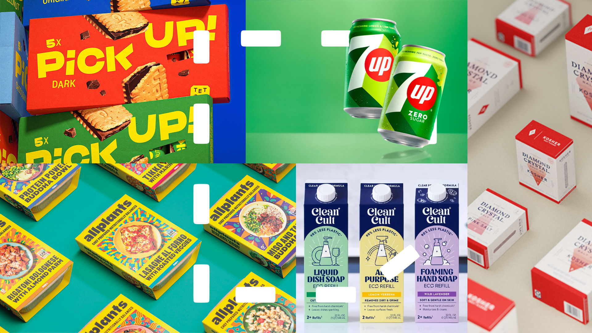
Founded in 2017 by Jonathan Petrides, allplants makes a range of plant-based and enticing pre-packed, frozen meals. Expanding beyond DTC and entering retail, allplants turned to Pearlfisher to revamp the brand, injecting the packaging with vibrancy and a more substantial shelf presence.

The new logo uses a striking, chunky, eye-catching, and contemporary type, especially when set against the bright, bold yellow that serves as the primary color of allplants’ new brand identity. Food photography takes center stage up front and is a feast for the eyes. Behind plated dishes, a colorful background consisting of dish components adds excitement to the packaging.

Read More

download (5).webp

Pick UP!

Bahlsen-owned Pick Up! is a brand of chocolate and cookie sandwich snacks that's been around for over 20 years. Pick Up! recently felt a need to contemporitze its brand, making it more appealing to its target consumer, young people.

Turning once again to Auge Design, the studio responsible for Bahlsen’s Dieline award-winning 2021 refresh, Pick Up! is injected with youthful vibrancy. The color palette gets brightened, and the wordmark reworked, featuring sharper edges that breathe energy into the logo while maintaining the brand’s quirkiness. The chocolate and cookie sandwiches are also featured on the packaging, highlighting the snack’s rich, crispy, and indulgent taste.

Read More

1.jpg

Cleancult

The word “cult” is certainly a charged one, pejoratively speaking. It invokes images of power-hungry and perverted leaders fostering a self-serving community to the detriment of their followers.

But Cleancult isn’t devoted to some charismatic charlatan. Rather, Cleancult celebrates the fervent commitment to using household cleansers free of harsh chemicals that are friendlier to the environment. Cleancult features refills sold in FSC-certified cartons similar to milk and says customers can cut out up to 55.8 pounds of plastic compared to the competition.

Cleancult turned to Robot Food to refresh the brand as it heads into national distribution through Walmart. The new packaging leans into the “cult of clean” theme with elements reminiscent of religious art, with an arch on the cartons and radiating lines in the background. The “ding,” a starburst-like graphic, is sprinkled throughout and is inspired by the glint of a freshly cleaned surface.

Read More

1.jpg

Diamond Crystal

Cargill-owned Diamond Crystal has made Kosher and coarse salt that cooks, chefs, and gourmands have turned to since 1886. Not much has changed when it comes to manufacturing, but Diamond Crystal refreshed its branding and packaging last month with help from the folks at Enlisted Design.

Diamond Crystal’s new look is contemporary and premium, taking advantage of its reputation among cooking professionals. The new wordmark’s pointy serif typeface is reminiscent of fancy cookbooks and menus and is also a nod to salt’s sharp edges. The boxes are primarily white, punctuated by a secondary color inspired by the type of salt. A four-sided diamond on the front of the package starts pale and grows darker towards the bottom, with an effect similar to a downpouring of salt.

On the sustainability front, Diamond Crystal’s salt grinders are now refillable, a much-welcomed change.

Read More

7UP & 7UP Zero Sugar (1).png

7UP (International)

A roundup of this winter’s best brand refreshes would be incomplete without 7UP.

The Keurig Dr Pepper soda brand is distributed internationally by PepsiCo, and its talented design and innovation team gave 7UP a significant revamp to its visual identity outside the US. 7UP’s brand refresh couldn’t have come at a better time, as rival Coca-Cola unrolled the exquisite global refresh of its lemon-lime brand Sprite by Turner Duckworth.

Core elements are given little tweaks, like the “7,” red dot, and citrus-inspired color palette. Deep shadows streak across the labels, creating a striking design interspersed with blocks of color. Superfluous graphics like bubbles are 86'd, and the new look modernizes 7UP and keeps the brand competitive in what appears to be an escalating lemon-lime soda war.

Read More