Featured image for Uchronic: The Augmented Tradition For Food And Wine Pairings

Uchronic: The Augmented Tradition For Food And Wine Pairings

by Chloe Gordon on 06/15/2022 | 5 Minute Read

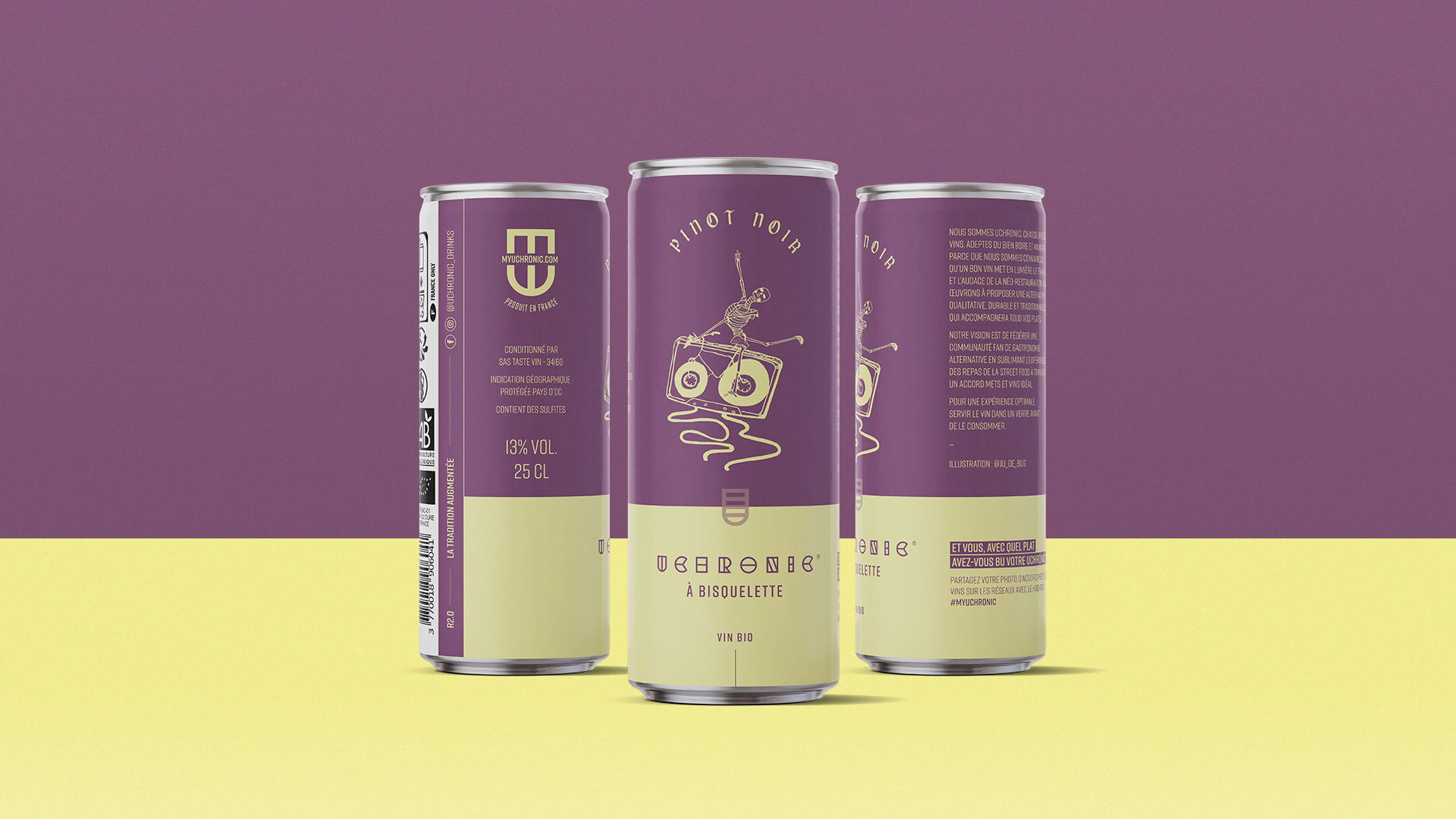
Studio Blackthorns designed the whimsical packaging for Uchronic, a canned wine brand. The packaging beautifully fuses 20s-inspired design from the prohibition days to that of futuristic cyberpunk qualities. The bright hues and cheeky line illsutrations make it clear that this is a wine that's for those that appreciate the craft behind the brand. It's light and it's approachable, but this is a brand that values the character in underground movements.


Editorial photograph

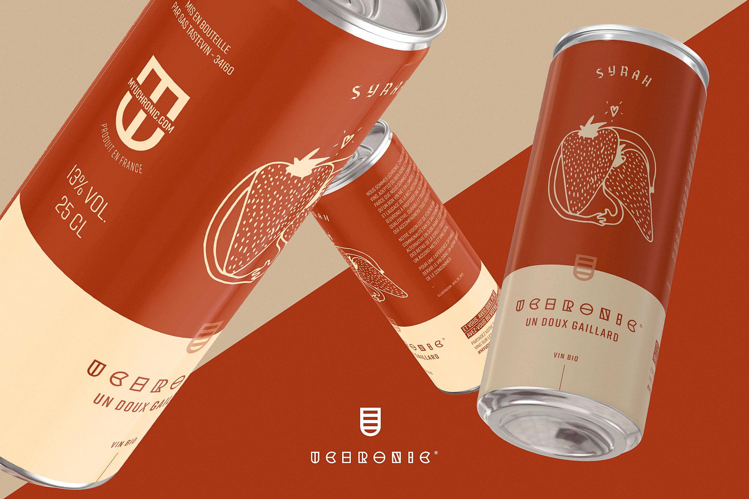
Benjamin Furlan, CEO of Tastevin approached Studio Blackthorns with the aim of launching a range of canned wines. Knowing the biases of this type of packaging for the wine category in France, the task was not an easy one. But at Blackthorns, we like the challenges and especially the audacity that emerges from this type of Anglo-Saxon project.

This way, their brand's mission is to be present in neo-restaurants offering Street Food on the spot or to take away. We've worked together to strategically define the essence and brand expression of Uchronic Wines. From this association has matured an efficient and beneficial branding and positioning strategy for the future development of the company. Through a succession of Zoom calls and intensive workshops, we brought the brand's decision-makers to define its DNA and refine its positioning strategy in view of the context of the health crisis.

Editorial photograph

These methods combined with strategic introspection and careful listening enabled Uchronic to transform the trial into a unique and recognizable brand ready to impose itself in the French canned wine landscape. « The brand we've created is not our own, it belongs to our customers. They are the ones who created this brand in their image and Ludovic has been able to develop its essence with brilliance and professionalism. » — Benjamin, Founder of Uchronic Wines

Fundamentally traditional and deliberately futuristic, Uchronic wines are timeless and sometimes technological. They straddle two millennia. Multigenerational they connect two worlds: physical and digital and propel the gastronomic tradition into the future. From this reflection was born a strong and recognizable visual identity. The logo reflects this "augmented tradition" with its digital coat of arms and futuristic typography.

The logo is a reminder of the coat of arms of yesteryear, but also reminds us of a measuring glass. On the typographical side, the letters are split to connote the precision of the blending but also the idea of food/wine pairings being the positioning of the brand. The vivid colour chart between pop culture and futuristic clarity takes us back to this uchrony.

Editorial photograph

The founder of Uchronic Wines wanted to be assisted throughout his brand creation process. Consultancy, strategy, visual identity and packaging design have provided the brand with a panel allowing a more serene launch in the difficult and uncertain atmosphere of the Covid-19 pandemic. THE APPROACH Based on a rigorous selection of the best wines and grape varieties of Southern France, Uchronic's aim is to bring a new choice to the street food community and to urban consumers: the choice to sublimate their dishes at all times by offering them a suitable, qualitative and sustainable drink.

Editorial photograph

Following the design of the brand identity, we created 7 different labels for the 7 wines of the Uchronic range. Throughout the strategy and creation process, we included about 15 people representing the typical target audience. This method is crucial in order to build a brand around consumer feedback and not lose sight of the most important element: your brand is not what you say it is, your brand is what they say it is. Benjamin understands this very well and that's what made this collaboration so strong.

Editorial photograph

So, from beginning to end, these millennials have allowed us to build a new brand and 90% of them felt this "wow" effect when they saw the finalized designs. For the creation of the labels, we first looked at the type of printing and paper we wanted to use. Not being a large production at the moment, we could not afford to print directly on the can. We selected soft touch labels typically used for craft beer cans in the modern brewing industry. The look and feel of this type of label pointed us towards the craft aesthetic that the certified organic brand wanted to incorporate. We then studied several creative paths before selecting the one that would meet with unanimous approval.

After a careful study of the target, we called upon the illustrator Julie Buguet in order to design wacky characters that would match the personality and taste of each can. The result: sober, illustrated cans in vibrant colours, all with a touch of underground flyer-like look, perfect for the target audience. All that was left to do was to name each can: Vif comme l’éclair, Frais comme un gardon, Sous les tropiques, Bar beauter, Entre bros, Bisquelette and Un doux gaillard.

Developed during the lockdown, Uchronic Wines is itself a fiction. Inspired by revisited historical periods, it evolves between the contemporary deco punk world of the prohibition of the 20s and the cyberpunk world of the near future.

Editorial photograph