Featured image for This Packaging Refresh Pairs Performance Nutrition With Taste Appeal

This Packaging Refresh Pairs Performance Nutrition With Taste Appeal

by Theresa Christine Johnson on 12/05/2022 | 5 Minute Read

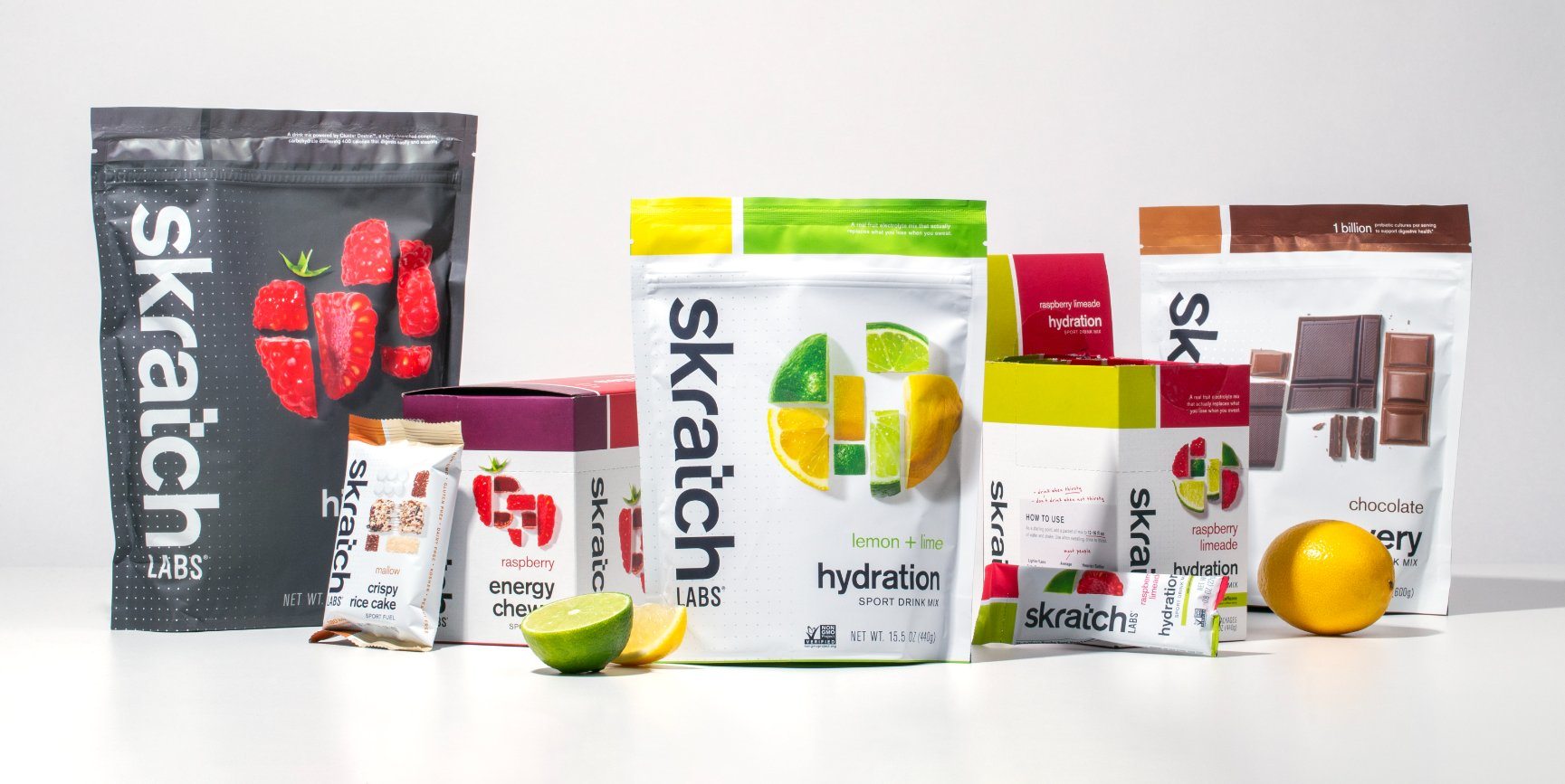
When it comes to energy bars and hydration mixes, “delicious” isn’t the first word that comes to mind. Many performance nutrition brands lean into the efficacy of their products and the benefits athletes get when consuming them versus the flavors—which might be bearable at best or chalky, dry, and unappetizing at worst. 

While a saccharine-sweet sports drink might not taste incredible, it at least gets the job done, right?

Skratch Labs' products are different from the average sports nutrition brands. Until founding Skratch Labs in 2012, Dr. Allen Lim worked on the Pro Cycling Tour as a sport scientist and coach for professional cycling teams. Most of the pre-packaged sports nutrition options available to his athletes contained heaps of artificial ingredients, which in turn causes gastrointestinal distress—not ideal for high-performance athletes.

Editorial photograph

Dr. Lim created a hydration option without artificial ingredients, and this “secret drink mix” had a simple and clean taste made from real fruit. The beverage soon became not-so-secret in the cycling community, so he launched Skratch Labs, which both pro and casual athletes enjoy today.

The brand is backed by science, but because they use natural ingredients, the sports drinks and snacks are easy on the stomach and taste great. That’s not simply their own claim, either. Consumers raved about the flavor—but when asked, they didn’t feel the packaging accurately represented just how good the products were. Skratch Labs needed a package design refresh to amplify the taste appeal.

Editorial photograph

“It was very strategic with how we had to approach that,” said Derek Springston, chief creative officer and partner at Moxie Sozo, the agency Skratch Labs hired for the project. The brand emphasized how they didn’t want to completely reinvent themselves but evolve the existing packaging to the next level. “It all revolved around the taste appeal and how we make it feel more real because they use real ingredients, and it tastes better."

Editorial photograph

"If we brought it to life in the right way, everything else would fall into place," he added.

Moxie Sozo started by looking at the Skratch Labs logo—one of the most substantial aspects of the existing brand, along with its shifted pixel in the “t.” While it initially looked perfectly square at the time, they brought it into an exact alignment allowing the entire packaging system to be based on a grid and, therefore, appear more consistent and have more versatility. That led Cara Berberet, senior designer at Moxie Sozo, to utilize a gridded design—something similar to what Skratch Labs already had, but elevated—that incorporated real images of genuine ingredients like fruit, rice, and chocolate.

Editorial photograph

“The fastest way to appetite appeal is often food photography, so we had to pursue how to make it happen,” Cara said. “That was a lot of trial and error. And Skratch Lab’s previous imagery was all around pixelated images, so we took that a step further and thought, how do we pixelate actual food? So we chopped ingredients into little pieces and turned them into pixels so that it became a cool, complex system that we could build upon and adjust.”

Editorial photograph

For the food photography, Tyler Beckwith, design director at Moxie Sozo, did plenty of exploratory images before nailing down the ideal manner to get those refreshing, so-good-you-could-eat-it photos (razor blades, a sharp Shun knife, and glycerin were especially helpful). He didn’t want to rely heavily on Photoshop because the goal was to have the packaging look as authentic as possible.

“Cara and I wanted it to look like a meticulously created mosaic actually shot in the studio,” Tyler said. “That's easier said than done to capture the whole piece at once, so what we found to work best was to shoot individual pieces and leverage Photoshop to bring the mosaic together. That gave Cara, who created the pixel images, more freedom to pick and choose, like, ‘Okay, let's rotate this piece here. Let's get another piece in here.’”

Editorial photograph

The formulaic, grid aspect of the packaging is juxtaposed with organic elements, a duality that appears throughout the design system because it's an inherent part of the brand. The products are rooted in science yet come from all-natural sources. Beyond the principle design system of the packaging, Moxie Sozo brought out the brand's humanity further with handwritten details on the back of the pack.

This flash of personality also shines on the substrate itself. The background for much of the packaging is a crisp white, but a gridded pattern of dots where the white background is not applied lets that subtle sheen of material pop. Nate Dyer, creative director and partner at Moxie Sozo, said that took some extra effort—including phone calls with the client and printer to ensure everything was done to perfection—but the result is worth it. The packaging refresh allows Skratch Labs to simultaneously exist as the very pragmatic solution for athletes that it is without sacrificing its character.

Editorial photograph

Being based in Boulder, Colorado, the entire Moxie Sozo team expressed how much they loved working on a brand in their own backyard. “It’s a really iconic local brand,” Nate said. “And you want to do justice to the brand because you know you’ll see it everywhere.” The agency focused on the packaging, but they really created a system that could get used for future products, as well as swag like water bottles, clothing, cycling kits, and more, some of which the team has gotten to see out in the wild. Their work has paved the way for Skratch Labs to expand and grow well into the future—one where people think of performance nutrition and “delicious” as one of the first things they’ll think of.


Go here to learn more about Moxie Sozo!