Oliver’s Oatshakes Might Be Dairy-Free, But The Nostalgia Remains In Tact

Published

Filed under

Memory was challenged by Olver’s Oatshakes with a tough brief: how could they create the branding for dairy-free, plant-based consumers and still keep the charming nostalgia of traditional shakes? The result is an optimistic and upbeat packaging system through illuminated colors, fresh character illustrations, and playful patterns, all working together to create a humanistic approach. So even if you’re not a dairy-free, plant-based consumer, your interest might still be piqued by the adorable packaging system.


Editorial photograph

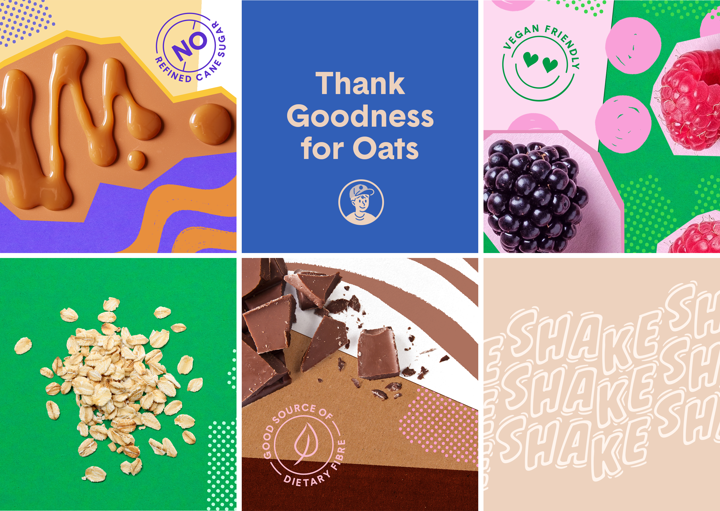
Oliver’s Oatshakes Oliver’s Oatshakes are a new product within a somewhat new category – a functional, plant based “milk” drink made with organic oats and natural flavours, including Toffee Caramel, Real Berry, and the staple favourite, Chocolate. The humble shake is traditionally associated with ‘dairy’ – not just in the cow’s milk sense, but also in childhood memories of skipping down to the local corner dairy for the ‘longest drink in town’.

How could we introduce a new offering that would appeal to the dairy-free curious and plant-based alike, while still retaining the playful nostalgia of the classic shake? Starting with the brand’s namesake character (based on the client’s own young son) we developed a complete design system to communicate a fresh, playful quality, as well as a sense of wholesomeness and “goodness” that avoided outdated tropes of milk splashing in a glass in front of a farmscape backdrop.

Editorial photograph

Our hand-drawn Oliver introduces himself with a humble, upbeat pose suggesting optimism and discovery, while the supporting graphics utilise collage, layering and the use of found imagery to create a language of abundance and joy – a less serious, less perfect, less ’Swiss School’ approach that adds a little heart and humanness across all touch-points. The characteristics of each flavour were interpreted into hand-illustrated textural wallpapers, using traditional colour cues that are countered with unexpected and expressive secondary colours to create a unique attire for each.

Rounding out this layered curation of colour are foundational tones of nostalgic blue and creamy oat milk – the latter a warm and modern neutral that anchors the palette while providing a visual cue of the product’s hero ingredient. Together the final result is a cohesive look and feel that balances the freshness of a new offering with a nostalgic, wholesome appeal to delight the discerning shake lover of all ages and dietary faiths.

Editorial photograph

This placeholder is removed when the ad slot is configured.

This placeholder is removed when the ad slot is configured.

This placeholder is removed when the ad slot is configured.

This placeholder is removed when the ad slot is configured.

This placeholder is removed when the ad slot is configured.

This placeholder is removed when the ad slot is configured.