In Portuguese, the word “desapego” means “detachment.” Inspired by the brand’s name Vinco Studio created a label for the wine that visualizes detachment. While the label is simple, with a solid color and a sans-serif logo making it up, the deeper meaning gives the design wit and charm. Sometimes, it’s not what we can see in packaging but the deeper concept behind the design that makes it captivating.
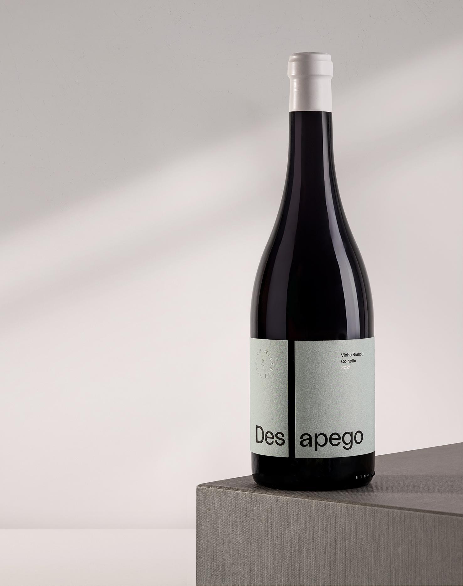
Desapego (Detachment), means knowing how to love and appreciate life with balance, freeing ourselves from the excesses that hold us back. “Live intensely, let go”. This is the message that Reserva Alecrim wants to convey with the “Desapego” wines and with which we identify so much.