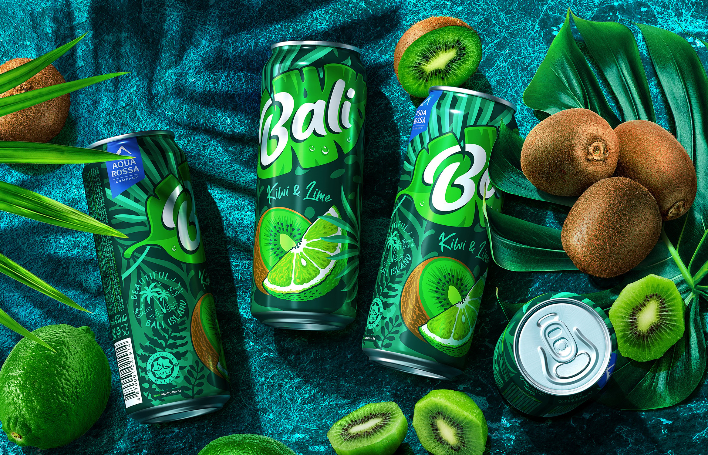
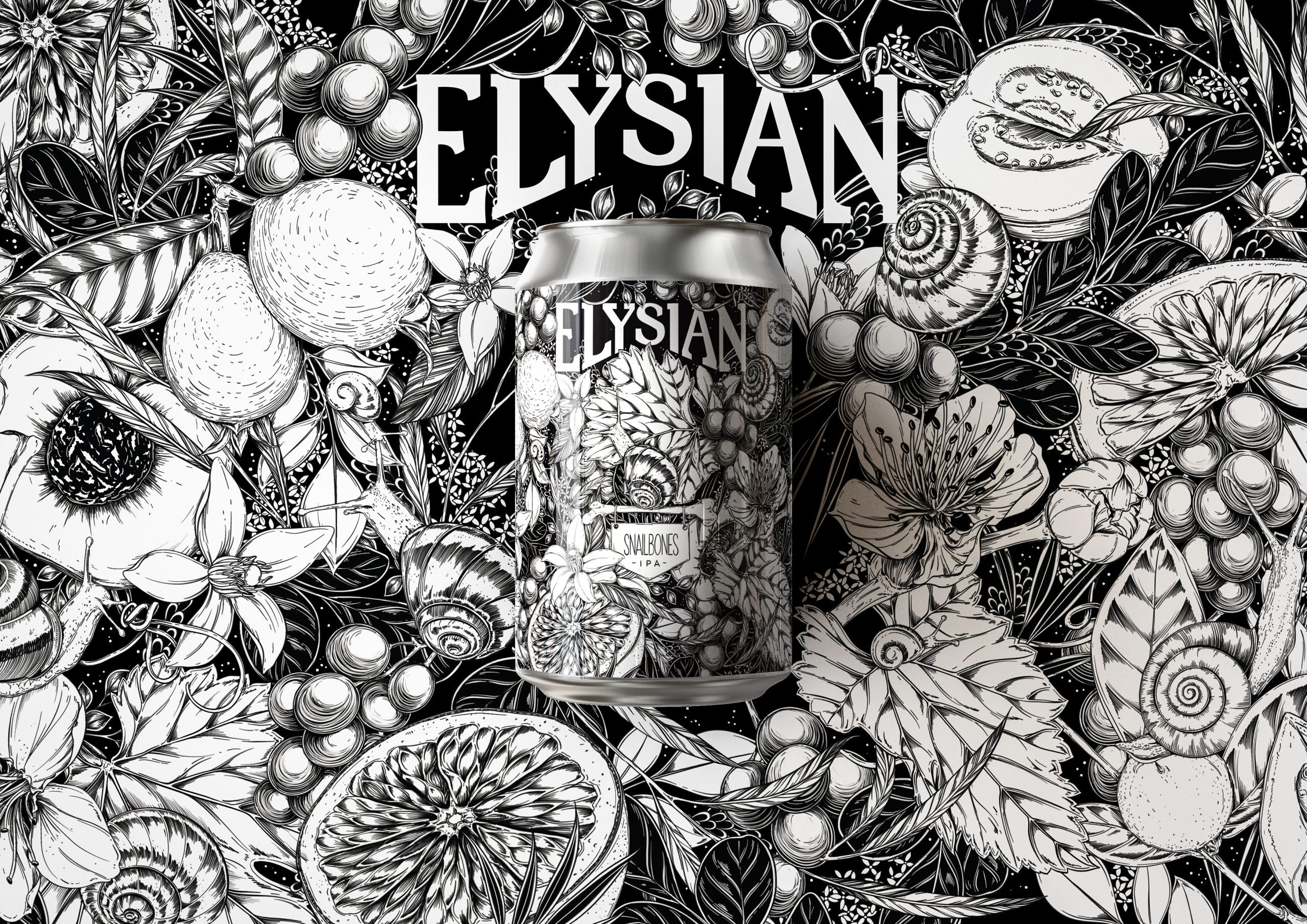
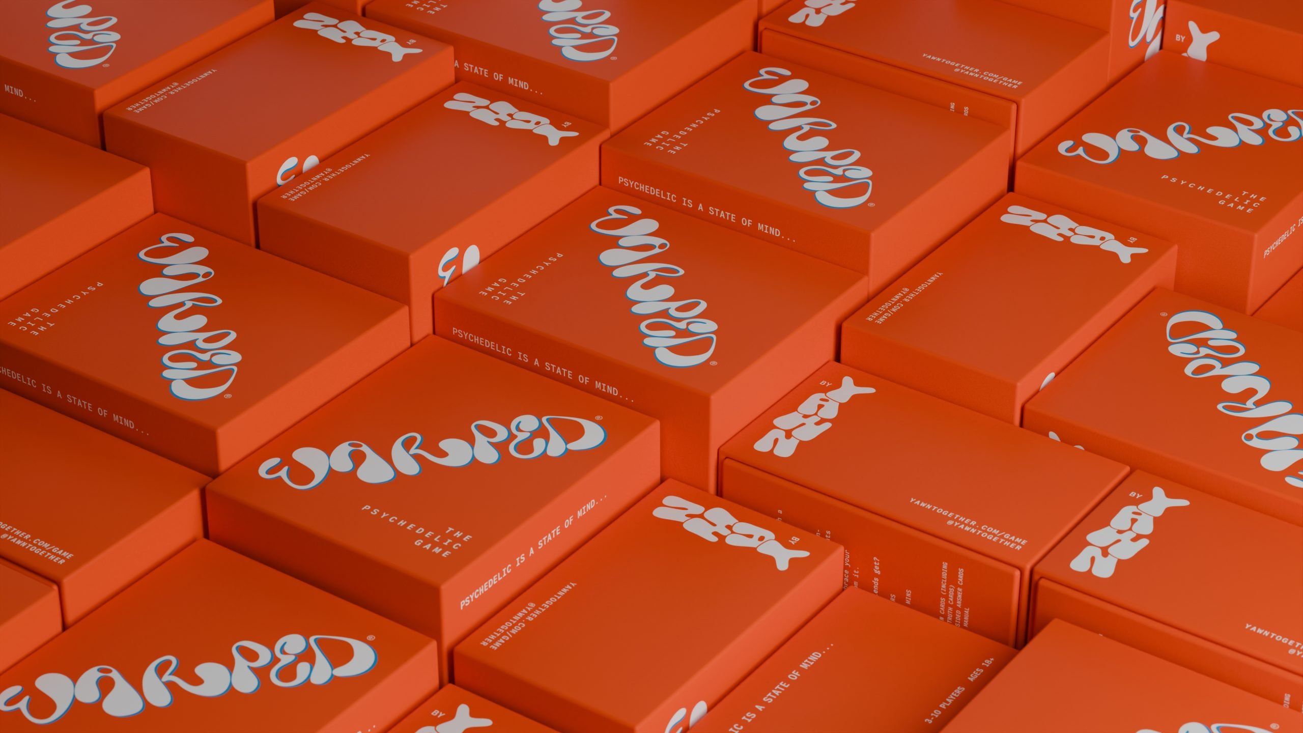
Hearth’s Yerba Mate cans are drenched in gorgeously colorful illustrations inspired by Earth’s natural resources. The natural color palettes were chosen for each can to reflect the delicious flavors within. Designed by Butterfly Cannon, the balance of the simplistic typography paired with the free-flowing details and colors creates a balanced yet playful can. Compared to other Yerba Mate cans, these are sure to stand out on any shelf.
Hearth was founded by a health-conscious couple determined to capture the very best of the Earthâs natural resources. Their first product is a duo of canned yerba mate drinks – an ancient South American tea. Which up until now has had niche appeal in the rest of the world, due to a lack of accessibility to all but the most health conscious. Sold through health stores, gyms and coffee shops, Hearth Yerba Mate was attracting some attention. Both for its product and colourful design. There was a slight issue: it looked like the brand was called Yerba Mate, not Hearth. And, if you werenât in the know you didnât know what the product was! Hearth came to us for a refresh. We re-drew the existing logo mark, making the Hearth word mark more distinct and interlocking âHâ heart shape more obvious. An ownable device that can be used beyond packaging; across digital and social.
