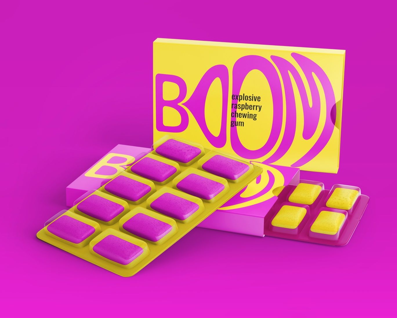
Daria Zharkova, a student at HSE Art and Design School, created Boom Gum with one thing in mind: make a statement. And that she did. With vibrant colors, illustrative typography, and minimalism in mind, the packaging for this chewing gum is everything you could dream of. It’s simple, but it makes a statement, just like the word “boom!” If there’s one thing you take away from Daria’s design, it’s that sometimes all you need are two contrasting colors and funky typography to make a lasting impact. Boom!
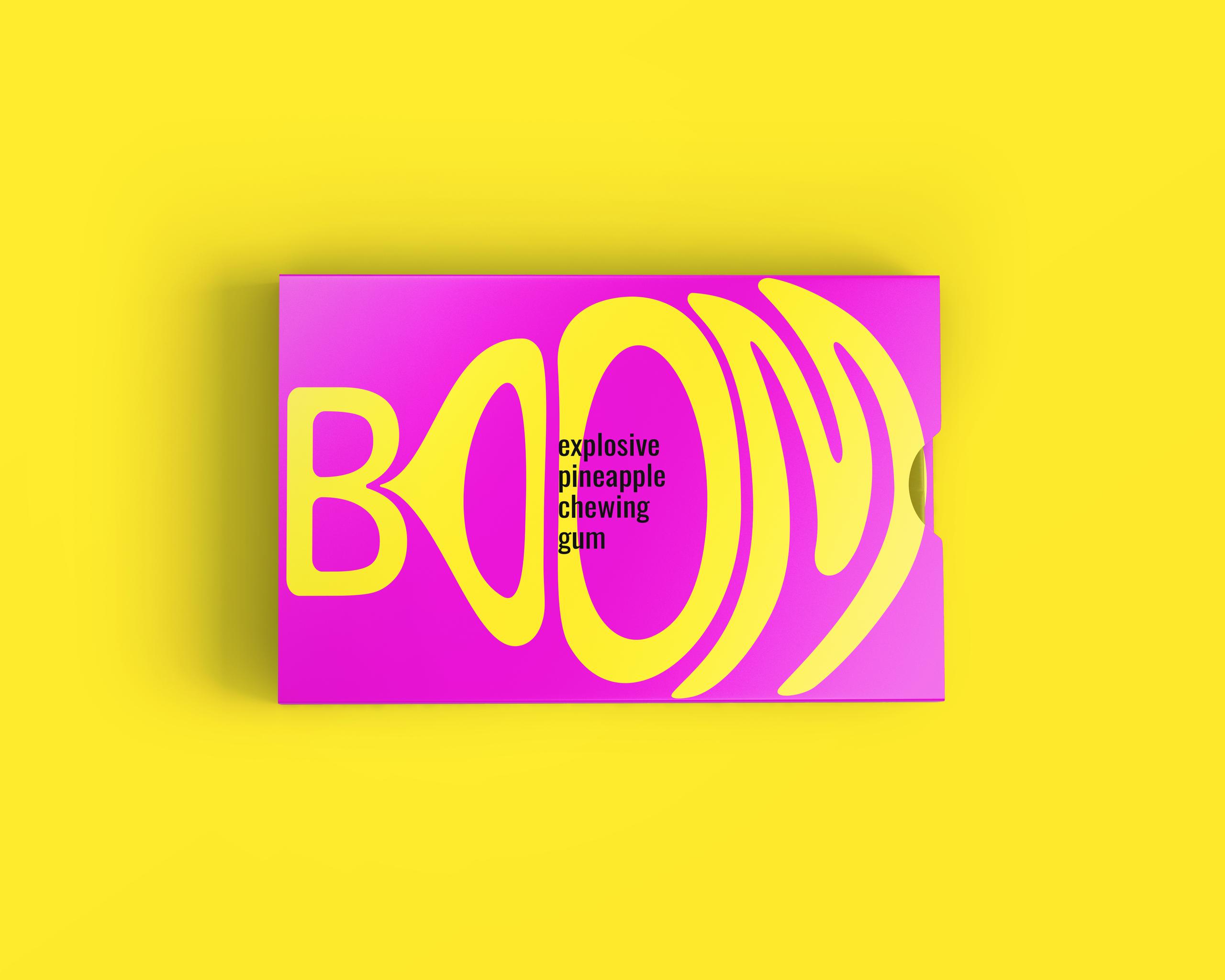
The BOOM GUM is based on the image of a bubble gum blowing up, as if it is about to burst. The vibrant colors grab attention and make the packaging bright and visible. The colors of the inscription refer to the taste of the gum.
