ZEO Blends In Gracefully In Any Glass Or Bar

Published

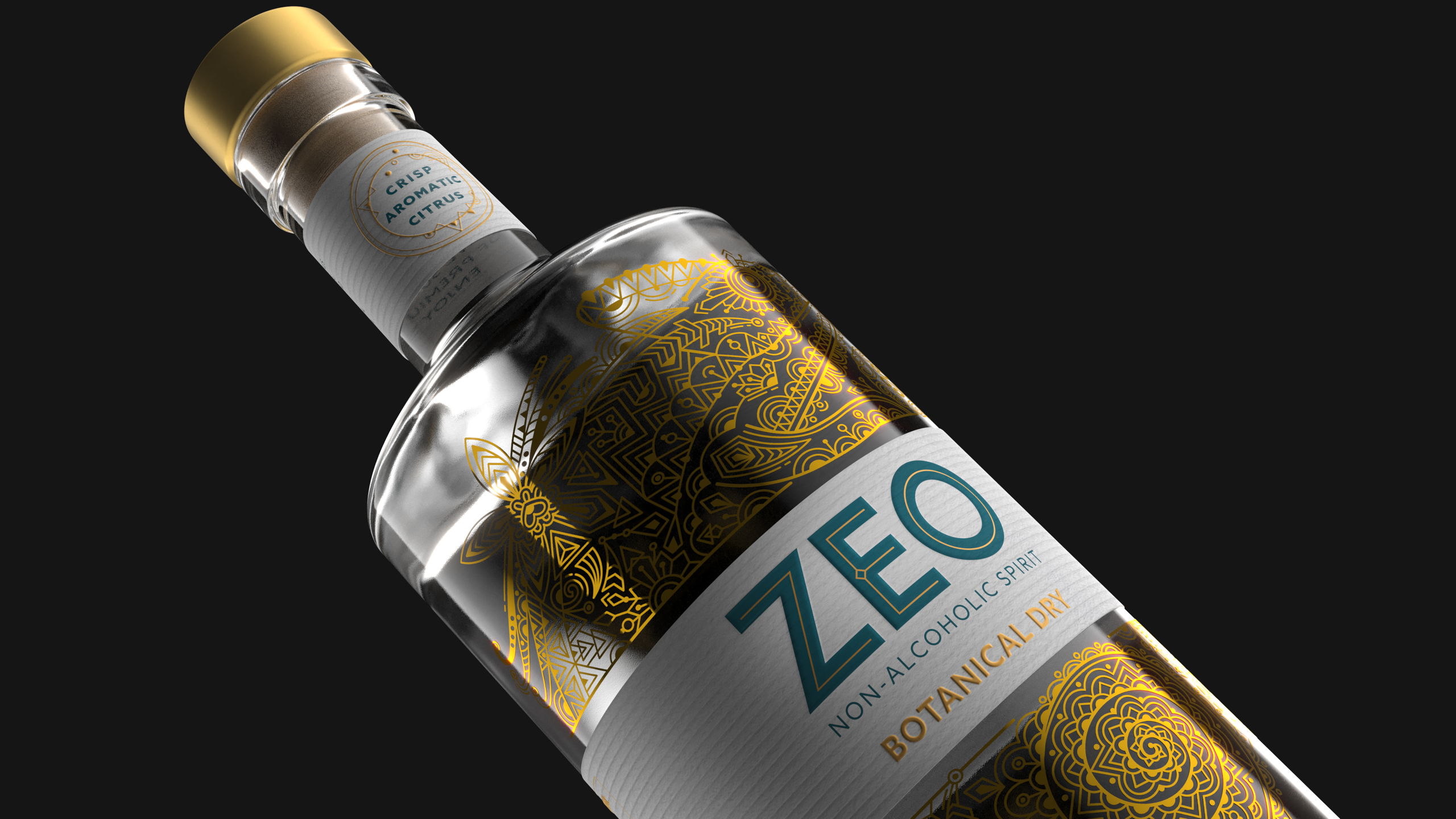
An intricately illustrated chameleon greets you when you go to pick up a bottle of ZEO, an alcohol-free spirit designed and curated to provide the same sensations and euphoria as a traditional alcoholic beverage. Knockout developed a brand identity that ties together the notion of blending in, not only with flavors, but amongst other spirits and liquors as well. The delicate gold details, both on the bottle’s design, as well as on the bottleneck serve to delineate elegance and craftsmanship. The amount of detail that goes into each botanical mix is the same that went into its bottle’s design. 


Editorial photograph

Drinks design specialists at Knockout have created a new identity and bottle design for ZEO, a range of sophisticated, sensorial zero-alcohol spirits. The brand’s first two variants, Botanical Dry and Spiced Oak, arrived in the UK market this November. 

Editorial photograph

Unlike other non-alcoholic spirits, ZEO possesses a sensorial dimension which mirrors the physiological effects of alcohol. It is made with high-quality, sustainably-sourced botanicals, meticulously crafted through a complex five-step process. It’s distinctive ‘triple layered taste’ makes it a genuine alternative for people who enjoy alcohol but, for whatever reason, choose not to drink. 

Editorial photograph

“ZEO isn’t for teetotalers. It’s for sociable urbanites who love to drink, but sometimes feel a bit of alcohol fatigue,” comments Dominic Burke, founder at Knockout. “When this happens, they either want to fly under the radar or enjoy something truly special. The duality of this blend-in/stand-out desire was the insight that set the course for the creative and inspired the genesis of the brand’s symbol: a chameleon.”

Editorial photograph

An exquisite embodiment of contemporary craft, ZEO’s bottle design strikes a dynamic balance between complexity and minimalism, underscoring the brand’s proposition as the best non-alcoholic spirit for modern tastes. 

Editorial photograph

An intricate pattern illustration of the chameleon curling around the label conveys the sheer craft, sense of skill, and attention-to-detail that goes into ZEO’s five-step distillation process. Hidden within the line work, are depictions of the individual botanicals, which further reinforce the intriguing, multi-layered sensation of ZEO’s drink experience. This highly-detailed expression is then off-set by a clean, uncluttered word mark, featuring bespoke typography that is bold in its simplicity, giving the brand a contemporary feel, whilst allowing for it to stand out on the shelf and at the bar.

Editorial photograph

“As a player in a growing industry, ZEO needed compelling creativity to show that it was more than just flavored water. The illustration of the chameleon is as delicately complex and versatile as the liquid within. Not only is it beautifully drawn, but as a metaphoric symbol, it emphasizes ZEO’s adaptive and transformative powers as a brand ready to evolve and elevate the category.”

Editorial photograph

This placeholder is removed when the ad slot is configured.

This placeholder is removed when the ad slot is configured.

This placeholder is removed when the ad slot is configured.

This placeholder is removed when the ad slot is configured.

This placeholder is removed when the ad slot is configured.

This placeholder is removed when the ad slot is configured.