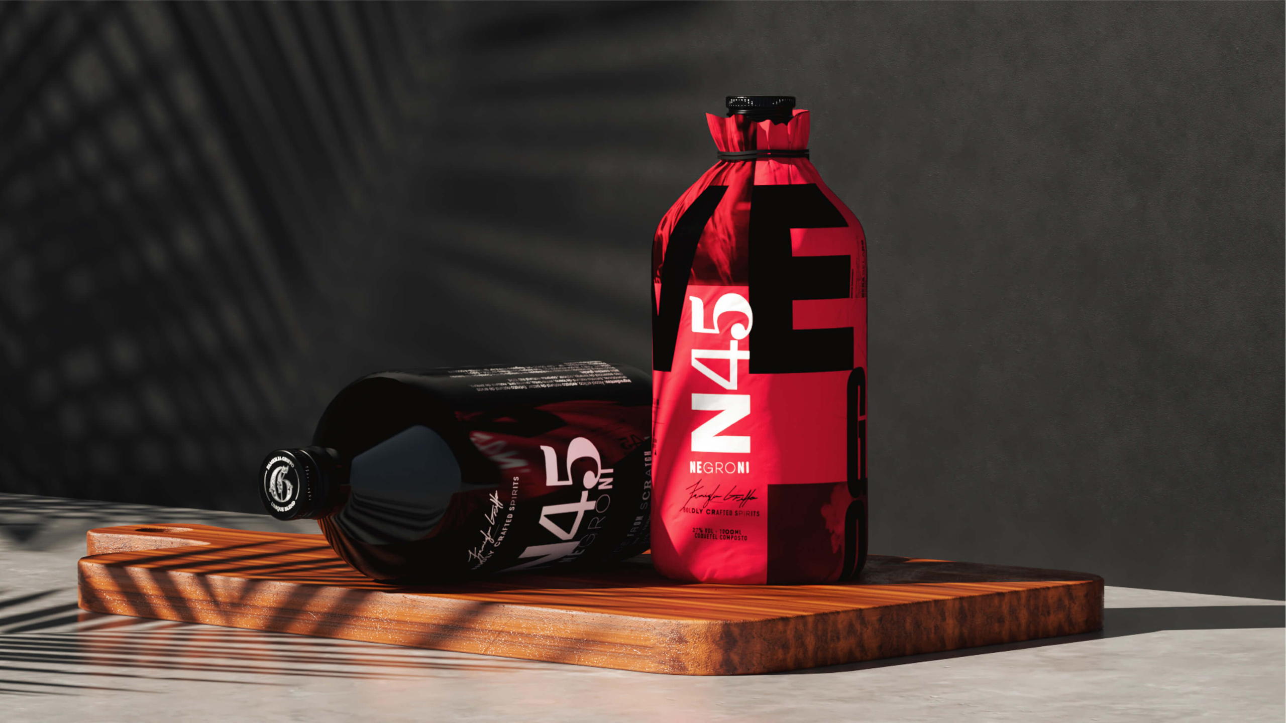
We’ve all seen the classic and traditional. N45, on the other hand, rebelliously goes against the grain in everything they do. They contracted Rebu to develop a brand identity that would go above and beyond in differentiating themselves from the rest of the bottles that any N45 bottle would be next to on any given shelf. Offering a pre-made negroni cocktail, consisting of gin, vermouth, and bitters, N45 aims for greatness, with every detail accounted for.
Going with a bold color palette consisting of red, black, and white gave them the opportunity to truly make a statement. The mismatched and eclectically positioned typography on the bottle’s label continues to evoke curiosity and a sense of playfulness. If you hadn’t just read it for yourself, you could pretty much assume that a cocktail like N45 never seems to get old.