Featured image for Dove Body Wash Revitalized Its Packaging—and Cleaned Up in Market

Dove Body Wash Revitalized Its Packaging—and Cleaned Up in Market

by Kim Gaskins on 11/23/2021 | 6 Minute Read

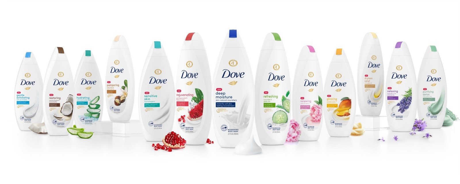
If you browsed the body wash aisle in recent years, you likely noticed more exotic and sensory-stimulating offerings, many of which hail from new or smaller brands. Some product descriptions sound like tasty toppings from a five-star restaurant, with others evoking lush, Edenic landscapes: “Vegan Murumuru Butter and Rose,” “Hydrating Coconut Latte,” and “Rich-Lathering Silver Water and Birch,” to name just a few. Many consumers have begun to feel that cleanliness ought to be a journey, not just a destination.

Dove, known for its high-quality formulations and moisturization benefits, has delivered superior personal care products for more than 60 years. Despite being a category leader with years of double-digit growth and a high-performing package design under its belt, the brand took a proactive approach to design management. 

Editorial photograph

“It was 2018, and we hadn't changed our artwork in about five years, so we were due for a refresh given the changing market dynamics. Consumers were expecting more in terms of sensoriality and naturalness from their personal care products, and there were a lot of new, emerging brands entering the market,” said Margaret Merritt, senior global brand manager at Unilever.

The rise of e-commerce has been a boon for challenger brands who struggle to secure distribution through brick-and-mortar outlets—and a thorn in the side of established brands now required to defend their market share from countless new competitors. “Previously, our competitive set was defined by what you’d find in a Target or Walmart, but the shift to e-commerce included many more indie or beauty-store brands, and they were accelerating trends like premiumness and modernity. When consumers are shopping online, they don’t know if something is a mass brand or a niche brand—they just see body washes, and we needed to take that into account,” said Marcela Melero, global brand vice president of Dove Skin Cleansing.

Editorial photograph

At a high level, the brand hoped to attract new buyers through an evolutionary design change that worked harder to emphasize its premium nature, modernity, and moisturization benefits, along with an elevated sensory experience. It also wanted to communicate more about Dove’s values—such as using 100% post-recycled plastic bottles and abstaining from animal testing—on the back of the new package for consumers seeking more sustainable, ethical options.

Early consumer research conducted by the Dove team revealed another opportunity to expand its audience, raising awareness that the brand offers so many different variants, which could help to capture consumers seeking scrumptious scents or specific benefits. “Our preliminary research showed that many consumers thought we only offered three or four variants, whereas we really have 13. That was eye-opening,” recalled Merritt.

Editorial photograph

In late 2018, the Dove team engaged forceMAJEURE, a Brooklyn-based design agency, to lead its redesign initiative. As a brand with deep roots, Dove had several distinctive assets they deemed vital for protection—its logo, bird iconography, white background, and colored caps—so a dramatic design change would have taken things too far. The critical challenge revolved around better expressing specific qualities while respecting the brand’s constraints. How could the design better highlight the pleasurable experience of using the product?

“We took a lot of inspiration just from the world of beauty in general. We weren’t just looking at the packaging but at key visuals more broadly. How do brands express themselves when the product possesses a lot of textural qualities? How do they tell a really great fragrance story? Which photography styles enhance the communication of these attributes?” said Michelle Mak, creative director at forceMAJEURE.

Editorial photograph

The agency explored different ways of staging the ingredients to make them feel more fresh and evocative. While most consumers don’t spend much time considering how imagery on a package comes to be, the breadth of exploration is often astounding. “We can shoot a cucumber in 10 million ways, and consumers will take away different sensory impressions. Should the cucumber be fresh or frosted? Diving into cream? Immersed in water? Should it have more leaves? Should the slice have more transparency to it? All those details are very important. And then we also have to consider what consumers will see in the store from 10 feet away or while browsing Amazon on their screens,” explained Laurent Hainaut, founder and president at forceMAJEURE.

Changes to the design's layout made the photography feel more dynamic—often bursting into the scene from the right rather than being confined to the center. “Before, the ingredient imagery was trapped. By moving the copy to the left side, there’s room for the photography to flow upward and to the right. That's analogous to what happens in the shower; the fragrance blooms when you open up the bottle, and the lather expands—it’s not a contained experience,” noted Melero.

Editorial photograph

In addition to reinvigorating the ingredient imagery, the team made a few noteworthy changes to the copy on the package. They assigned a carefully-selected benefit to each variant, such as “revitalizes and refreshes skin” for “refreshing cucumber and green tea,” and “calms and comforts skin” for “relaxing lavender oil and chamomile.” The color-block housing each benefit descriptor echoed the cap color, beautifully balancing the layout while reinforcing that each product offers something a little different.

The combined effect of the new photography and copy had a dramatic impact on the brand’s communication. When asked about whether the old or new design better conveyed critical attributes in the category, consumers noted that it demonstrated massive gains on “leaves skin moisturized,” “high-quality,” “made with real ingredients,” and “helps me smell fresh,” according to research by Designalytics.

In early 2020, the new design hit retail shelves, earning the brand incremental distribution and triple-digit household penetration gains. The brand also saw greater engagement across all key audiences, including Hispanics, African Americans, Gen Z, Millennials, and Boomers. And it’s no wonder: When asked which design—old or new—consumers would prefer to purchase, 74% selected the new design, according to Designalytics’ analysis. During the six months following the launch, the brand experienced double-digit sales growth compared to the same period during the prior year.* “We led the category in dollar share growth—growing five times more than our nearest competitor. Moreover, we've seen record share growth, exceeding 20% in the body wash category for the first time,” said Merritt.

Editorial photograph

The success of Dove’s redesign is remarkable—not just for the staggering sales outcomes but for the brand’s bravery in making a change at all. According to Designalytics’ category analysis, the previous design was a top-performer in the unisex body wash category, and the new packaging set an even higher benchmark. While most brands in this elevated position would have determined that any improvement would be unlikely and not worth the risk, Dove instead focused on the upside potential of design—and made a clean sweep in market.

“Bad design is a risk factor, but design, in general, is not a risk factor,” quipped Hainaut. Dove exemplifies this truth: When effective, strategic design decisions get made, sales soar.


*IRI, total U.S., multi-outlet, latest 26 weeks ending 8/9/2020, compared to the same period during the previous year. Data impacted by Covid-19 has been adjusted to account for anomalous shopping trends that skew year-over-year comparisons.

Editorial photograph