Featured image for Seed Condoms Packaging Leans In

Seed Condoms Packaging Leans In

by Shawn Binder on 06/22/2020 | 3 Minute Read

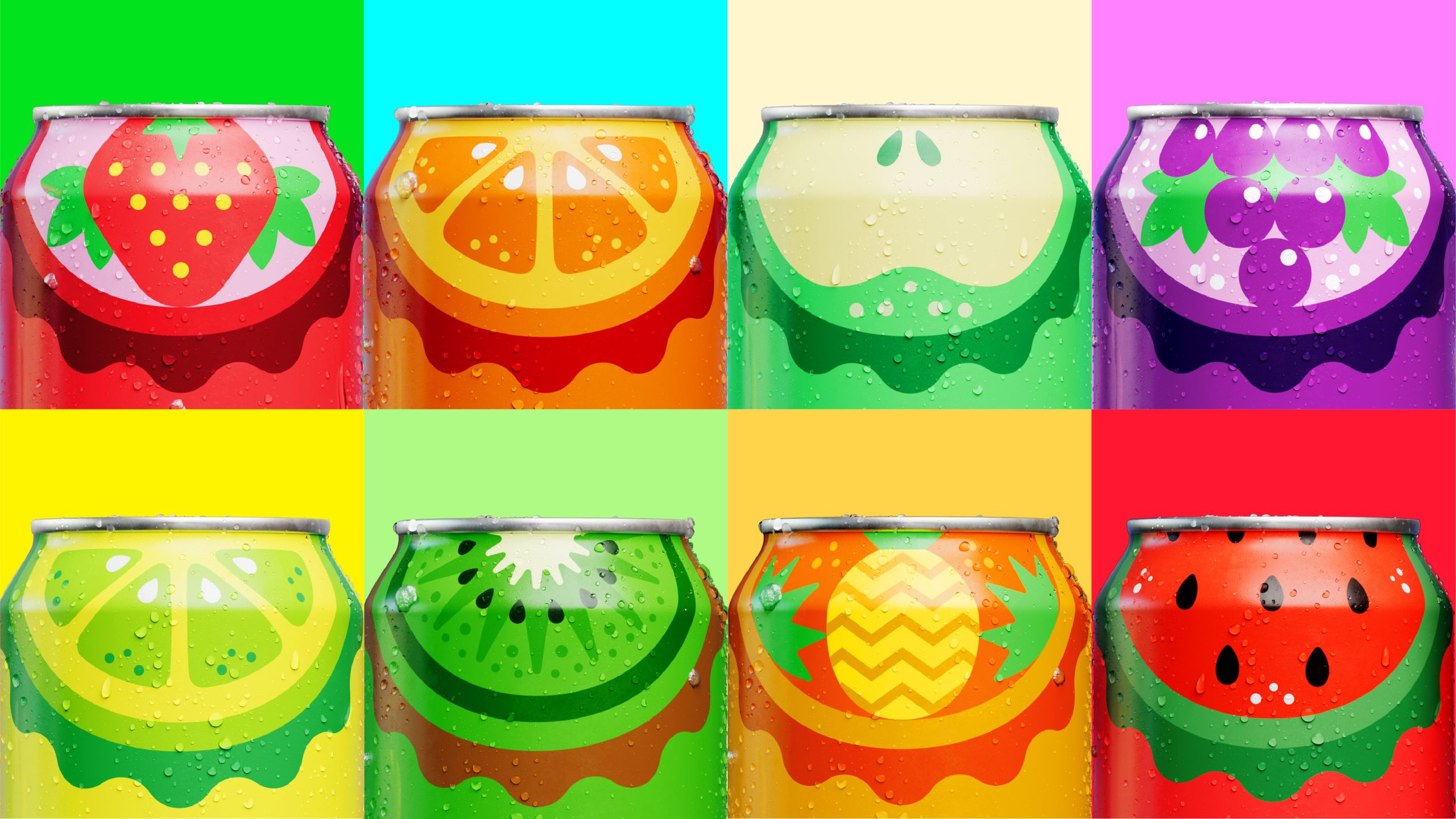
While it's an interesting choice to lean into the word 'seed' when it comes to condoms, I can't deny the visual commitment the brand makes. Each condom variant has an illustration that highlights the fruit's 'seeds' inside. Is it on the nose? Yes. Is it gorgeously designed and something I will personally want to keep in my wallet? Absolutely. The deep greens utilized throughout the brand design give these condoms a sleek, elevated look that is sure to get people excited about condoms. 

Modern society has evolved to be more sex-positive than ever, but the world of condoms has not followed suit. Functional, performative and of a pharmaceutical visual world, condom brands are failing to connect us to the most important driver of sex: desire.

Our big question: How can we take condoms from something you need to have, to something you want to use?

Seed subverts the visual clichés of the condom shelf to embrace the more exciting, emotional and sensual side of intimacy. Protection is implicit; pleasure is key.

Seed condoms are made for every measure of pleasure – and with the environment in mind.

This design idea takes inspiration from fruit, and the way a fruit’s peel keeps its seeds from spreading. Each variant – ribbed, dotted, extra strength – takes the flavour of a fruit whose outer skin is characterised by a similar texture.

Editorial photograph