Morton Salt Refresh Brings Modern Zest To The Brand
by Rudy Sanchez on 10/21/2020 | 2 Minute Read
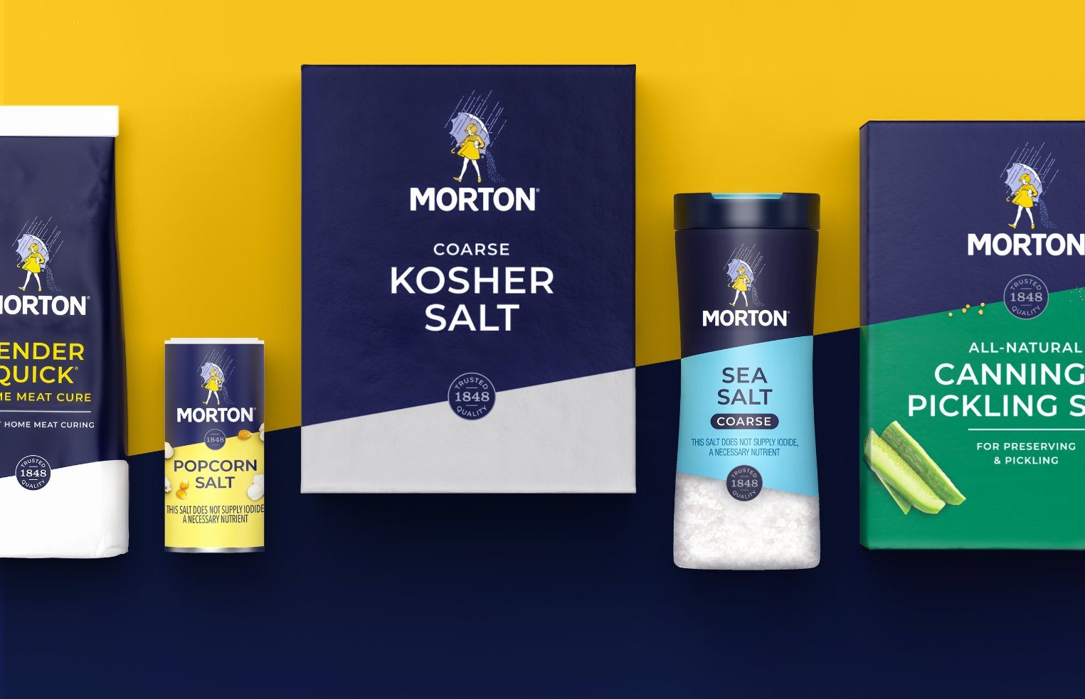
Morton Salt, founded in 1848, became a household staple in America, being the country’s salt bae decades before internet memes became a thing. The grey-blue and white cylinders have become nearly synonymous with the seasoning, but they still haven't managed to make us believe that rain is also salt.
Though instantly recognizable, Morton Salt’s visual identity still needs the occasional refresh to highlight the heritage of the brand. They recently pulled the curtain on their latest redesign, eliciting the services of Chase Design Group to contemporize the salt purveyor's look, aligning Morton's packaging with how consumers shop today.
Gone are the Apple Aqua-inspired elements, replaced with clean, modern lines and color choices. A new design system is introduced, making it easier to distinguish products across Morton’s range. Typography also gets tightened up, opting for an easier-to-read sans-serif type. Keystone visual components, such as the Morton Salt Girl and the signature slate blue, remain. Obviously.
"We successfully combined Morton's iconic brand assets with clean typography and bold graphic shapes to create a design system that celebrates Morton's rich history while feeling relevant to today's consumers," said Chase Design CCO Clark Goolsby in a press release.