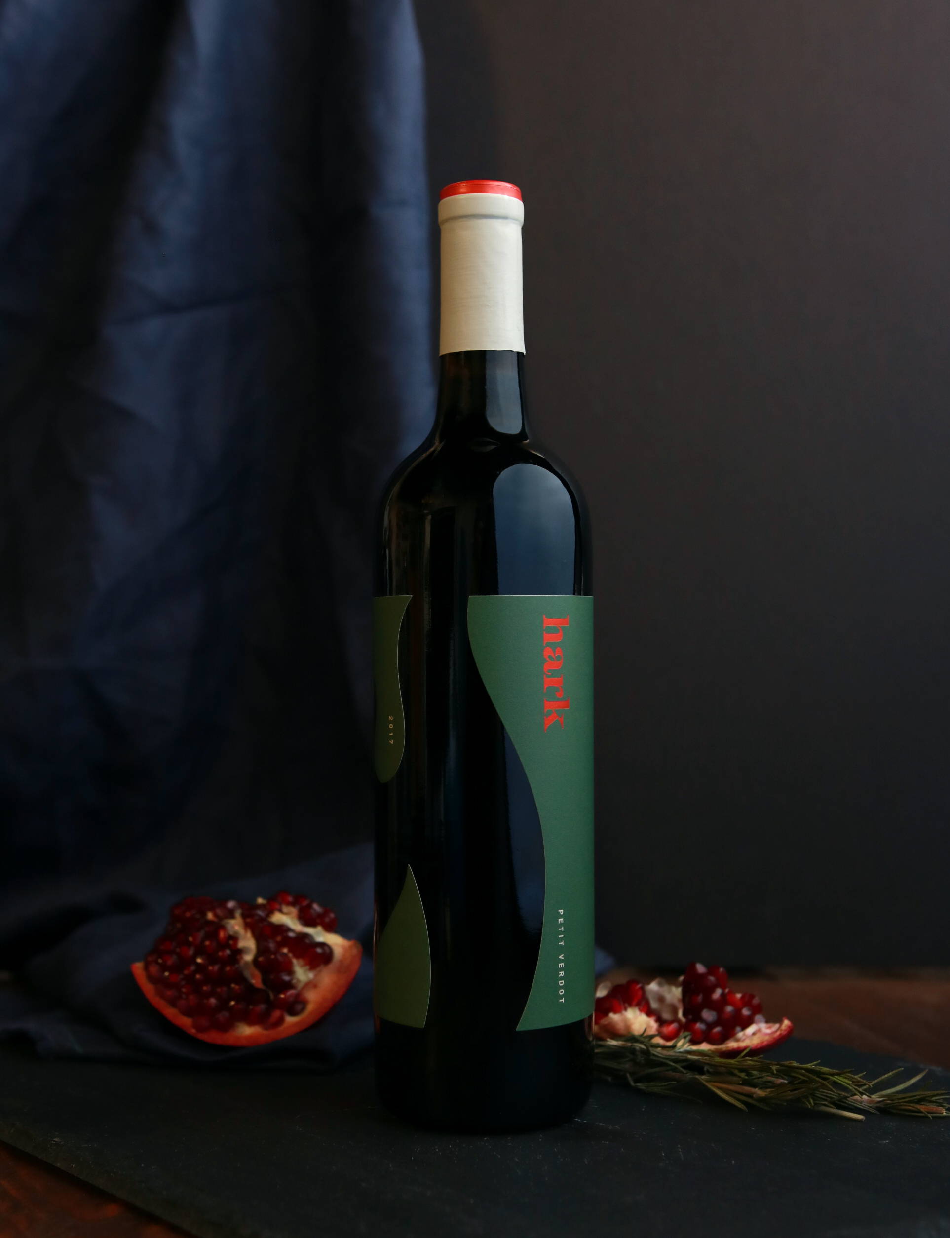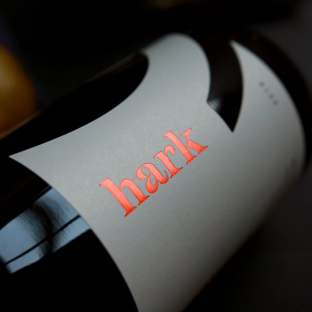
The dream of owning a vineyard, of hosting guests with wine at outdoor fireplaces while surrounded by a beautiful landscape informs the bottle and label design for Hark. The warm colors are punctuated by the burnt orange along the top, and the grey along the neck is inspired by the estate’s architecture.
“As many vineyards do, Hark started as a dream for the owners. Wanting to build a place that was approachable and welcoming, inviting you sit a while with some great wine by their outdoor fireplaces, and within the architecture designed to highlight the mountain vistas, vineyards and bring the outdoors in. Watermark designed a brand celebrating these goals, choosing contemporary typography that would stand out in a more traditional regional market, while also feeling friendly. The Hark label design challenged the accepted and in breaking the rules, shines in its simplicity, warmth and edge. Custom capsules keep a wide range of wines cohesive through a neutral palette and a pop of burnt orange, continuing to evoke the physical location through the branding & package design.”