Monotype Lays Out All Of The Type Trends You Need To Know For 2020

Published

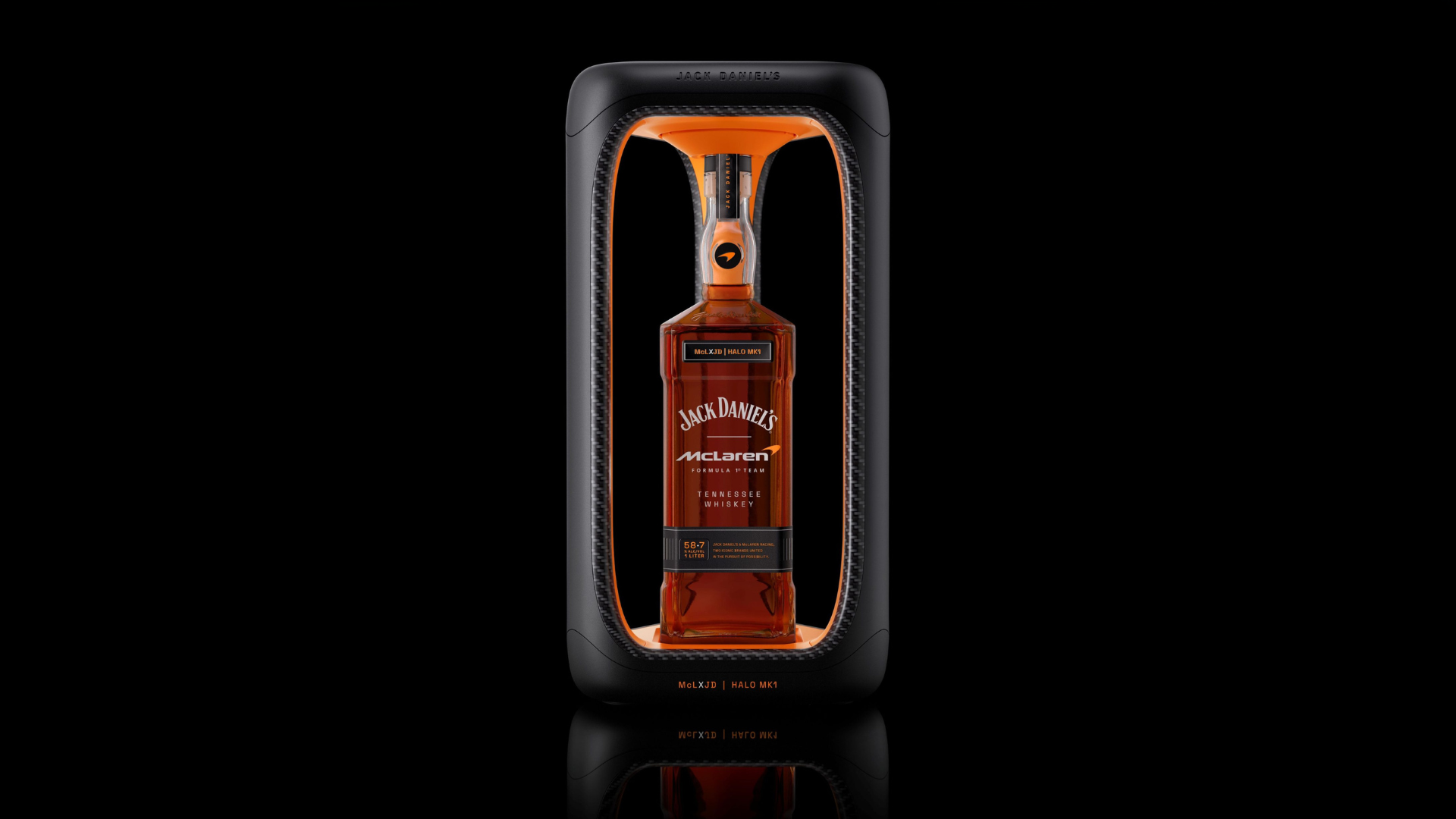
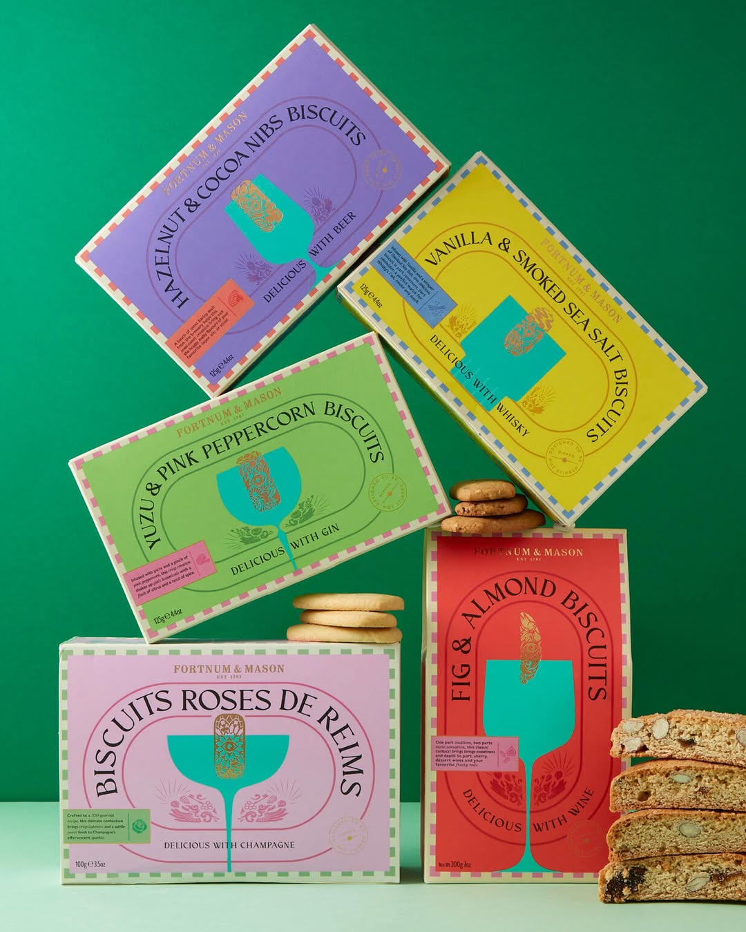
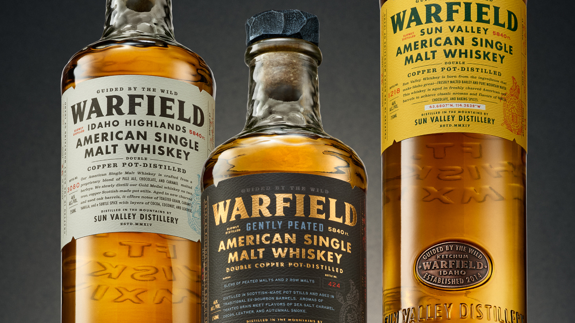
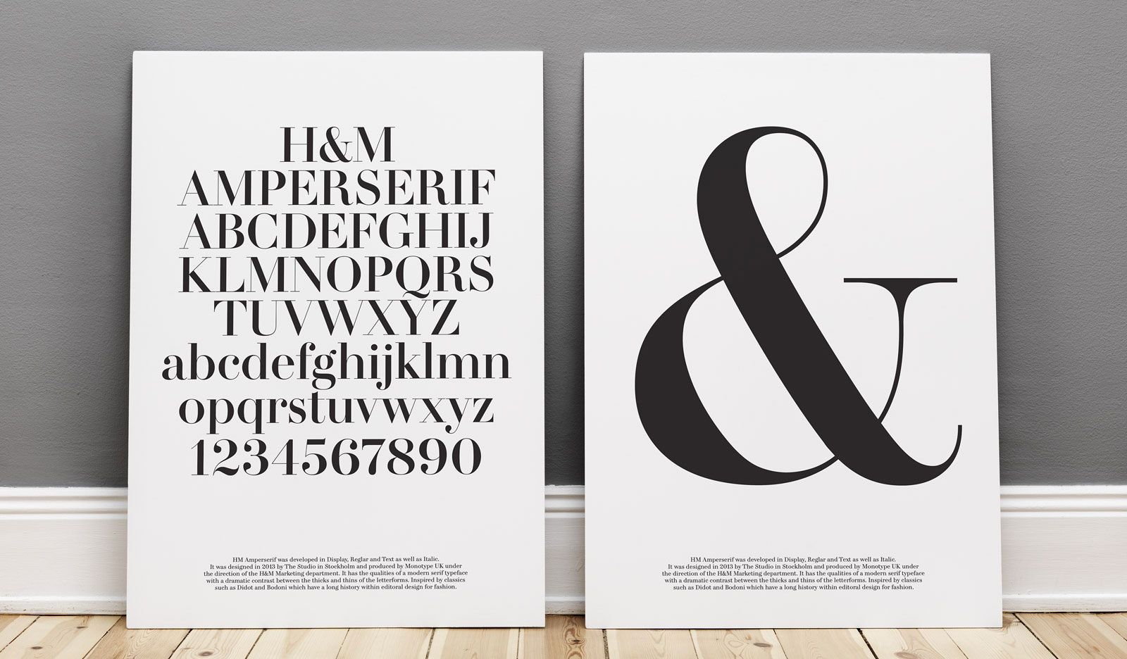
When you see a piece of packaging, type is one of the most important foundational elements of the packaging. Brands with memorable typefaces—the ones you can instantly recognize—are drilled down into our very subconscious, and they can serve as a clear expression of a product’s identity. 

But it’s also an element that can bring harmony to the voice of any given product when coupled with the other assets of a design, whether it’s an illustration, logo, pattern, or even a wild color. 

Late last year, Monotype released a report on the type trends we’d see in 2020, saying that, “typefaces can deliver a clear, consistent, and identifiable voice wherever they appear. The individual shapes of letters imprint themselves on us, working as an immediate cue. Consumers might not be able to explain what a brand’s typeface looks like, but they’ll know it when they see it.”

Here are the five trends Monotype defined for the coming year.

Editorial photograph

The Need For Global Language Coverage

If you’re a mom and pop business, likely you don’t have to worry about this. But a global brand? Well, you have to worry about this. 

Your brand can live in several markets, and while the English language might be the great unifier, that’s not going to fly in a global economy. You can’t just slap your brand’s identity on a piece of packaging in Mandarin and call it a day, you need to have a type that can represent your brand across multiple languages. Now, you can pair some types together in hopes of achieving some harmony, or you could spend some coin developing something more global. 

This is why Monotype developed the Neue Frutiger World typeface alongside Akira Kobyashi, as it covers over 150 languages and scripts, including Arabic and Vietnamese, as brands need to be sensitive to the stylistic and cultural nods of any given country.

Editorial photograph

The Rise Of Variable Fonts

Last year, Monotype surveyed purchasing habits, and they found that 24% were confident that variable fonts would change future usage and how they’re made; 39% didn’t even really know what that meant.

So what are they?

It’s “a single font that acts as many,” and according to Monotype, variable fonts are going to be huge in the coming decade. That’s because instead of digging around through multiple files, all of your data is in one place, and this single font has all of the possible widths and weights you would need, promising more flexibility and ease of use.

Editorial photograph

Emphasis On Geometric Sans Serifs

Ah, yes, the geometric san serif, aka, the most-entrusted font for building trust in the world of tech. Spoiler alert—they’re not going away any time soon.

And for a good reason. If you’re building out the branding for a start-up, having a wordmark that’s clean and legible inspires confidence when you’re trying to entice a consumer or client. They’re safe and non-divisive, and they have an air of class and professionalism in tow. As we noted in our 2019 Trend Report, proprietary fonts were all the rage (hello, Dunkin’ and Netflix), and the geometric serifs were the clear beneficiary. Even Starbucks got in on the action this past year with Sodo Sans, and by the end of this year, every major brand will probably have their BRAND NAME + SANS.

Editorial photograph

Type As Icon: Inline and Engraving

Most global brands have leaned in so far on geometric sans fonts that they’re starting to look like 45 at an impromptu press conference. That’s why anything that doesn’t look like a Netflix or Airbnb can feel like a breath of fresh air—yes, they’re clean, but also, yawn? It’s sort of like picking Classic Blue as your color of the year.

Monotype says that this new decade will see the return of inline fonts and hyper-decorative styles, meaning lots of mustache-twirling and calligraphy (at least, that’s how we sort of envision it). 

Look, minimalism will never die and don’t believe any rend report that says as much, but it is OK to, you know, actually design every now and again.

Editorial photograph

A.B.R. Always Be Rebranding

Remember how we talked about flexible logo systems in our Trend Report?

To be a brand strategist in 2020 means that you are always looking ahead, and the next rebrand is just right around the corner.

“Customers are in more places than ever, from geography to the device or surface they’re using,” said Monotype Senior Director of Creative James Fooks-Bale Fooks-Bale. “And by the time you think you have things set, a new device, platform, or form of content creation has been added to the pile.”

Your logo, just like the type your brand might utilize, needs to be adaptable across a wide range of platforms where that brand lives. Yes, unify what your brand’s identity is, but give it the space to evolve naturally.

Go here to learn more about Monotype’s 2020 Trends In Type report.

This placeholder is removed when the ad slot is configured.

This placeholder is removed when the ad slot is configured.

This placeholder is removed when the ad slot is configured.

This placeholder is removed when the ad slot is configured.

This placeholder is removed when the ad slot is configured.

This placeholder is removed when the ad slot is configured.