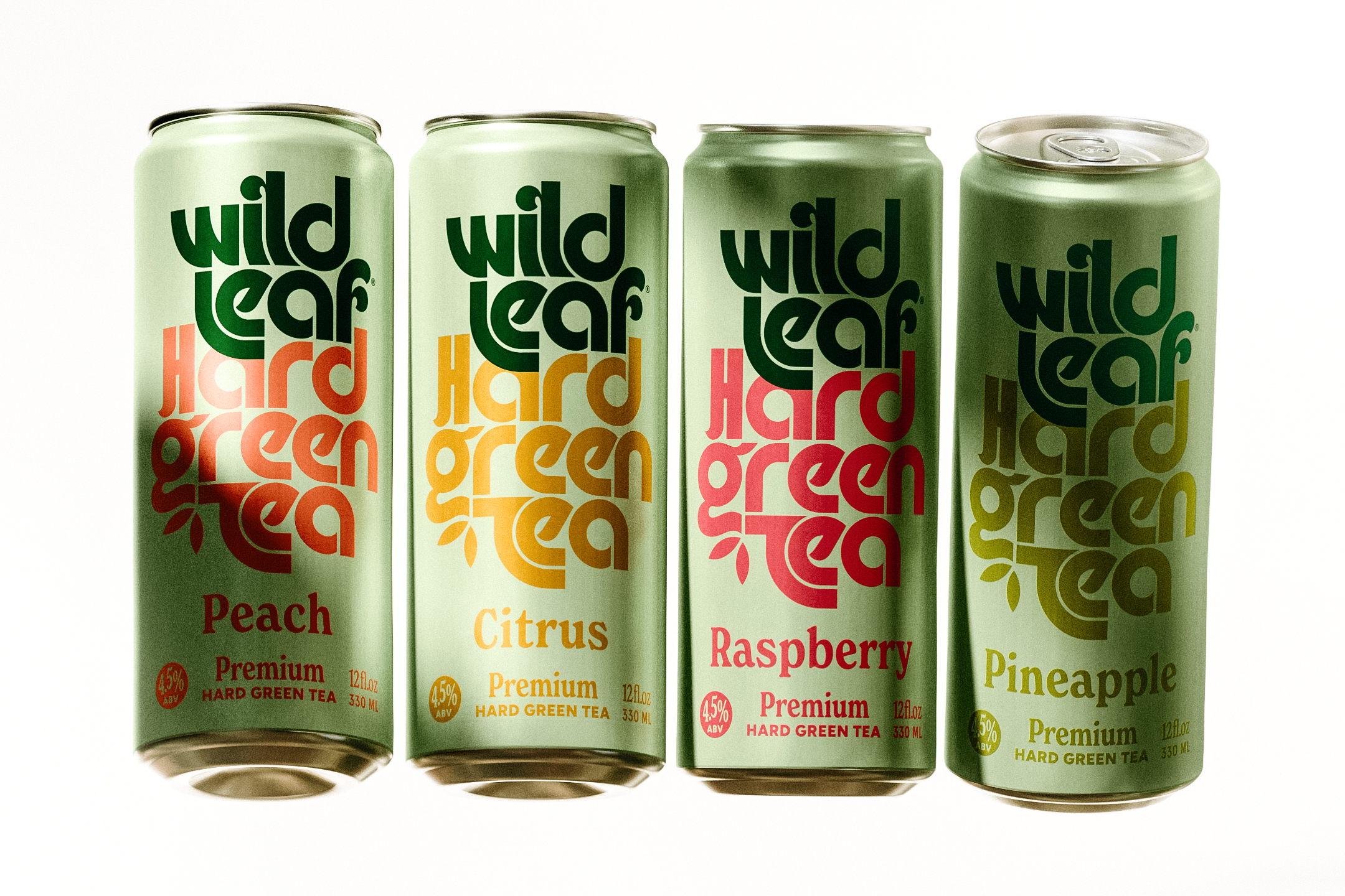
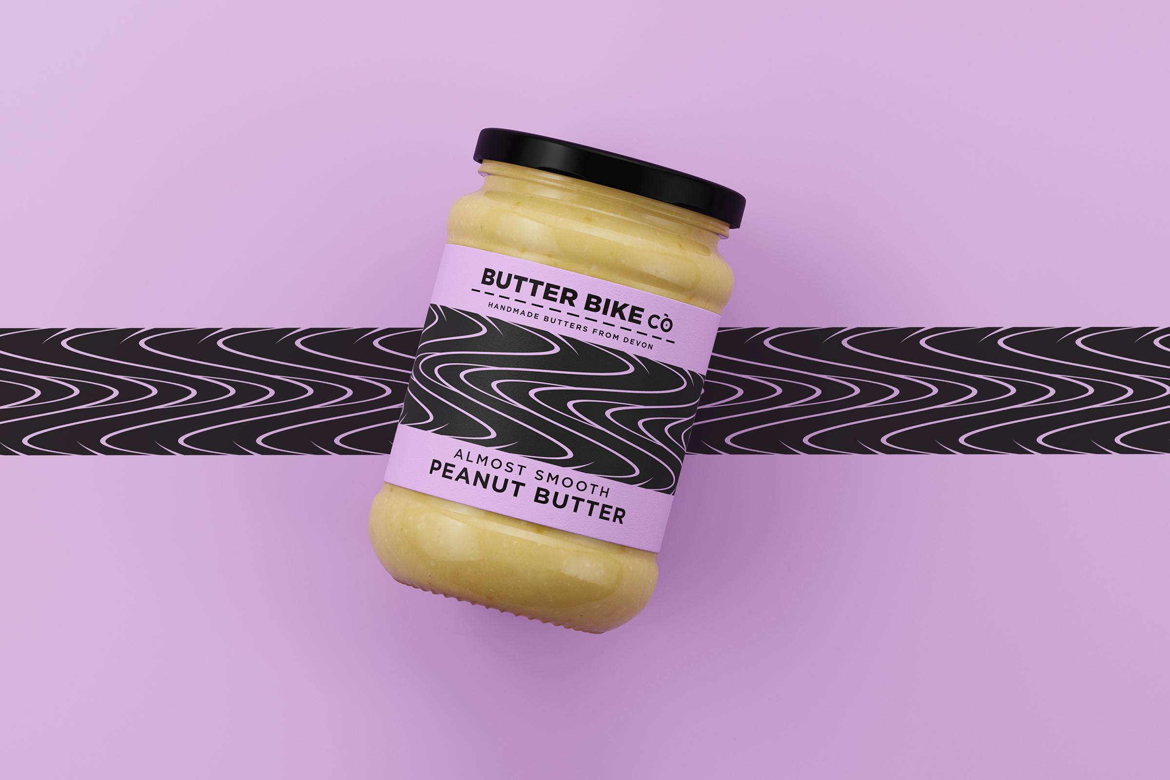
Butter Bike Co’s packaging is just as creative and colorful as their flavors. The varying tread marks on each label are also a great touch and help create a unique look to provide differentiation within the market.
By
Published
Filed under
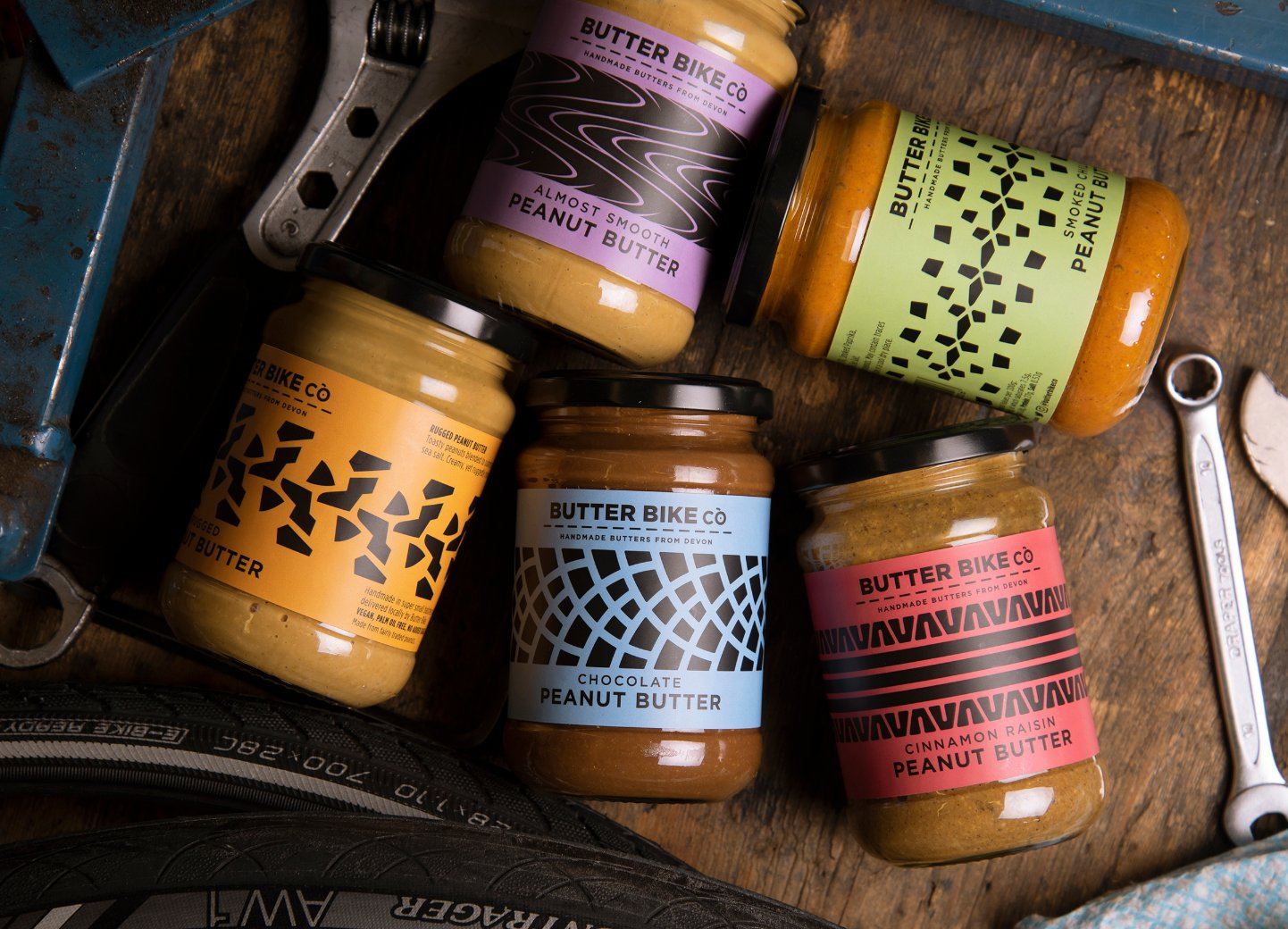
Butter Bike Co’s packaging is just as creative and colorful as their flavors. The varying tread marks on each label are also a great touch and help create a unique look to provide differentiation within the market.
Get unlimited access to latest industry news, 27,000+ articles and case studies.
Have an account? Sign in