We Love North Rice Farm's Beautiful Illustrations
by Casha Doemland on 02/18/2019 | 3 Minute Read
When it comes to buying rice, you might find yourself at the grocery store looking at shelf upon shelf of similarly packaged items, just varying in grain style and type. North Rice Farm chose to break the mold and commissioned designer Meng Zhang to produce packaging that conveyed the concept of zen and love.
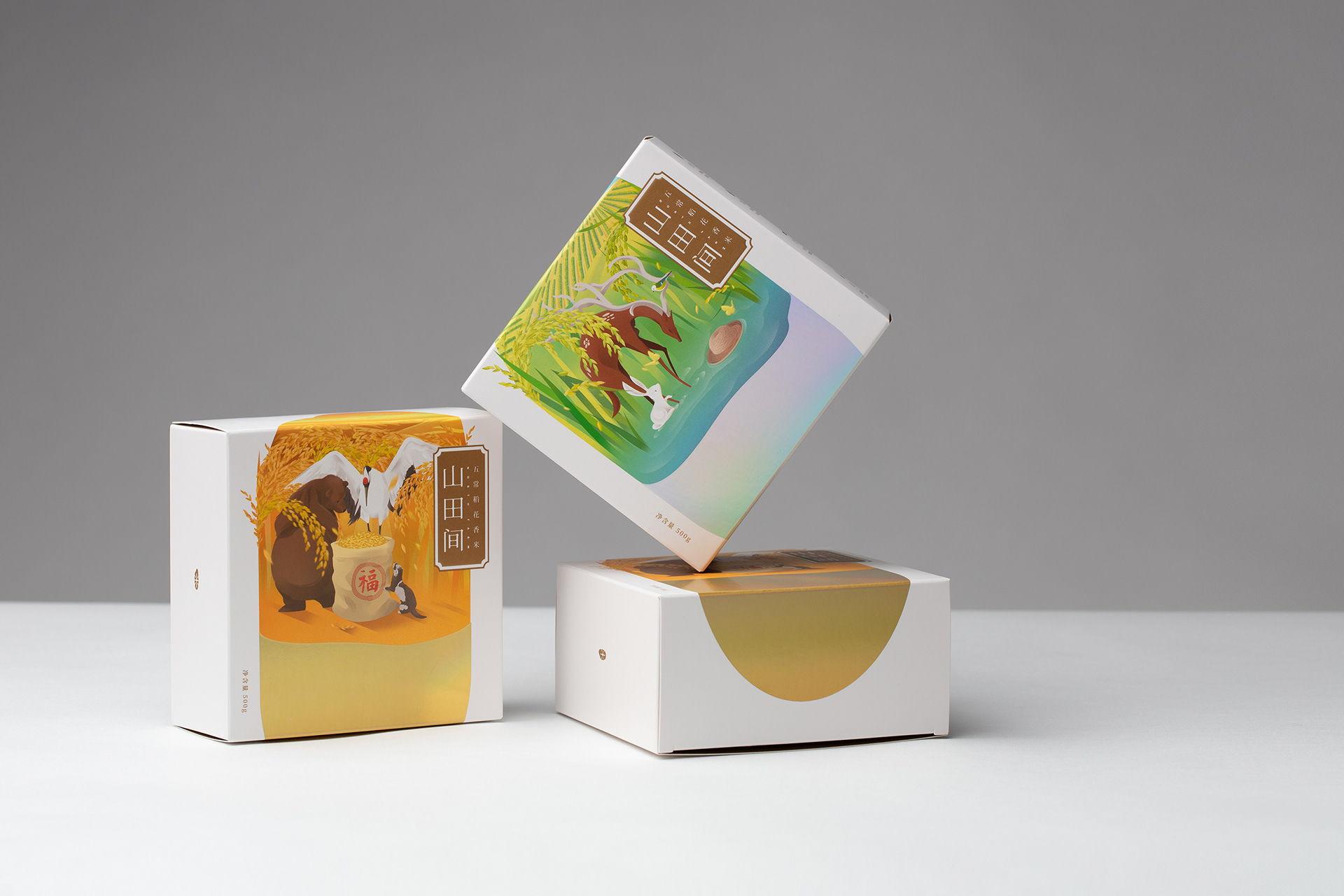
He did that and more as he single-handedly elevated the packaging by illustrating two beautiful stories through the theme of fauna. As he believes everything is in the details, he created two scenes. One displays a deer with a bird on its horn and a rabbit by its side during the summer, while the other depicts a brown bear and an otter in a grain field during autumn.
To find out more about the inspiration and delivery of the final product, we spoke to Zhang about his elegant watercolor illustrations.
What's the story behind both of the designs?
One represents summer, the time for cultivation, and the other one represents autumn, the time for harvest. The two packages combined were designed to convey a sense of narrative.
The main reason for choosing these two themes is because the harvest of Wuchang rice only happens once a year. In the process of rice growth, late spring/summer and autumn are the two most important growth stages. During that period, it has the best climatic environment and a sufficient water source.
I believe it's a more subtle and smarter way to deliver the intended message to the customers by using different facial expressions and postures of the native seasonal animals.
Why did you opt for the exterior box to be minimalistic, while the interior boxes come to life with color?
The decision to keep the exterior box minimalistic and the interior boxes filled with color stems from the concept that each grain of rice has its own story to tell.
Therefore, the exterior box focuses on illustrating the shape and color of a single grain, allowing potential customers to ascertain what it is that we are selling quickly. When they open the box, they will be greeted by the stories a single grain has to offer.
Moreover, I was hoping to achieve a sense of contrast in how the use of colors and the detailed illustrations are being used between the exterior and the interior.
How did you tell North Rice Farm’s brand story through the packaging?
North Farm Rice's brand story is "Life Is In The Details," and the target consumers are those who pursue quality over quantity.
I believe a good packaging design should be simple but detailed. It needs to speak to the right audience. Just like books, which are often judged by their covers, products are frequently judged by their packaging.
Effective packaging design should be a reflection of the product itself and should be a representation of the heart and soul of the business – consistent with the tone, the voice and the values across the business branding.