Featured image for Sparq Wants You To Inhale Your Vitamins

Sparq Wants You To Inhale Your Vitamins

by Gili Malinsky on 12/03/2019 | 3 Minute Read

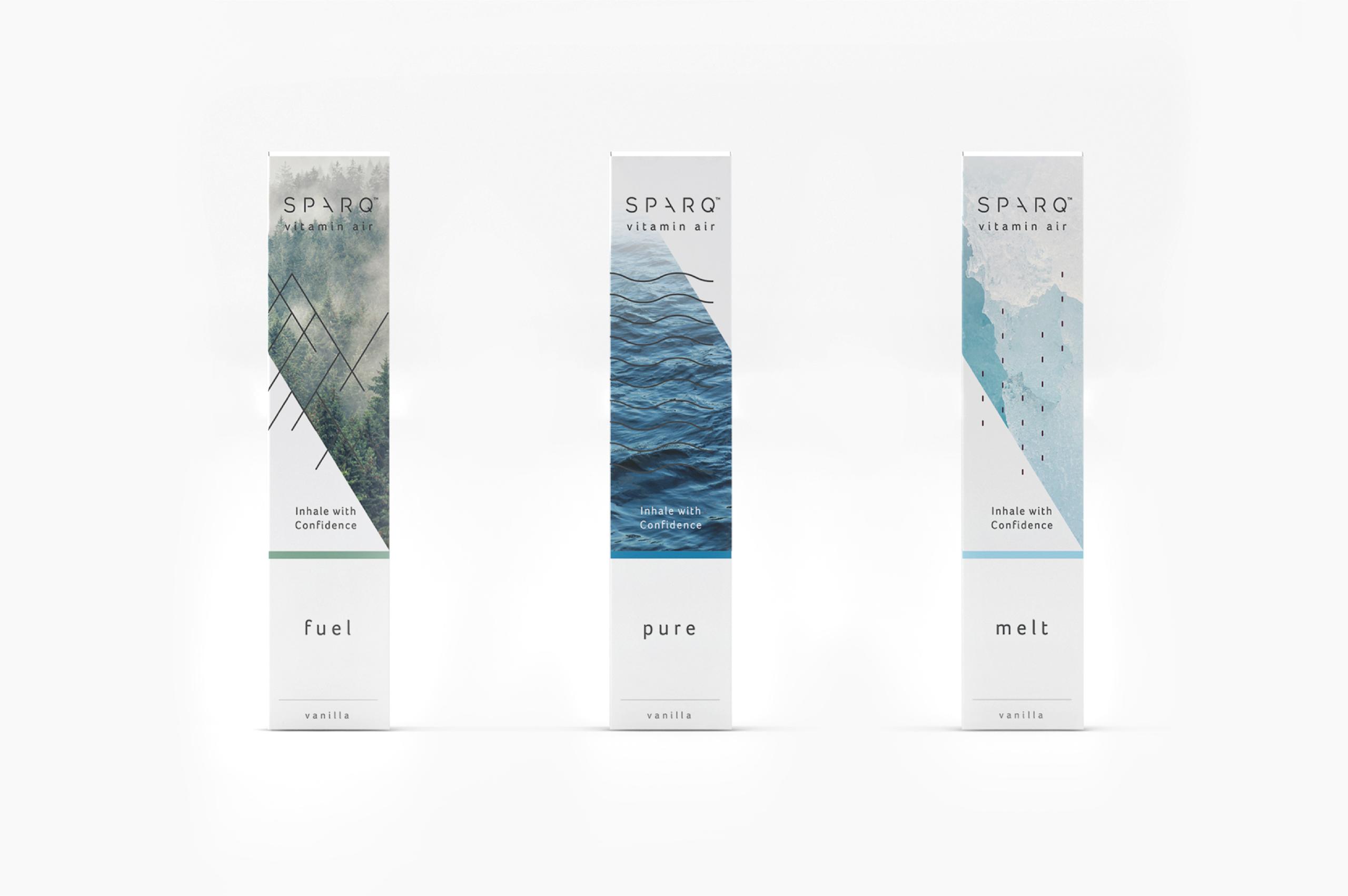
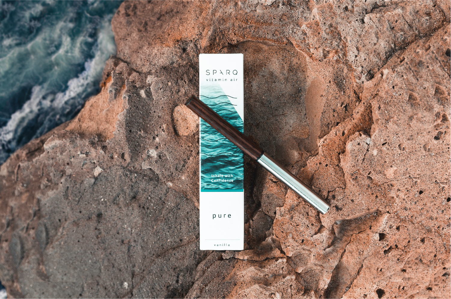
These days, vaping is regularly in the news. Though much of its press has been negative, one company’s trying to overcome e-cigarettes’ cultural stigma and redefine inhaling. New York-based SPARQ created a series of inhalers, called Vitamin Air, free of “nicotine and harmful chemicals,” according to its website, and, instead, filled with vitamins and herbs users absorb through their lungs. 

A product so bold called for stand-out branding, and longtime brand guru Squat New York was up for the challenge. The creative agency, founded by husband and wife duo Shiri and Itamar Kornowski, met with SPARQ’s founders to learn their vision to its core, and built an immersive, moving, and comprehensive brand strategy that would give customers a one-of-a-kind experience and let them create a bond with the product. This included every element of building the brand’s voice, from giving SPARQ’s products their simple yet captivating names to taking risks in their surprising and delightful packaging to directing a powerful video introducing Vitamin Air to the public.

Editorial photograph

“For us,” says Squat creative director Itamar Kornowski, “the most important thing is the customer’s experience. We imagine every step of the process—from the moment they see it on the website to the moment they get their SPARQ package in the mail to the moment they get to try the product for the first time.”

Editorial photograph

In envisioning the purpose of each of the brand's three inhalers, Squat honed in on the visual motif of nature, breathtaking landscapes greeting customers whether they log onto SPARQ’s website or hold the inhalers’ beautiful packages in their hands. They coupled the visuals with short, evocative names, the linguistic kick that gives people an immediate sense of what you use each Vitamin Air for. The energy-enhancing inhaler Fuel gets represented by misty forests while anti-aging inhaler Pure finds representation in infinite, blue ocean waves. Lastly, they portrayed metabolism-boosting inhaler Melt with stunning, immense ice caps. 

Editorial photograph

The packaging features the perfect balance of copy and visuals, creating a singular experience. Instead of opening the top of each container like a typical box and pulling out the inhaler, users unravel the box piece by piece from where magnets hold it together; you'll then find the inhaler embedded in a Kinetic art-like structure. Completely undone, the container looks like a sheet with multiple protruding triangles. Looking at them from one side, users will see a series of lines such as SPARQ’s tagline, “Nature In, Nurture Out.” Looking at it from the other, users will see the image representing that particular inhaler coming together across the surfaces. 

At the heart of the entirety of SPARQ’s brand language, Squat used the golden ratio, a unique mathematical relationship that shows up frequently in nature. 

Editorial photograph

“The shape of this pattern was applied to everything from the logo to the packaging designs,” writes Squat on its website. “With clean, geometrical shapes and a palette of neutral colors, the brand takes on an equally modern and rustic feel.”

Squat even helped SPARQ pick the inhalers’ recyclable materials. Customers use a bag they receive with their purchase and a return label available on the company’s website to send back four inhalers at a time.

Since its launch, Squat’s brand design has helped SPARQ create a buzz both in the media and VC worlds, with multiple investors taking a keen interest and the company looking ahead to its future products. And Squat will be ready.