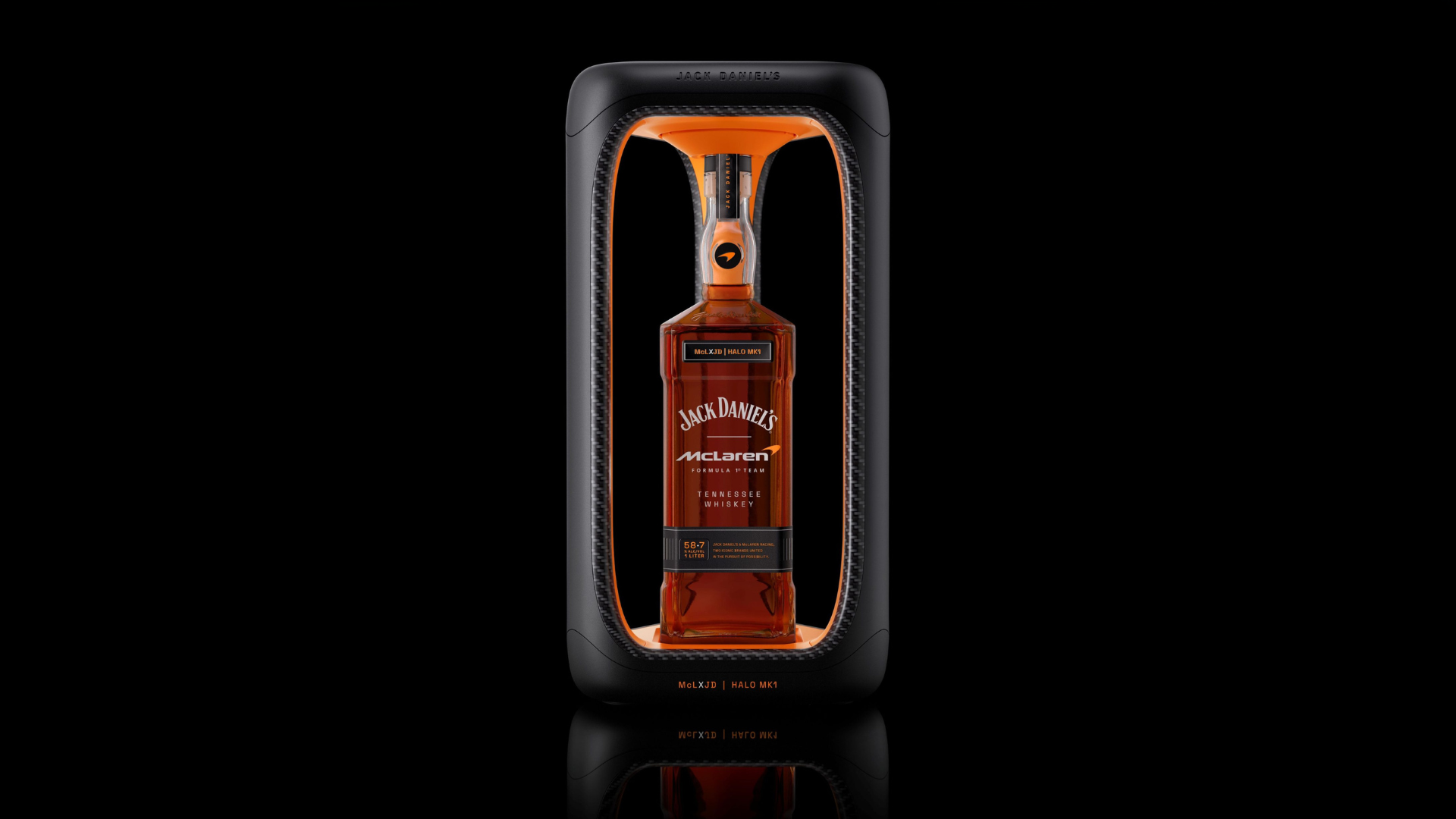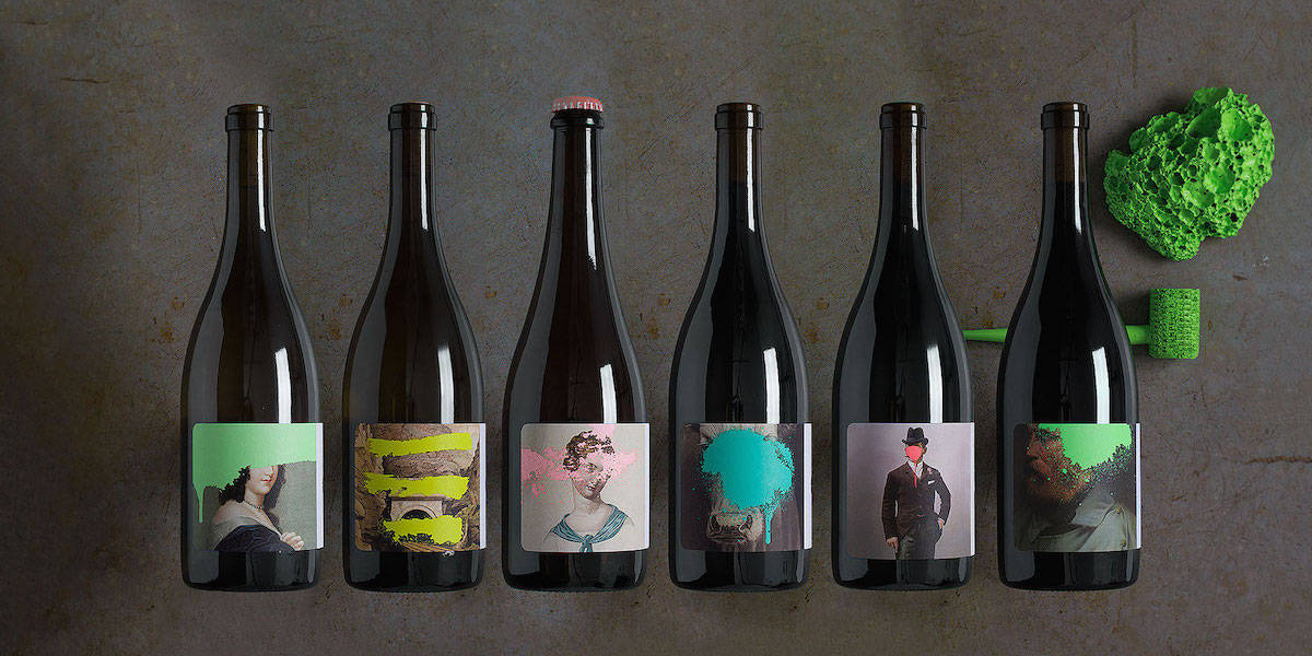
Just like graffiti is an edgy form of artistic expression, these bottles for Cruse Wine Co. are adventurous and new. Designed by Force & Form, the wines combine classical works with splashes of bright colors, giving off a fresh, youthful attitude.
“With the growing popularity of boutique wines, it has become increasingly important for small producers to embrace packaging that is expressive, intriguing and atypical. To do so, we drew inspiration from the Cruse Wine Company’s maverick attitude by contrasting tradition with irreverence. As winemaker Michael Cruse puts it, that juxtaposition reflects his goal to ‘return to California roots and California classics…but doing it in a modern way.’”
Cruse Wine Co. allows the images to do the talking, leaving off text from the front of the label. On the back, the winery name and wine description are found, written in a traditional-looking font. The combination of classical elements and graffiti-inspired paint is a rebellious take on normal wines, resonating with those who want to step away from the typical.