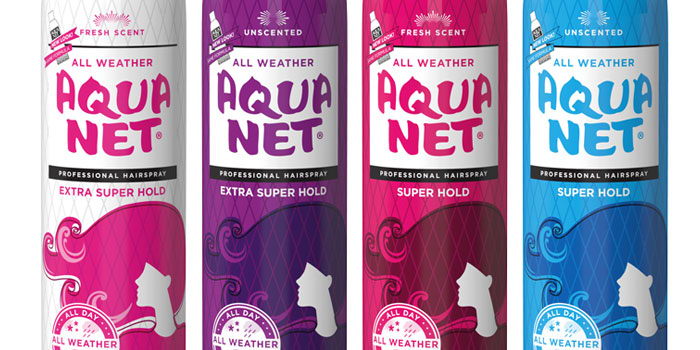
“As often happens to older, beloved brands, Aqua Net changed owners multiple times and the brand went through an evolution; a simplified, diluted logo and weaker brand impression. After Lornamead, Inc. acquired the brand from Unilever in 2006, the company looked for opportunities to reinvigorate the brand. “The package had lost its personality with its previous owners,” said Randy Sloan, President of Lornamead. So last year, Randy and the Lornamead team decided it was time for a makeover and called in Terri Goldstein and The Goldstein Group. The team of strategists and designers had a firm mandate: “Make the brand relevant and exciting once again, but don’t lose one current consumer!”