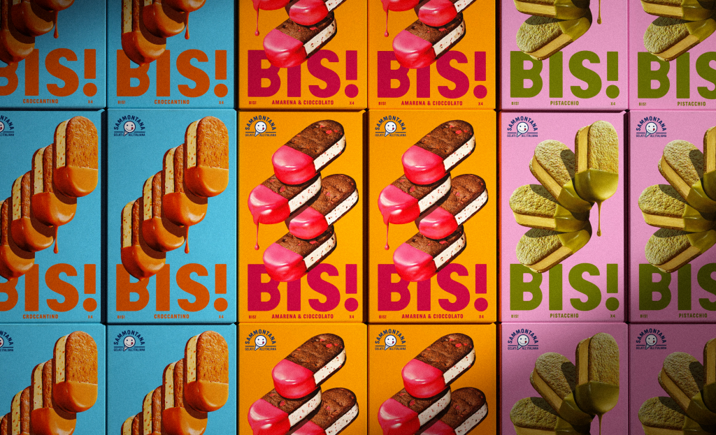
Sammontana’s new BIS! ice cream sandwiches are presented in bold, theatrical packaging that captures the brand’s playful spirit, turning every product into a show-stopping experience. The vibrant design, created by the dynamic team at Auge Design led by Davide Mosconi, uses poster-like graphics to make this unique dessert impossible to miss.
“With over 70 years of history in ice cream making, Sammontana is the Italians’ favorite industrial ice cream and frozen goods brand. The Group operates in 5 production sites around the country and counts over 1000 employees. Sammontana indubitably means Italian Summer.
– Auge Design
With its colorful and unconventional design, this gelato is a show-stopper, and the packaging serves as its stage.
From the naming onward, the whole identity plays around the concept of a sensational spectacle.
The stars are three poster-like, choreographic, hyper-realistic compositions featuring the four ice cream sandwiches contained in each pack. The BOP is designed to resemble itself the poster of a play, announcing each gelato and its flavors in a unique language that evokes the idea of an extraordinary performance coming on stage.
Bis! is so surprising and delicious that once you taste it, you can only say: Bravo! Encore! Bis!”