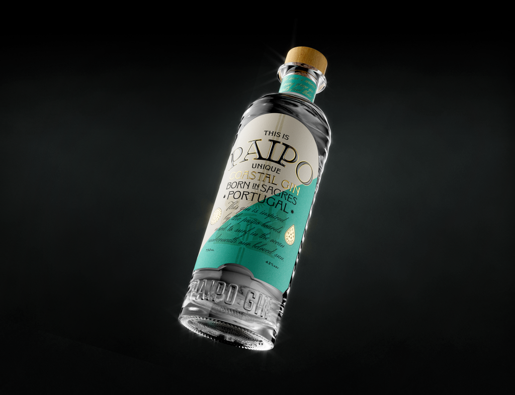
Paipo Gin’s Shiny, Wavy Bottle Design is a Feast for the Senses
By
Published
Filed under
By
Published
Filed under
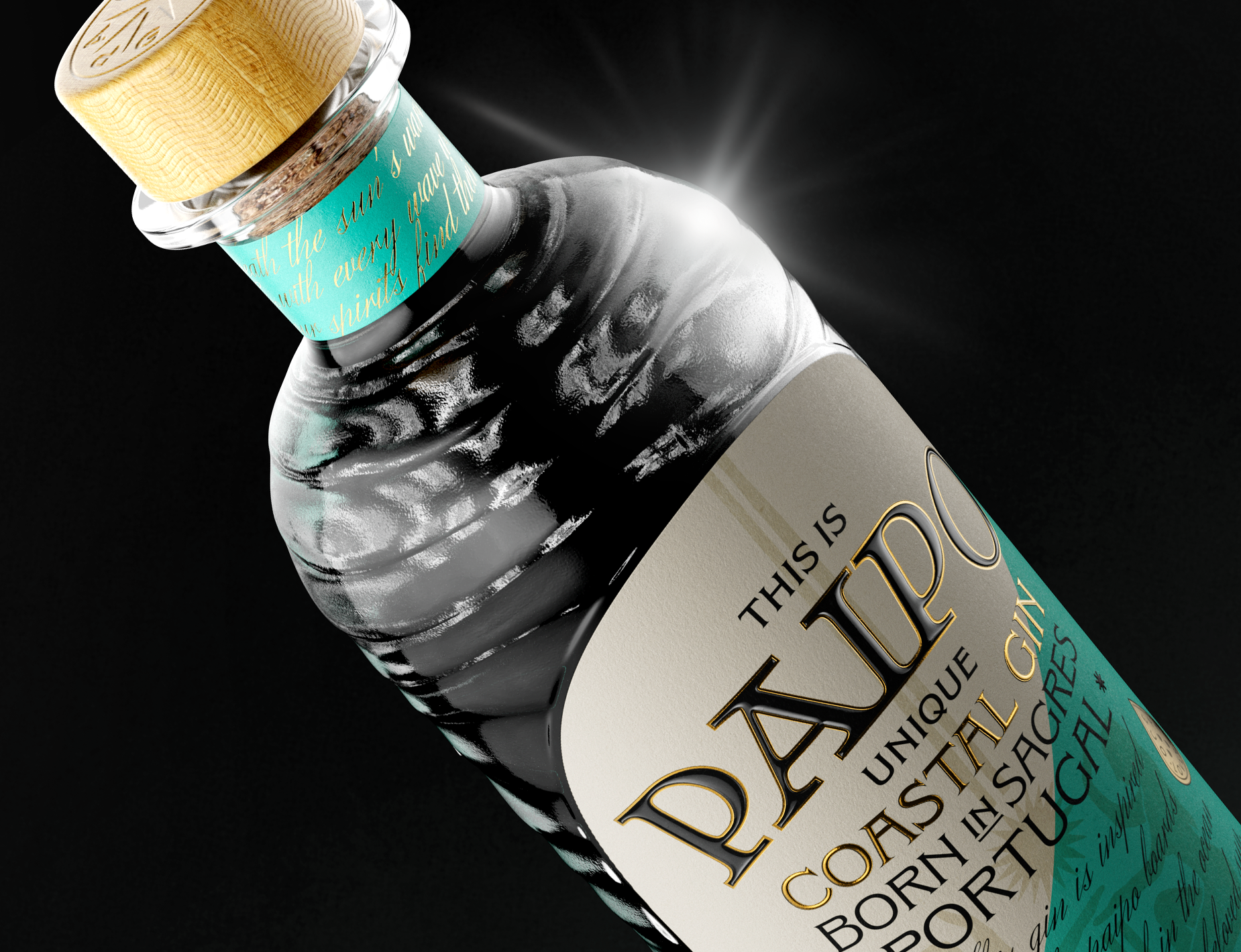
While we’re obviously all about packaging that looks great, tactile appeal is an underrated part of what makes an object special. Sometimes, the texture of a box, pouch, or bottle just looks such a way that you just know it’d be fun to touch.
Jacomy & Mayne Studio’s design for Paipo Gin obviously looks great, with an aquatic duochrome palette, a ghostly illustration of beach revelers, and tons of shiny gold details. But a portion of the text is also embossed on what looks like high-quality paper, affixed to an impressive bottle and cork engraved with cool wave details. Hard not to imagine those wouldn’t feel good in your hand after a few gin and tonics!
Get unlimited access to latest industry news, 27,000+ articles and case studies.
Have an account? Sign in