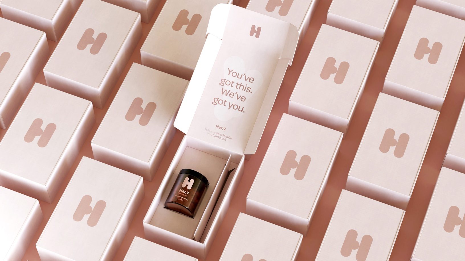
Pearlfisher is helping to redefine the dated motherhood category of brand identities through the branding and packaging for Her.9, an innovative direct-to-consumer pregnancy care brand. The packaging and branding system embraces mother’s needs and is sustained throughout and after their pregnancies.
The identity system is built from symbols representing both pregnant women’s bodies and the unique shape of the vitamins themselves. Moreover, the color palette embraces muted tones, inspired by the diversity of skin tones, vastly distinctive from Her. 9’s competitors.
Her.9 is examining the long-standing brand leaders of pregnancy nutrition that has a largely one-dimensional focus on the physical wellbeing of the baby. Instead, this brand is leaning into the mother’s lens, which is exactly what the market was in dire need of.