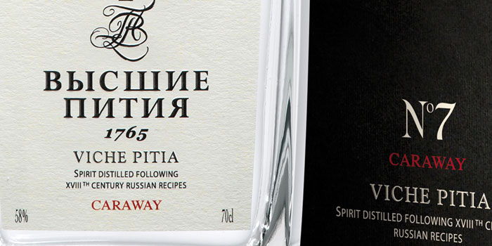
“The brand stages a long awaited return of precious 18th century Russian aperitifs. The identity is expressive of an exceptional artisanal quality, traditional values and aristocratic Russian heritage. A minimalist design suggests purity and refinement while delivering modern appeal. The bottle silhouette is inspired from authentic Russian decanters. Custom typography plays on a contrast of bold and masculine character with the elaborate, aristocratic signature and crown logo of Viche Pitia. The concept and final product was launched to trade, generating great interest at Vinexpo 2011.”