THIS IS IT! DIELINE Awards 2026 Late Entry Deadline Ends Feb 28
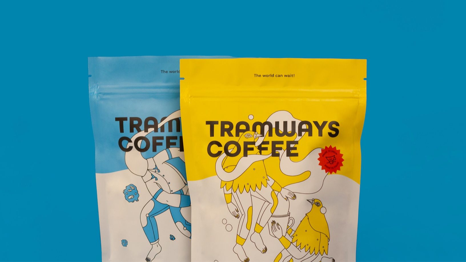
Coffee has the innate ability to lean into an elitist perspective. Not because coffee is too good for anyone but because the richness of the beverage lends itself to a sophisticated space. Yet, Studio Ping Pong created the packaging for Tramways that reflects a more playful nature. The bright colors and quirky illustrations collide, forming a packaging design highlighting a more slowed-down approach and enjoying life as it unfolds.

Tramways is a speciality coffee brand in India that is out to change the perception of craft coffee as prescriptive and intimidating. Founded by firm believers of coffee being savoured however ones likes, Tramways is a line of transportive coffees that lets people enjoy coffee at their own pace. The visuals were created to echo the experience of savouring a cup of coffee inspired by the brand’s tagline of “pause to brew, brew to pause.” A two-colour approach was used, with the paper’s base providing the third colour. The two brand colours, yellow and blue symbolise the colours often seen in Calcutta trams, the namesake and the origin city of the brand. Rather than going into the origin and complex flavours, the world of craft coffee was simplified by focussing on the outer coffee wheel of 9 major flavours- citrus, smoky, nutty etc.
Get unlimited access to latest industry news, 27,000+ articles and case studies.
Have an account? Sign in