Despite centering its theme around rugged nature, Tooth and Nail’s packaging, designed by Studio Ethur Ethur, is quite decadent. The intricate border around the label paired with rich typography and stunning illustrations is a recipe for success. Of course, finding a balance between rugged and delicate isn’t simple, but this packaging cracked the code.
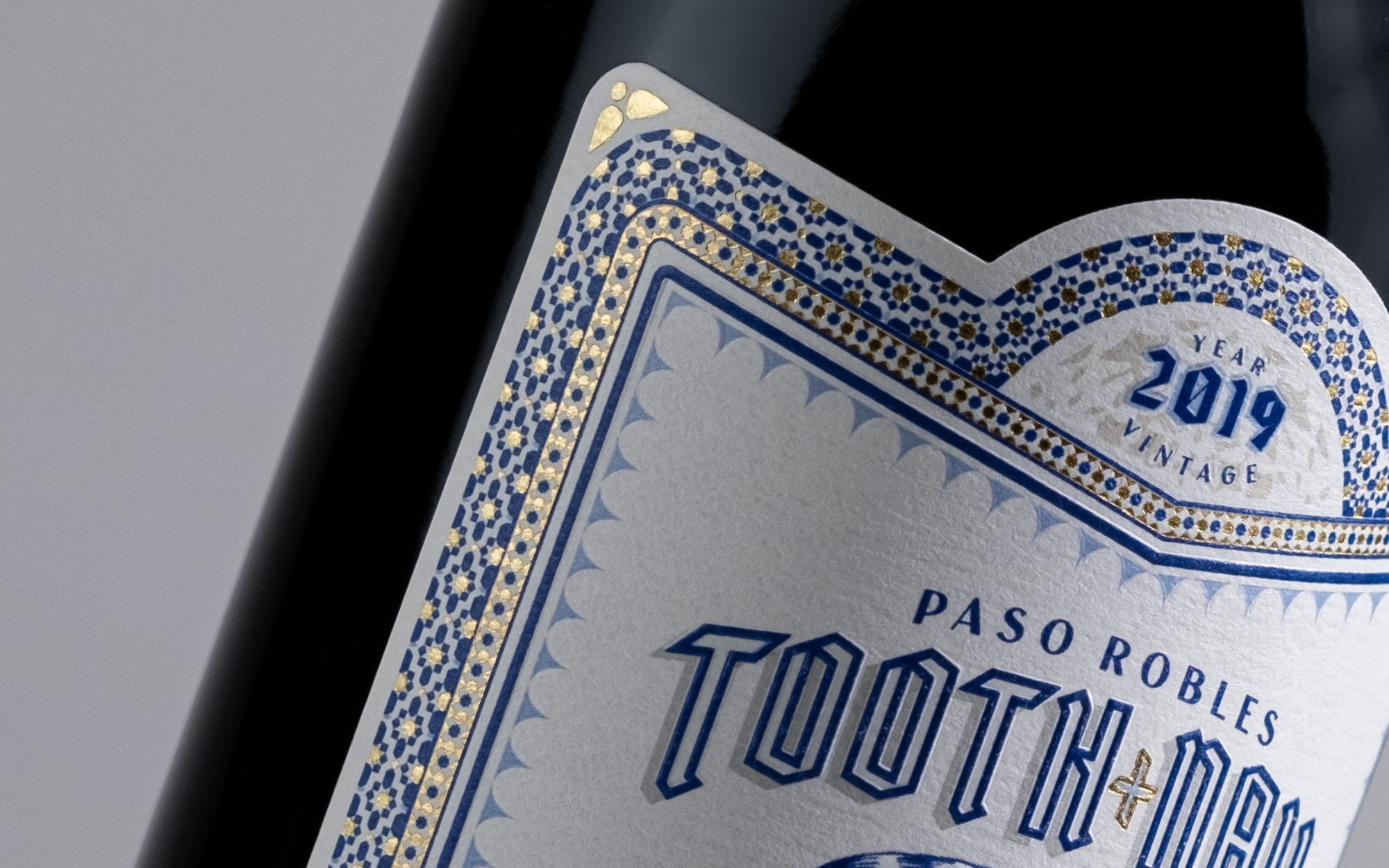
Studio Ethur Ethur was tasked with the creation of a completely new style of bottle label. A dark, daring and decadent series of red blends, Studio Ethur Ethur reimagined the great J.J. Audubon’s wildlife illustrations into an all-new series of serious wine for everyday pleasure. Themes of rugged nature, and stark beauty stemming from fighting for one’s survival are illustrated throughout this series channeling JJ Audubon’s original paintings with a stylized interpretation of the 18th Century iconic wildlife artist.