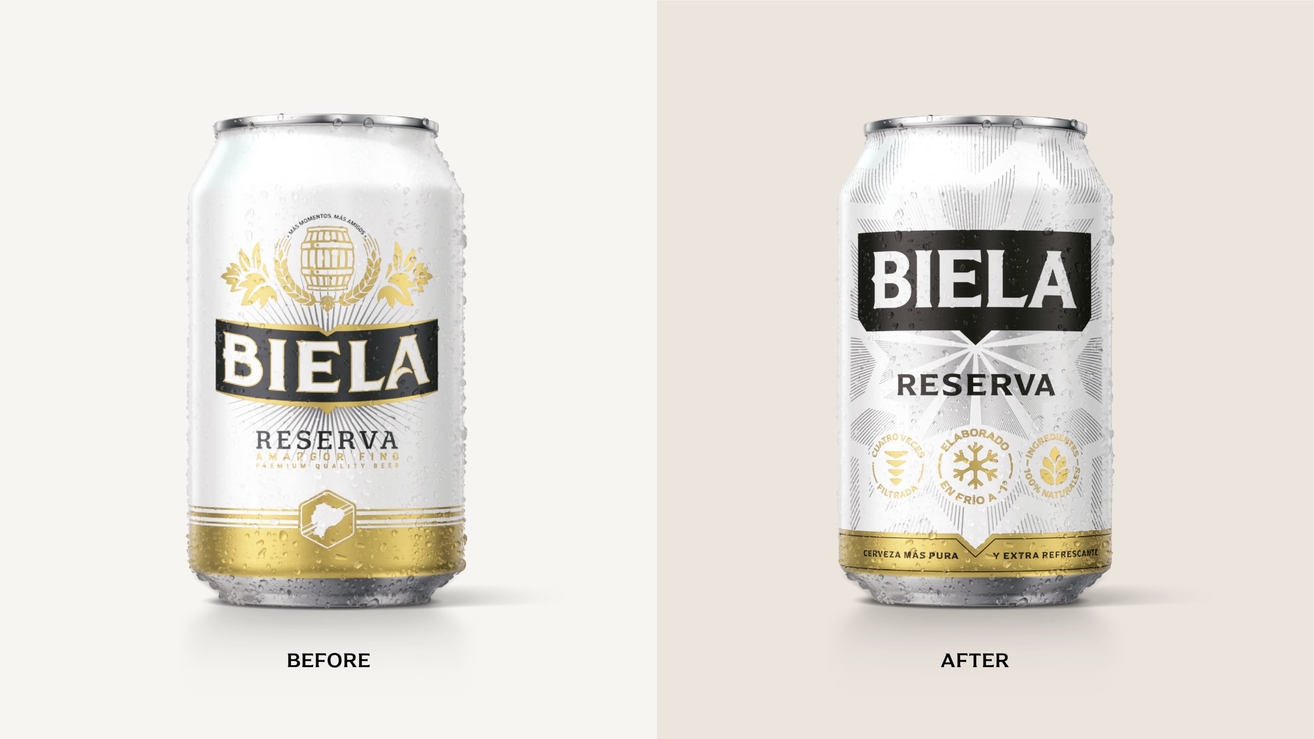
In Ecuador, ordering a beer “bien helada,” or ice cold, is an everyday expression at get-togethers with friends, and Biela took its name from that phrase. That’s about as good a brief as a brand can get, and Elmwood leaned into it for the refresh, built around a new positioning called Friendship as Alchemy.
The previous design felt busy. Gold hops flanked a barrel tucked inside a wheat wreath, but the update clears all of that away. The wordmark now sits inside a black “flag” with a little point at the bottom, while silver lines burst out behind it like frost creeping across a cold glass. I love those frosty lines because you can almost feel the condensation before you crack it open. Mainstream lagers everywhere are trading crests and filigree for cleaner systems, and Elmwood shows how to do it without losing the friendly corner bar quality that made people reach for Biela in the first place.