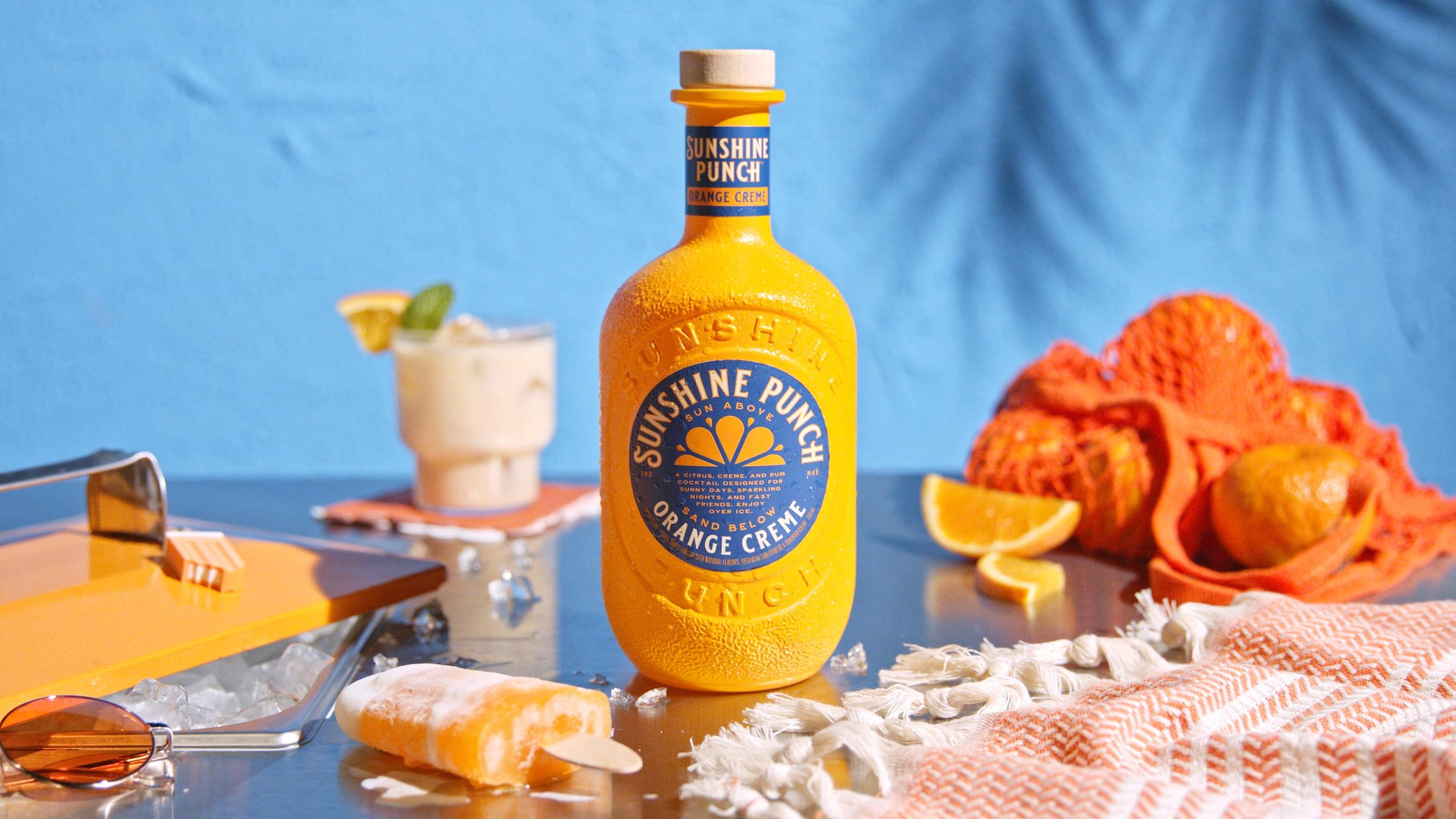
I’ve yet to meet an orange and blue color palette I dislike. That is, unless I pretend to enjoy watching football while my Alabama-rooting boyfriend cheers on the Crimson Tide. And if Saturdays weren’t already exciting enough, Sunshine Punch has just been revealed.
The packaging, designed by Sandstrom Partners, serves up a drool-worthy orange and blue palette with nostalgic details that pack a fruity punch. This bottle proves the good sippin’ beverage that lies within in a way that’s undeniably upbeat and cheerful. Plus, who can deny the sweet, heavenly details of a creamsicle?
And if SEC football can learn anything from Sunshine Punch’s packaging, it’s that cheerfulness wins over arrogance every time.