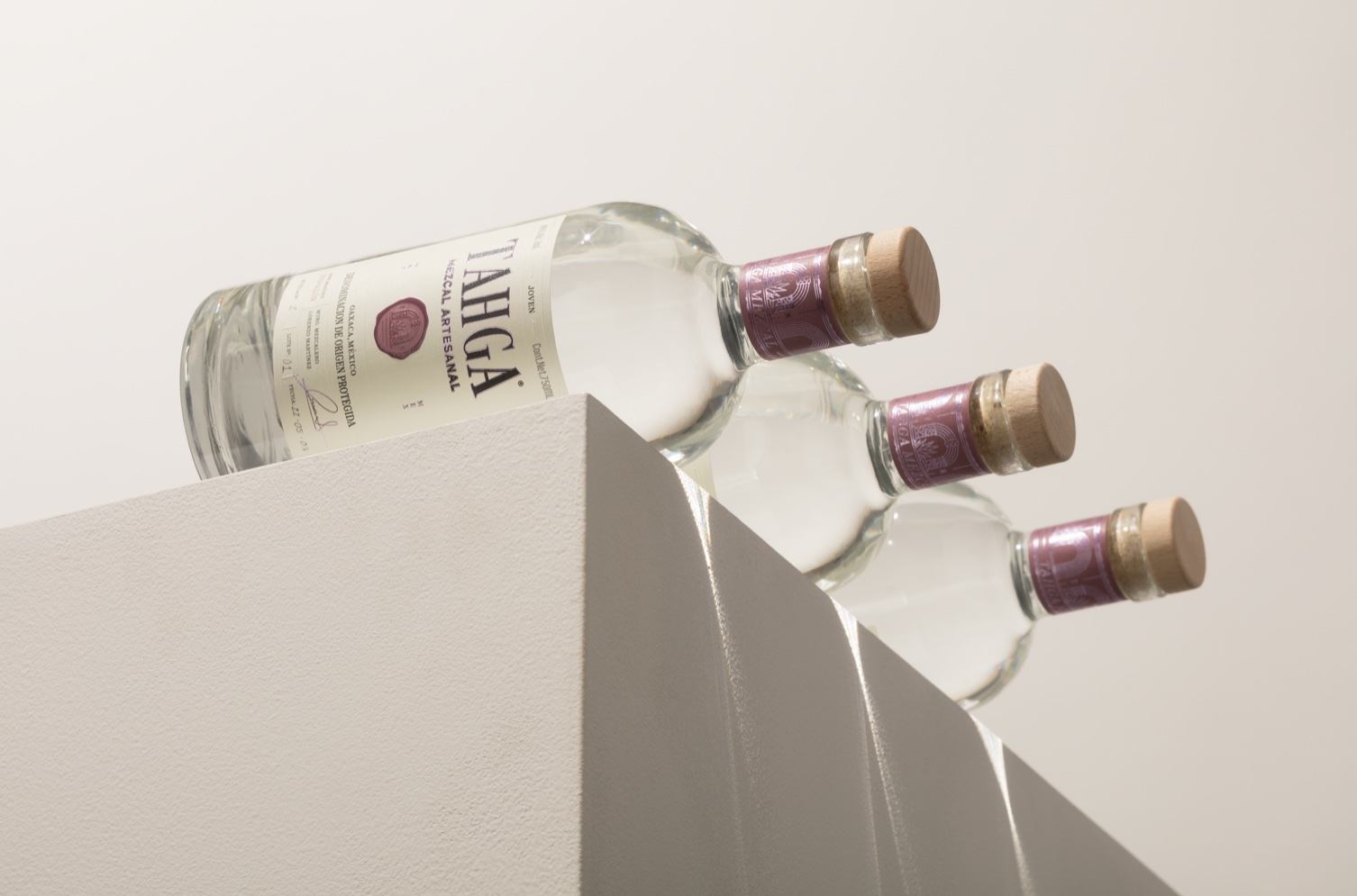
Mezcal packaging often leans towards a dark, masculine identity, but Human designed a light and refreshing bottle for Tahga. The plafyul pink and sophisticated typography paired with the white label creates an unexpected gentle aesthetic.
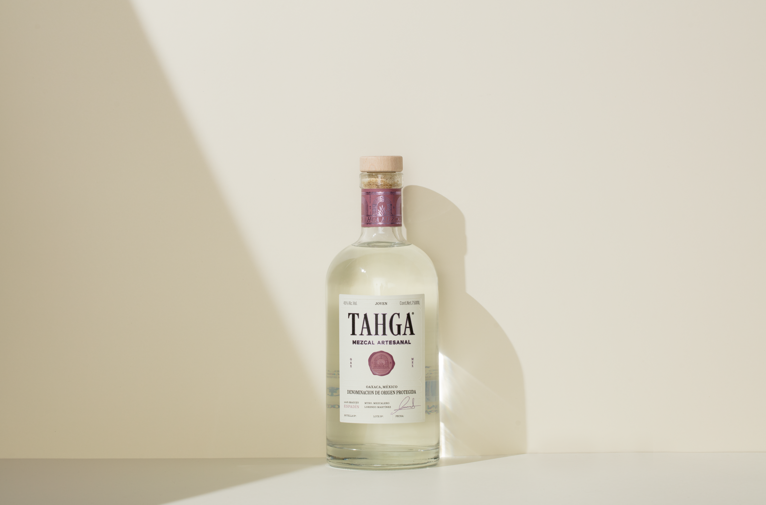
For Tahga´s identity, we took a classic unpretentious approach to deliver a fresh and minimal label that relies on soft finishes such as emboss and purple foil that distinctively stands out on the shelf. We took this direction to balance between the content of the bottle and the label, where the elements harmoniously converge between one another in a sober yet memorable identity for a truly unique mezcal.