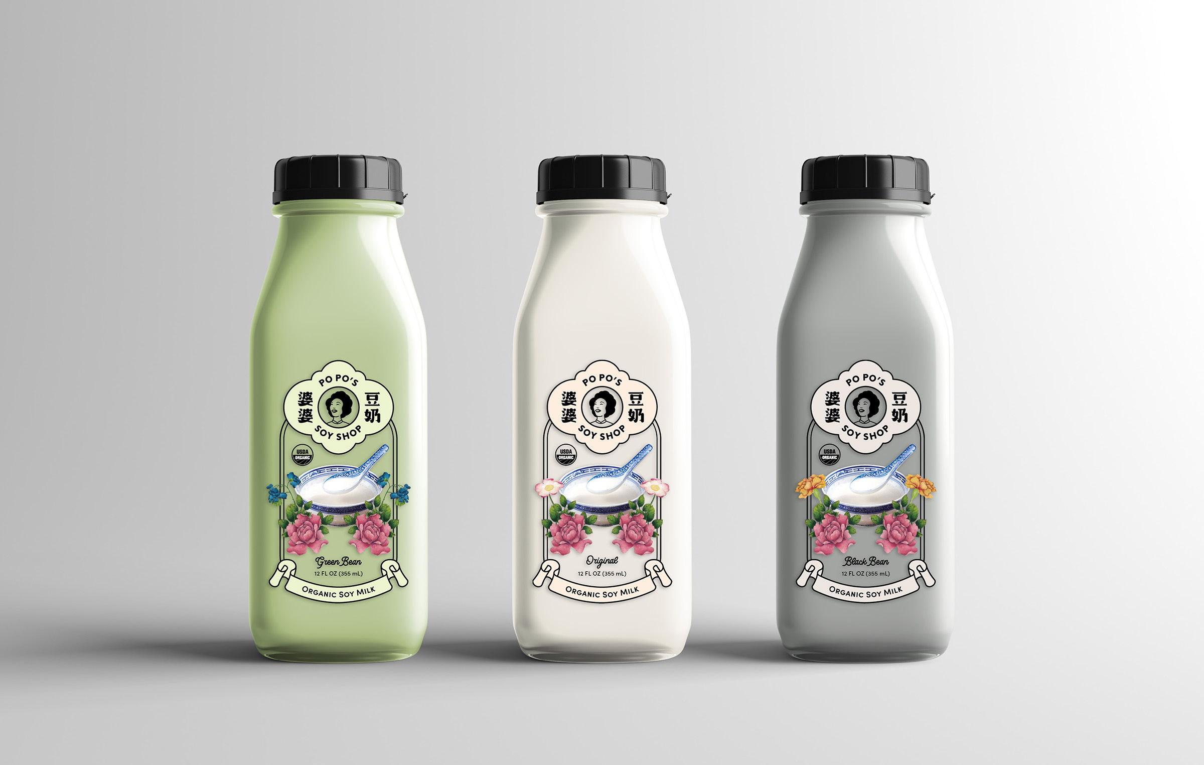
Wynne Au-Yeung’s packaging design for Po Po’s Soy Shop resonates deeply with Asian American coffee shops and dessert cafes. The single-serving glass bottles, featuring three distinct soy milk flavors, capture the essence of nostalgia associated with soy milk in Asian households. The heartwarming brand story of Po Po, the Chinese grandmother who lovingly crafted soy milk on a backyard fire pit, evokes a sense of community and cherished memories. The logo, depicting a youthful Po Po surrounded by both Chinese calligraphy and English text, is adorned with peonies inspired by Qing Dynasty art. At the same time, the design’s modern take on traditional Asian packaging and typography pays homage to the past with a contemporary twist.

Po Po’s Soy Shop is a concept soy milk brand sold in Asian American coffee shops and dessert cafes. The product line features three flavors made from different types of soybeans, packaged in single-serving, grab-and-go glass bottles. Tapping into the deep nostalgia associated with soy milk in Asian households, Po Po (Cantonese for grandma) is the inspiration behind the brand story: “Growing up, my Chinese grandma cooked delicious soy milk for our neighbors in a large cauldron on the backyard fire pit.