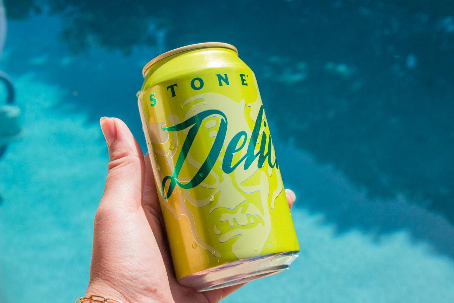
Turning something good into something better isn’t an easy task, but Graphic Designer Laurel Syring and Art Director Joanna Dawson worked together to rebrand Stone Brewing’s packaging system into something great. The new packaging system captures the brand’s beloved bright green hue and edgy illustration through a more simplistic and minimal design. Utilizing a solid shade and the entire aluminum can creates a sleek, refined design system, and when paired with a darker green hue, the system feels effortlessly balanced. Like the libation within, the packaging design is crisp, clean, and wildly refreshing.

In effort to better communicate appetite appeal, reinforce quality and build an inviting, fresh brand personality, Stone is elevating Delicious this summer with premium finishes and a new clean, minimal layout that pulls focus on the name of the beer, supported by a bright crisp color palette. All to send one simple message: It’s just Delicious!