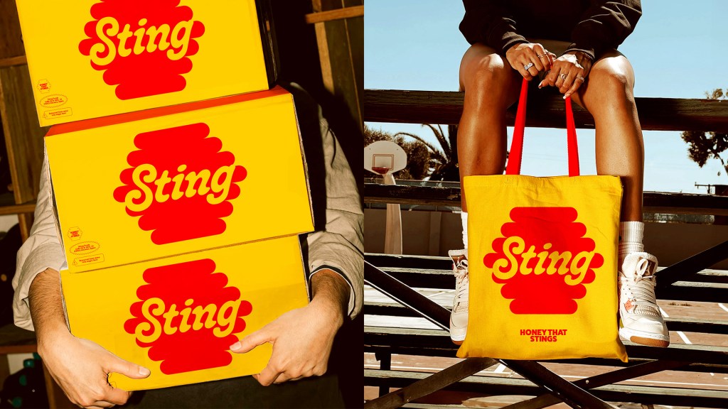
Sting’s packaging, designed by Manas Trivedi, leans into the heat unapologetically. The wordmark is punchy and rounded, echoing the gooey flow of honey while still feeling assertive. Set in bold red on a bright yellow backdrop, the label reads more like a warning sign than a product, intentionally. The jar shape stays classic, but the palette and typography shout with energy. It’s playful, almost cartoonish, with a wink to retro supermarket spice cues.