Stappa’s Vibrant Charcoal Illustrations Add A Moody Touch To The Label’s Design
By
Published
Filed under
By
Published
Filed under
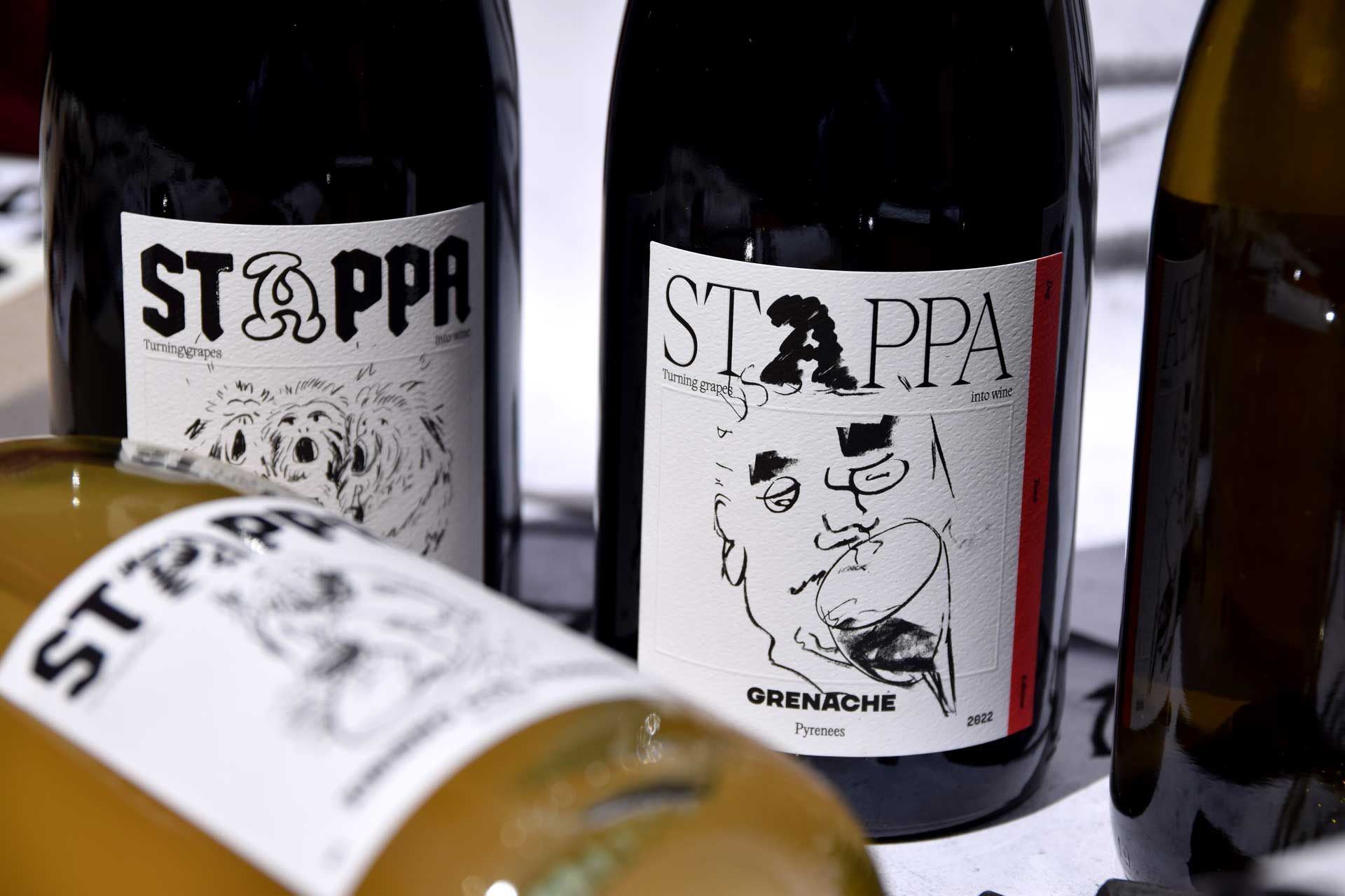
Stappa’s wine label is wildly authentic and celebrates a sense of craft and quality. Studio Chenchen helped Stappa discover its no-nonsense strategy, resulting in a packaging system commemorating the brand’s original voice. The illustrative graphics created with charcoal create a deeply vibrant, textured aesthetic that aligns perfectly with a wine brand. The label is moody, obscure in all the right ways, and artistic enough to set this label apart from the masses.

Stappa curates obscure grape varieties from the best growers in Australia to develop small batch releases of delicious and interesting wine. As a new entrant to Australia’s wine scene, Stappa wants to make its mark and assert its point of difference in a way that is authentic and engaging.
Get unlimited access to latest industry news, 27,000+ articles and case studies.
Have an account? Sign in


