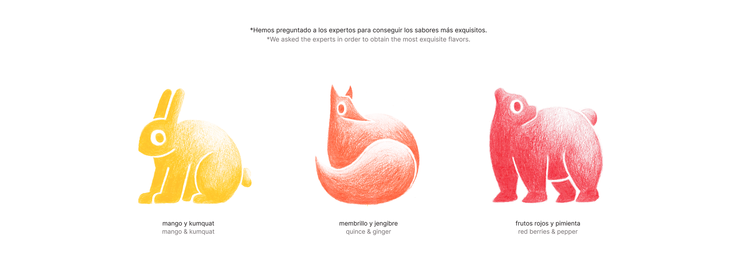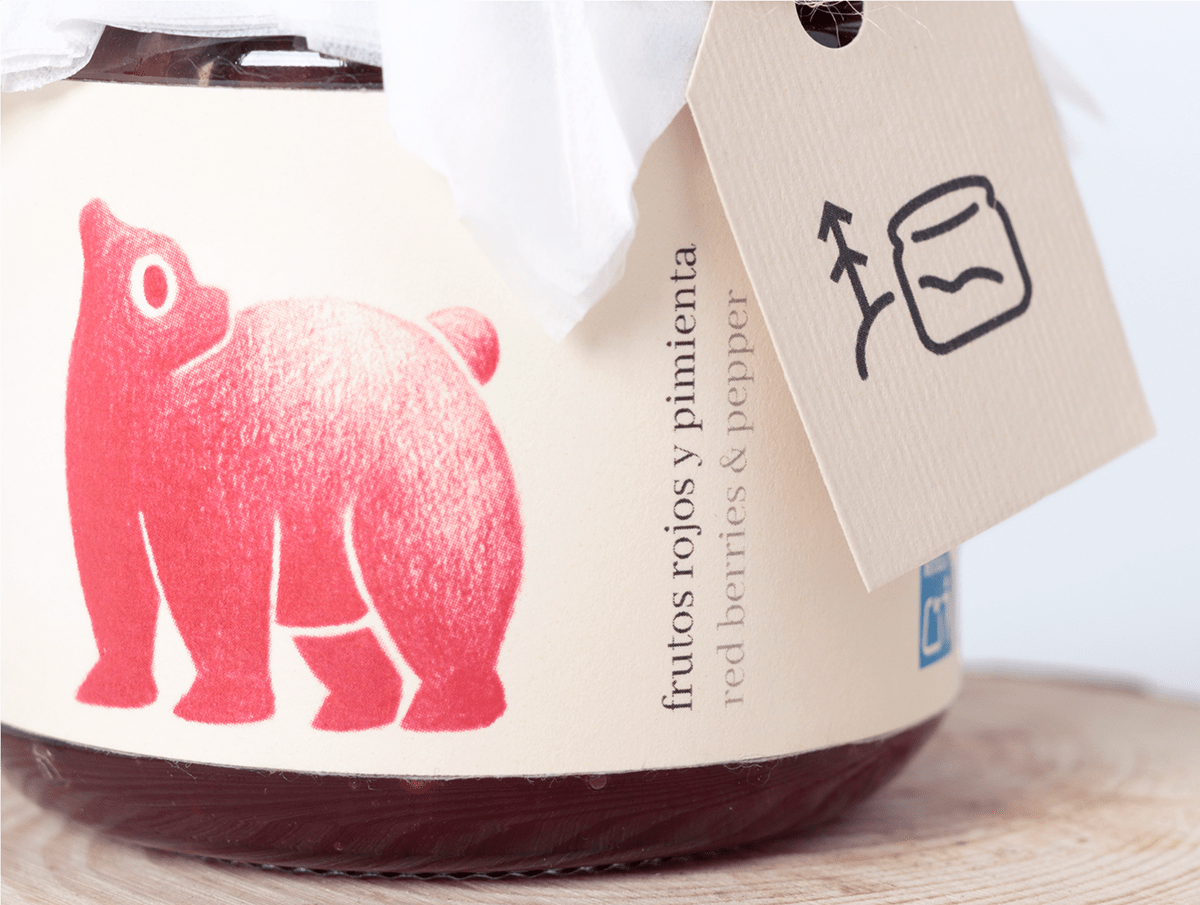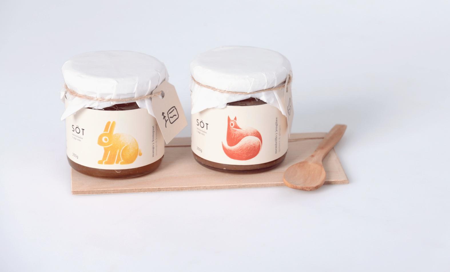
Leaning into the homemade aspect of the jams, Söt’s packaging, designed by Sofía Pérez and Antonio Figols Villanueva, features airy and soft aesthetics. The stunning use of white space, light sans-serif typeface, and innocent stamp-inspired illustrations leans into a design style reminiscent of the sentiment of getting together for a cozy, homemade family breakfast