SOTO Adds a Stylish Touch of Controlled Chaos to Their Beautiful Sake Bottles
By
Published
Filed under
By
Published
Filed under
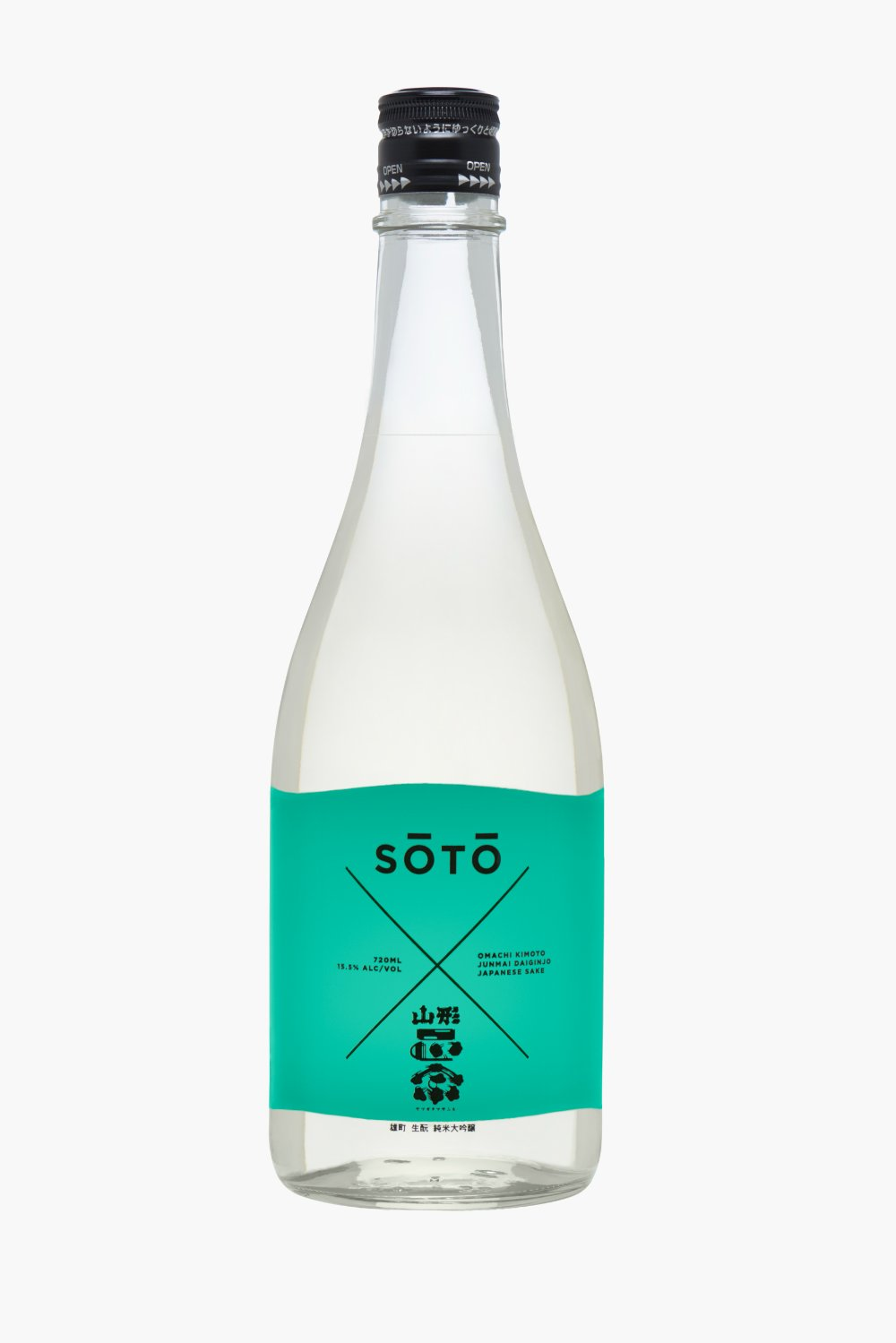
SOTO’s sake is one of the classiest we’ve seen in a minute, and it’s not afraid to have a little fun either. Joe Doucet aimed for a balance between order and chaos, which they nail beautifully with clean lines, a little bit of scattered serif text here and there, and smart uses of color.
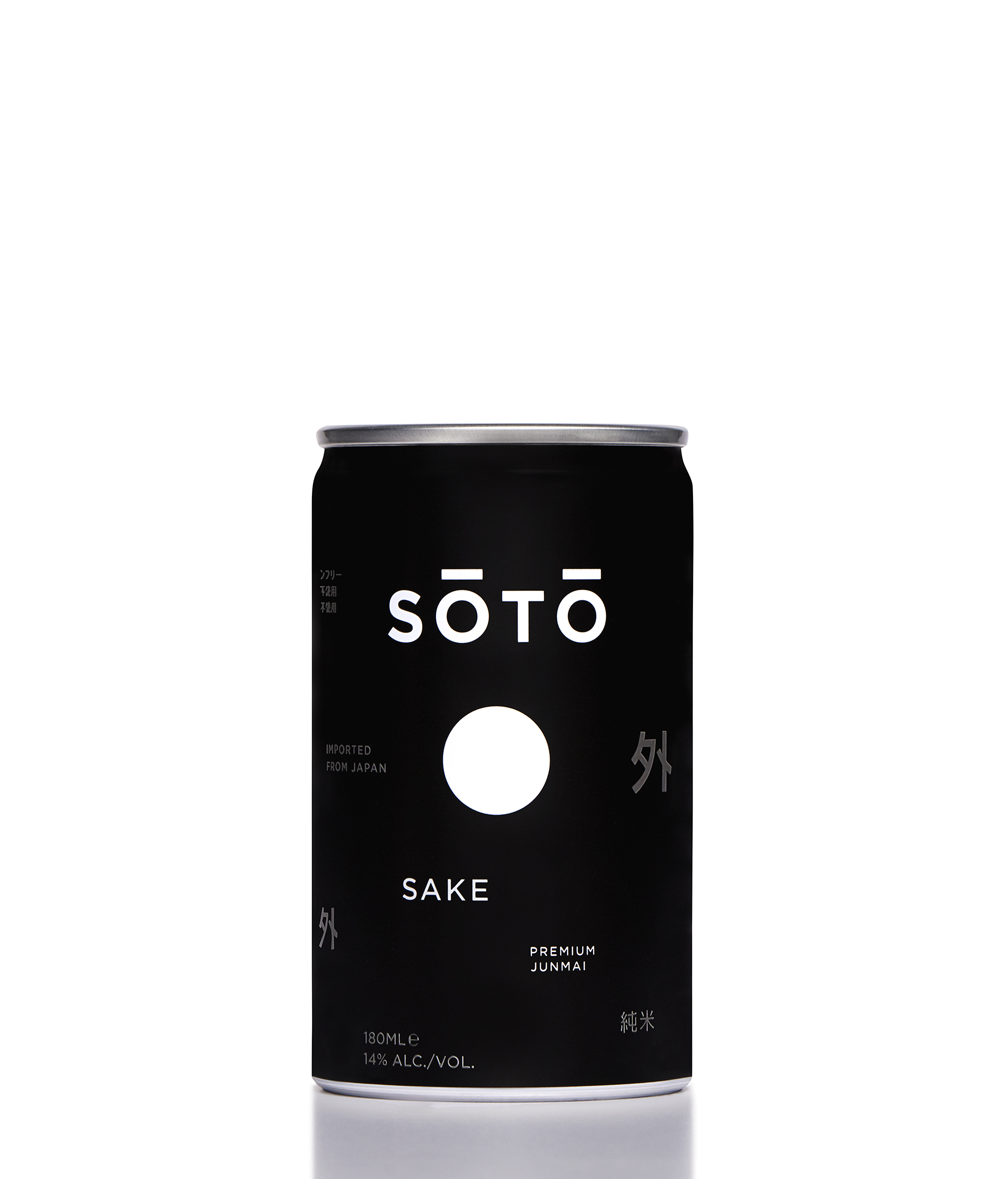
“Designed to reflect the beautiful contradictions of Japan”
Get unlimited access to latest industry news, 27,000+ articles and case studies.
Have an account? Sign in


