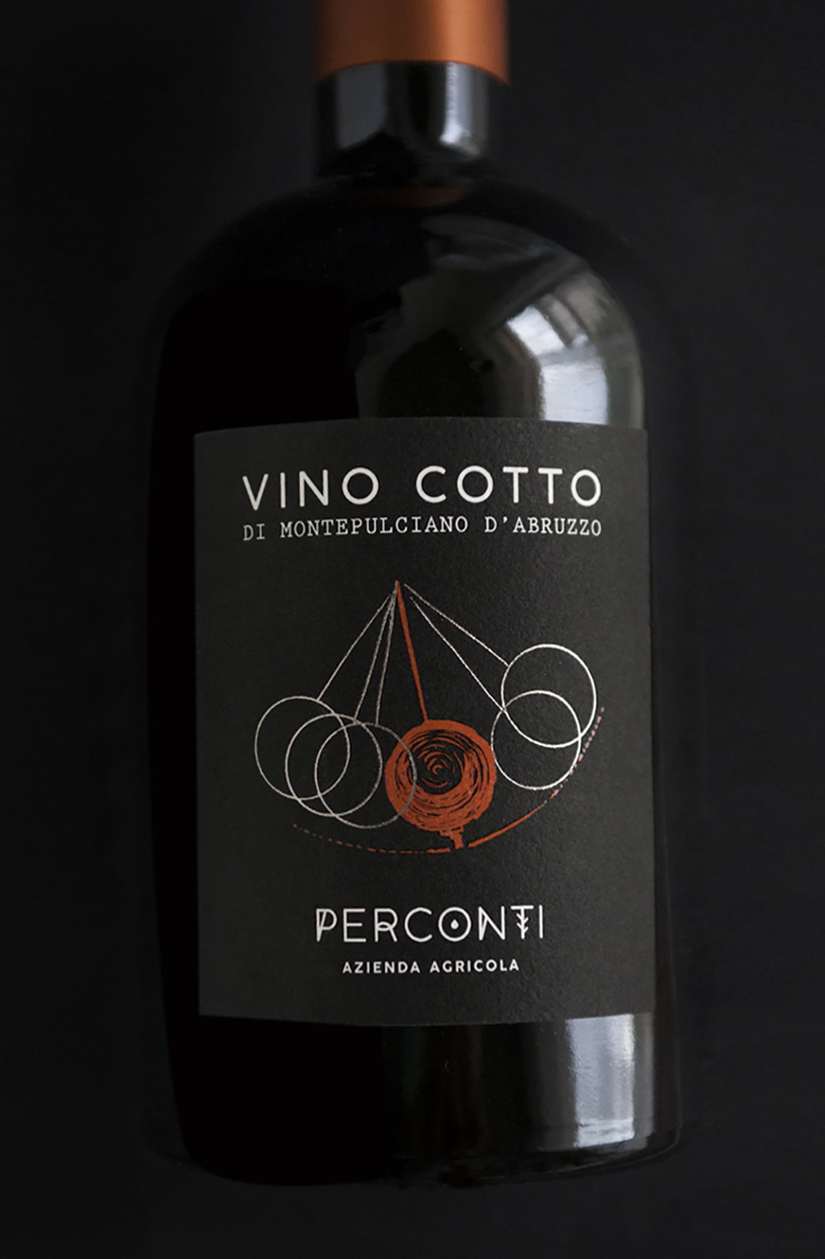
The dessert wine “Vino Cotto” features a wine label showcasing the swing of a pendulum, meant to represent the passing of time. Auca Design created the label, and the use of utterly simplistic typography helps balance the more profound reflection of time as seen in the illustration. Additionally, the black and white label with just a simple pop of terracotta red, allows for a more refined aesthetic.
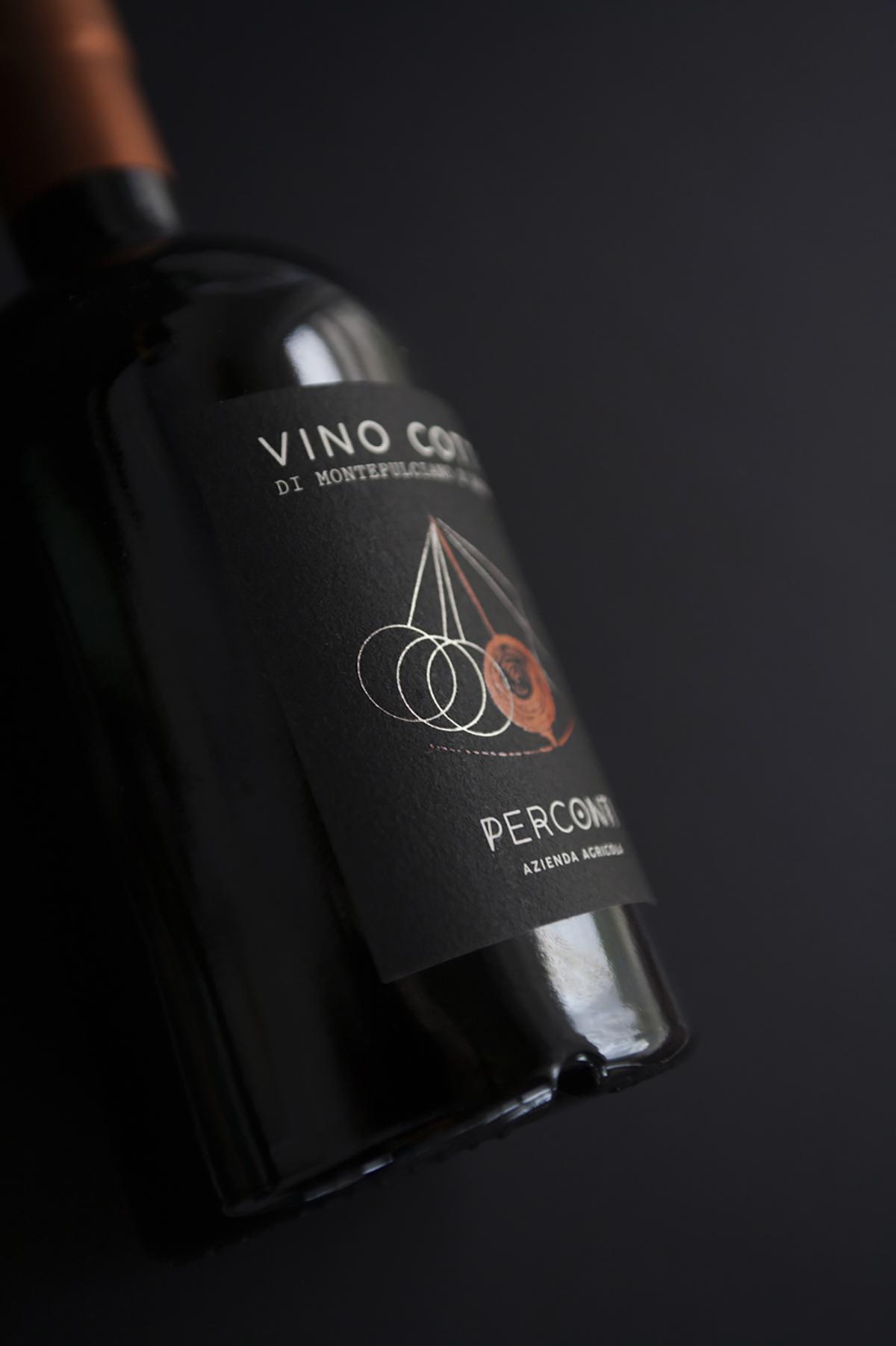
“Vino Cotto” is a special dessert wine produced with Montepulciano grapes fruit fermenting and cooked must, aged in oak barrels for years. This is the reason why I decided that Perconti Vino Cotto label should be inspired by the concept of time and patient waiting for the right moment. I imagined the passing of time through a perpetual pendulum that can be found in the right position only after a long wait. The color of the pendulum is bronze, such as the wine nuances. A simple but effective and refined label, that tells about a singular and unusual wine, typical of middle Italy region Abruzzo.