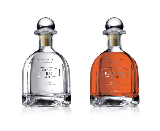

A student project designed and sent in by Andrew Harrington, tackling redesigning Patron Tequila:
“Patrón is to the premium tequila industry what Kleenex is to tissues or
Band-Aid is to wound-dressings. Problem is, Patrón has never looked the
part thanks to its dated-looking layout and less-than-refined type choice.
To improve the presentation, I kept some signature elements of the
old package, such as the rectangle with the chopped corners, which now
serves as a housing for the new logotype. The bee makes an appearance
embossed or etched into the top of the cap. Speaking of the logotype, I
set it in Neutraface as the modern elegance and retro flair of this
face seemed to fit the attitude of the premium tequila lifestyle very
well. It’s a little bit business, and a little bit fun. The bottles are
stamped in shiny hematite-colored foil.