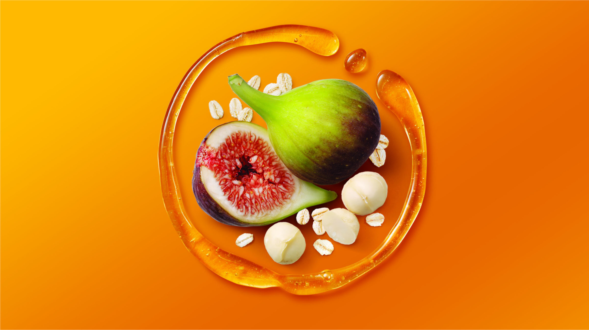
Oatmeal isn’t the most exciting breakfast option to start your morning. AKA Brand Design is looking to change that with O&G Oatmeal’s packaging, creating a pack that gives off vibrant energy that is lacking in other oatmeal brands. The house-shaped box subliminally gives the product a “homey” feel while reminding the consumer that oatmeal can be fun with a colorful arrangement of natural ingredients displayed at the top.
“Sydney based agency AKA Brand Design were recently tasked with creating packaging for a new product in the Oats category for UNCLE TOBYS.
When UNCLE TOBYS came to us and said ‘We want people who don’t like oats to start loving oats!’, we thought ‘Well, this will be a challenge!’. What we learnt was there is a whole segment of consumers (SINKs and DINKS) who know oats are good for them but don’t really like traditional porridge because they perceive them to be bland, stodgy and generally just a bit boring. What we had to do was show that not all breakfasts (especially oats) are created equal and there was in fact a product & brand just for them. This new product was ‘oats reinvented’ – full of yummy fruit and nuts and could be eaten hot or cold.”