Why does nail polish tend to look so boring? While most brands in the wildly competitive cosmetics industry have gotten increasingly ambitious with packaging, nail polish has felt stuck in the 20th century for quite some time. The regular-degular cap and bottle design has been so standardized that it’d be easy to conclude that innovation just isn’t possible—but why the hell wouldn’t it be?
When it comes to creativity in the nail polish sphere, it’s hard to think of anyone doing it better than Austin’s Death Valley Nails. The extremely hip small-batch brand has pushed the envelope for years with impressive formulas that change color in sunlight, make freaky patterns with a magnet, and even witchy sustainable pigments made with garden herbs and crushed crystals.
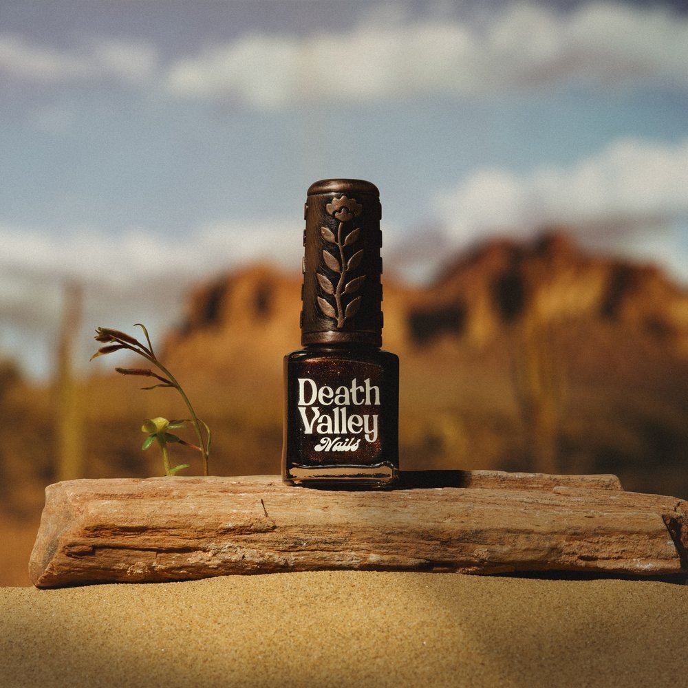
It only makes sense that they’d want to up their game with branding that reflects their expansive scope. Last Halloween, the company unveiled an impressive redesign from Studio Bookmark that transcends the standard polish look with a huge, ‘70s-inspired script logo and gorgeous removable bronze caps decked out with flowers and scarabs. The caps are removable to stay conscious of accessibility, simple preferences, the natural magpie tendency to collect shiny objects, and maybe the desire for some glamorous finger hats.
