When your brand is named for a distinct place, you need to make sure your packaging design is unique as well. Mt. Macedon skincare definitely took that to heart when considering its visual identity.
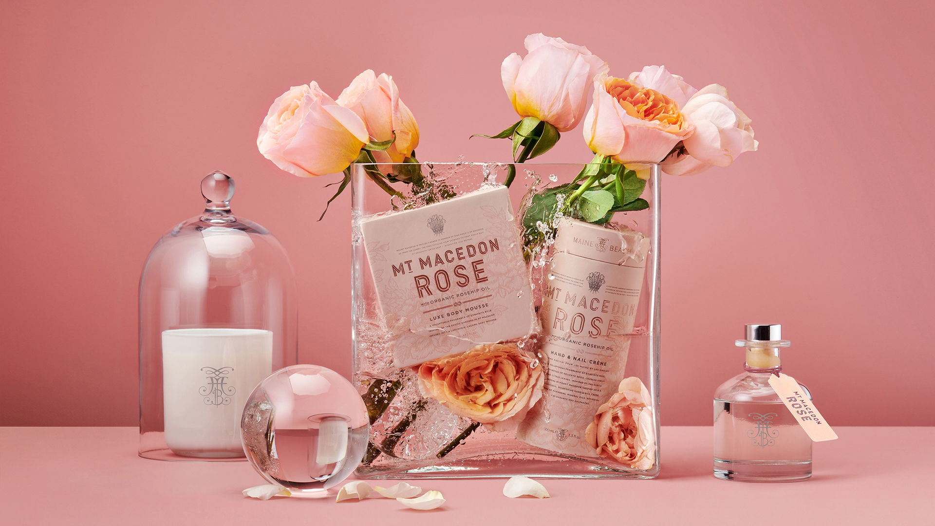
Utilizing a warm, pink-tan as the base color across all product variants, Mt. Macedon speaks to how fruitful the soil in the surrounding area is by using illustrations of flora faintly placed behind the typeface. Perhaps the most luxurious element of this package design is the pink-copper foil used for the brand name, a reminder that this is a skincare line honoring the royal lineage from which it received its namesake, King Phillip II of Macedon.
“The magnificent gardens of the Mount Macedon region in Victoria inspired this contemporary rose bodycare & home fragrance collection by Maine Beach. Mount Macedon’s unique geography and cool climate, combined with its rich volcanic soils has created ideal conditions for these exquisite grand gardens to flourish.