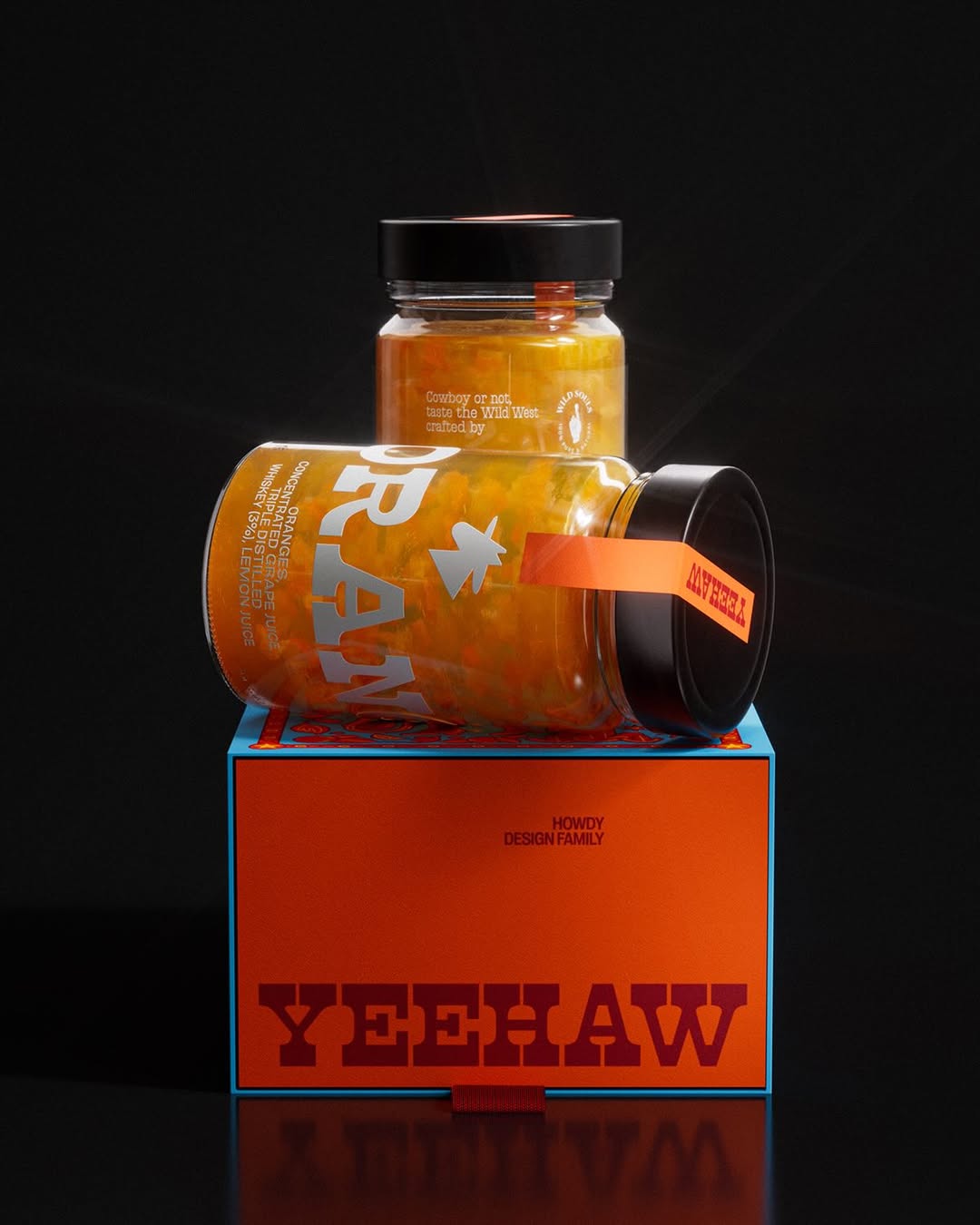

Mez’s packaging, designed by Audrie Kapinus, instantly grabs eyeballs with its bold wordmark and confident typography reminiscent of vintage concert posters and woodblock prints. Inspired by the rich landscape of the Southwest, the design combines earthy, saturated colors with botanical and ingredient illustrations that highlight the brand’s signature appeal.
The carefully arranged layouts create visual balance, while embossed details make for a tactile experience. By focusing on flavor cues and nutritious ingredients, the design shifts the narrative from restrictions to deliciousness. The result is packaging that feels dynamic, approachable, and all kinds of cute.
