Men Rock’s Balanced Packaging Reinforces The Importance Of Men’s Grooming Aesthetics
By
Published
Filed under
By
Published
Filed under
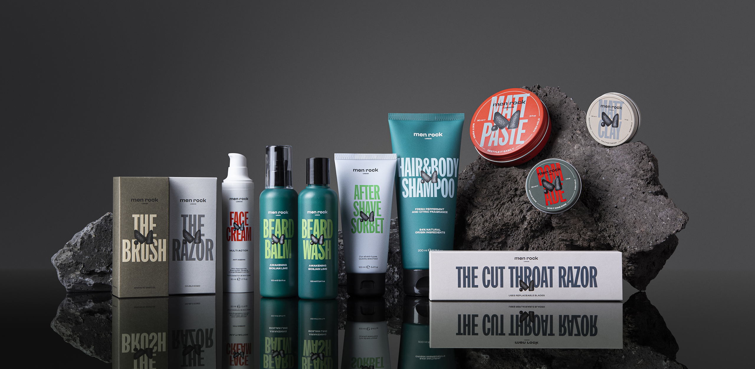
Younique Studio rebranded Men Rock’s grooming products with a restorative and innovative packaging system. Men Rock aimed to communicate that men’s grooming should be simple and enjoyable in a market saturated with generic brands. The solution was a design system that effortlessly balanced confidence with simplicity, featuring solid, highly legible typography that made selecting and using grooming essentials as simple as possible. The typography features a bold sans-serif typeface, adding an element of confidence to the design, and further reinforcing the brand’s message.
Moreover, the color palette used in the packaging design went against the grain of conventional men’s grooming products. Instead of the typically dark and uninspiring colors, Men Rock opted for vibrant hues and pops of color that celebrated the unique personalities of the brand’s consumers.

Get unlimited access to latest industry news, 27,000+ articles and case studies.
Have an account? Sign in