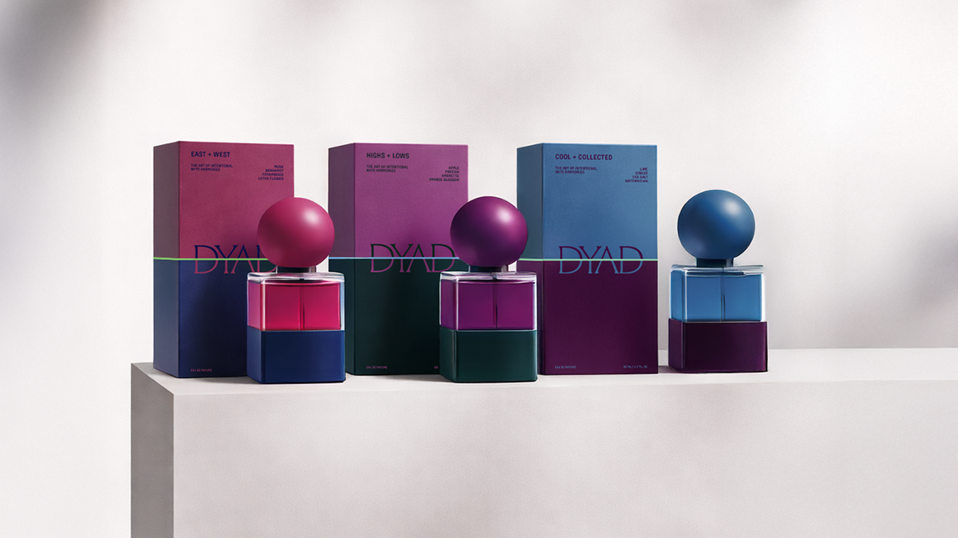
THIS IS IT! DIELINE Awards 2026 Late Entry Deadline Ends Feb 28
Matcha Society Attempts To Build a New Visual Language for the Category
By
Published
Filed under
By
Published
Filed under
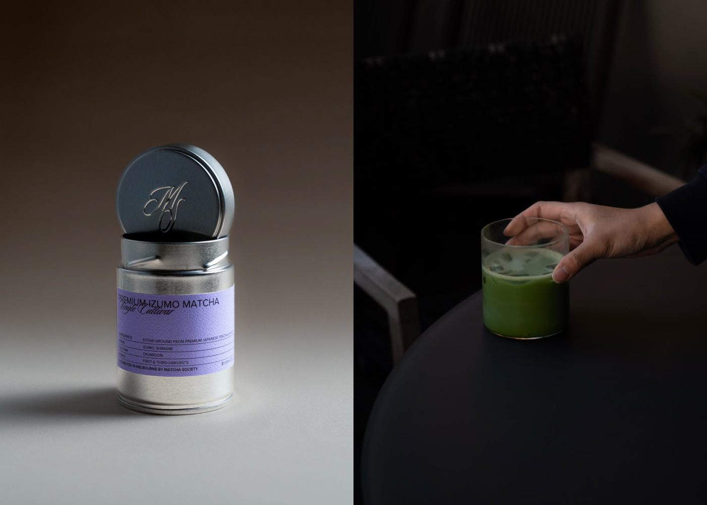
Matcha Society’s packaging, designed by perfectgraey, rejects ornamental tropes and instead uses brushed-metal tins that signal utility and freshness, borrowing from apothecary and Japanese tea storage traditions.
The typography pairs a clean, modern sans serif with a calligraphic script. A muted palette of moss green, charcoal, and silver creates a sparse layout and ingredient-forward hierarchy that sets it apart from decorative matcha brands that prioritize ceremony over clarity.
Get unlimited access to latest industry news, 27,000+ articles and case studies.
Have an account? Sign in