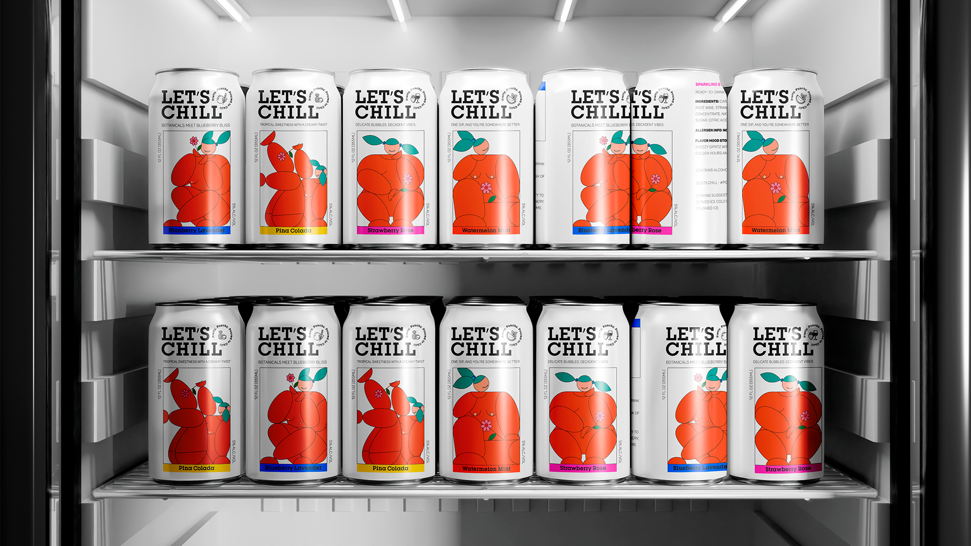
Let’s Chill’s concept packaging by Tuyen Lam leans into comefort and happiness. Each can is wrapped in an illustrated character made of soft, fruit-like shapes with their legs crossed and flowers in hand, totally at ease.
A bold slab-serif logotype holds down the top, balancing the fluid forms with structure. The white background keeps the look crisp, while each flavor has a pop of color. The design is simple, but full injected with a cheery personality and an artful take.


