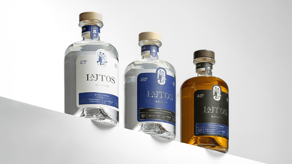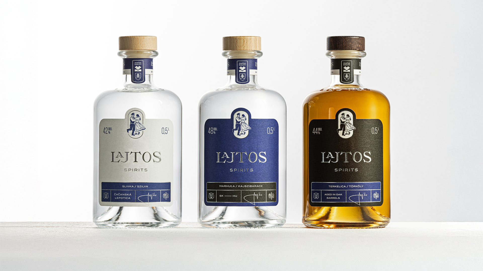
Lajtos Spirits, designed by Békefi+NAGY, leans into a restrained serif typography that nods to old Central European signage, paired with compact folkloric dance illustrations. The label blends traditional apothecary layouts with a hint of glossy maximalism. Rich blues, deep neutrals, and metallic touches give each variant a clear hierarchy without becoming overwhelming. It’s quiet confidence, and that’s exactly what separates it from its louder competitors.