Who doesn’t love a packaging system that’s as vibrant as it is minimalistic? ZAK Design Studio designed the packaging with KOKOMO with lively simplicity in mind. The brand’s logo represents the bowls that some of the products come in, and by keeping the bowl-shaped window and geometry consistent throughout the packaging, consumers are introduced to the brand’s entire line of products. Additionally, each of the product’s color palettes is determined by the flavors within, creating a rainbow-hued line with earthy, natural undertones.
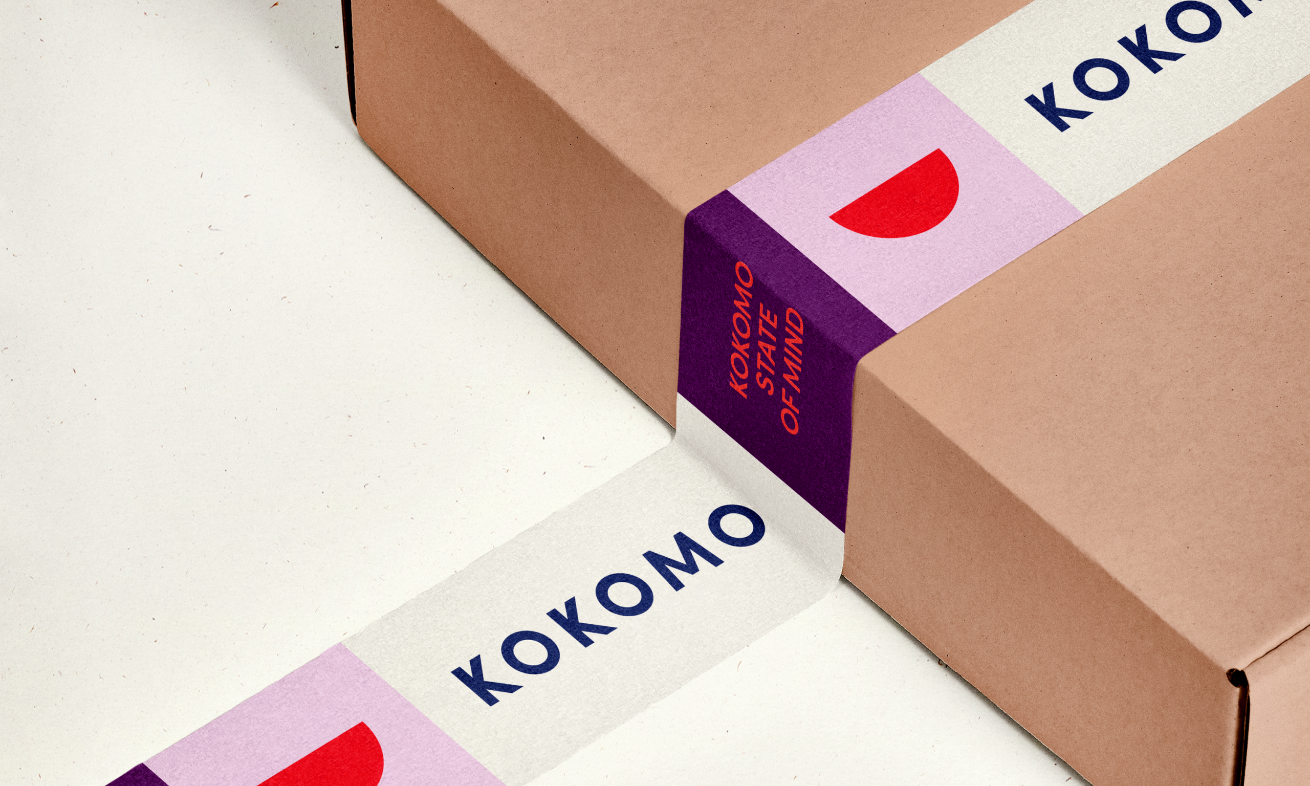
Nourishing, plant-based foods that are inspired by the sun and created for you. KOKOMO believes that summer is a state of mind that should embraced 365 days of the year. From fresh, nourishing, plant-based bowls and burgers, to delicious smoothies and snacks, KOKOMO is a staple for food that is better for you. We worked alongside the plant-based restaurant to establish their brand identity and everything that goes with it. Packaging design, website design, store signage and hoarding – you name it, we had a hand in designing it.