Johnny Pep Microfarm Turns Up The Heat With A Side of Personality
By
Published
Filed under
By
Published
Filed under
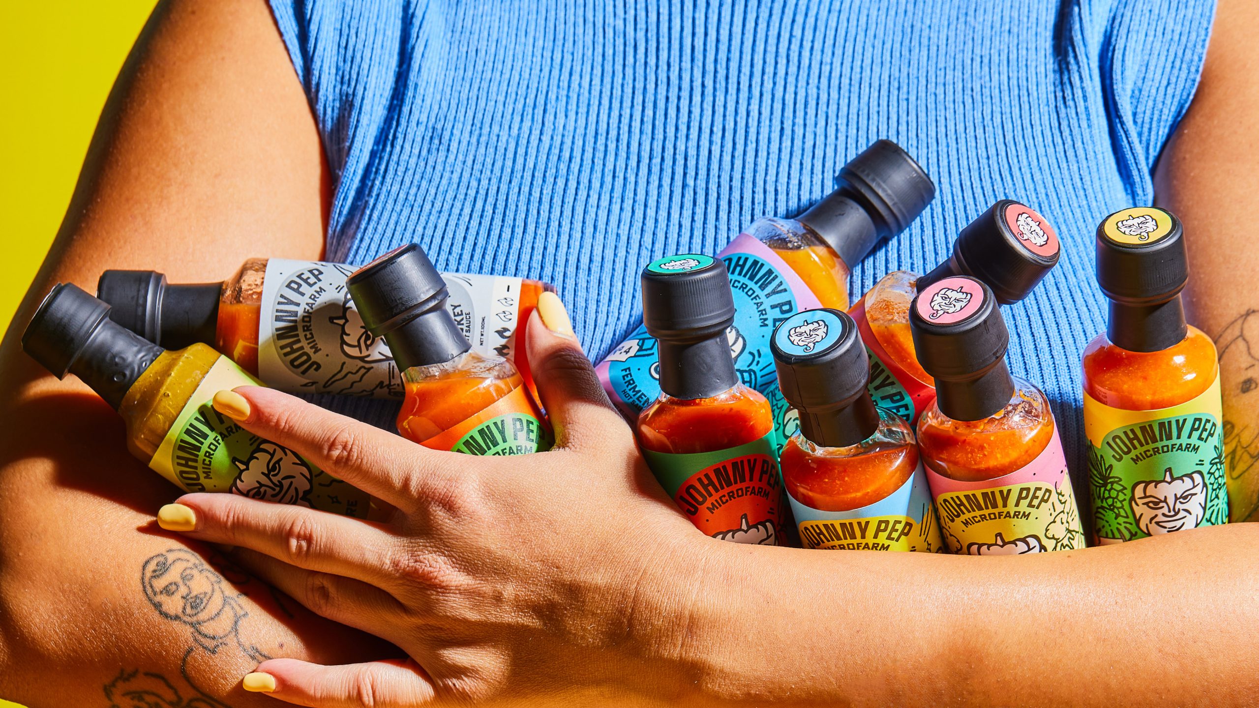
The packaging design for Johnny Pep Microfarm hot sauces is playful, with energetic color palettes that make each bottle stand out. Quirky illustrations, like the smiling pepper mascot, add a sense of warmth to the brand.
The hand-drawn typography and vintage-inspired design details give the labels a personal, crafted feel while maintaining a clear focus. Each variant’s color combination reflects its flavor profile, creating a cohesive yet dynamic lineup that invites exploration.
Get unlimited access to latest industry news, 27,000+ articles and case studies.
Have an account? Sign in


